Abstract: The Nextera “study” by KPI Ninja misappropriated the prestige of a Johns Hopkins research team to support its risk measurement claims; relied on an undisclosed and unvalidated methodology for obtaining population risk measurements; obtained highly dubious risk measurement results; and sharply mischaracterized the significance of those results. In the end, because applying even their own risk measurement results would have reflected negatively on Nextera, they never actually performed risk adjustment of the cost and utilization data under study.
It was a charade.
UPDATED, 12/16/2020. View between two rows of red asterisks (**********) below.
Context.
When KPI Ninja’s analysis of Nextera’s SVVSD clinic and the attendent social media blitz first hit the public, Nextera used the following language to misappropriate academic prestige to support the report’s handling of population risk measurement.
“KPI Ninja conducted risk score analysis in partnership with Johns Hopkins’ ACG® research team [.]” Before being sent down the rabbit hole, this language appeared in two prior versions of the study, dated 10.13.20 and 9.22.20 versions of the report. Similarly, a published program of a direct primary care summit meeting noted that, “The case study came together though partnership with KPI Ninja and the Johns Hopkins’ ACG® research team.” In a Youtube video, Nextera’s CEO declares: “[KPI Ninja] brought in the Johns Hopkins research that has significant expertise in what is called population risk measurement”. And on he goes, “We took that extra step and brought on the Johns Hopkins team that has this ability to run analysis. It’s in their wheel house and they applied that [.]” Specifically asked about adverse selection, he went on, “[The] Johns Hopkins Research Team did the risk analysis . . . and that allowed us to get to the $913 [in savings].”
Here’s a screenshot from that video.
And, here is reality.
“We were not directly involved in this analysis.” Associate Director, HopkinsACG.org.
In general, any direct primary care provider should earn some credit for acknowledging the relevance of population health metrics to assessments that compare results between direct primary care populations and other populations. Not here.
In this case, Nextera’s analyst KPI Ninja performatively measured population risk to anticipate criticism, but stopped short of actually applying any actual risk adjustment, even one based on its own measurements, because doing so would have weakened Nextera’s coat reduction claim.
There is no indication that KPI Ninja actually performed a risk adjustment.
Big talk about risk measurement. No actual action.
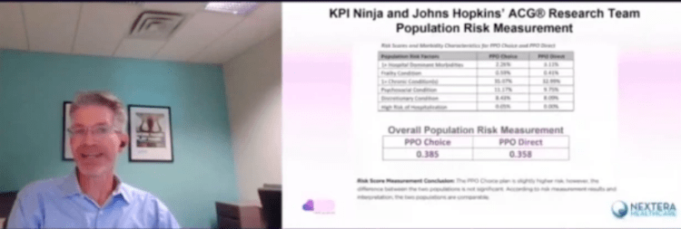
KPI Ninja computed the risk scores for the two populations at 0.358 (Nextera) and 0.385 (non-Nextera), a difference of 7.5%. The appropriate way to present statistical risk adjustment work is to present unadjusted raw claims data, apply to the raw claims data the relevant calculated risk adjustments and, then present the adjusted claims and utilization data with a confidence interval to assist those using the data in making such judgments as they wish. As the landmark Milliman report on direct primary care for the Society of Actuaries shows, this is done even when presenting differences deemed not statistically significant.
Instead of following standard statistical practice KPI Ninja pronounced the difference “insignificant” and pronounced their own “interpretation” that the two populations were “comparable”, then excused itself from actually applying any risk adjustment to modify the raw claims or utilization data at all, as if no measurement had ever been made. In effect, they treated the data as if their risk measurement had yielded zero difference.
This is nonsense, not analysis. As an initial matter, in common statistical practice with which all analysts, data modelers, and academic researchers (even medical practitioners) should be generally familiar, there are rules for calculating and expressing the statistical significance of differences. KPI Ninja purports to have a crack team of analysts, data modelers, and academic researchers who should know how to do this. What number did they get? Did they bother to determine statistical significance at? They aren’t saying.
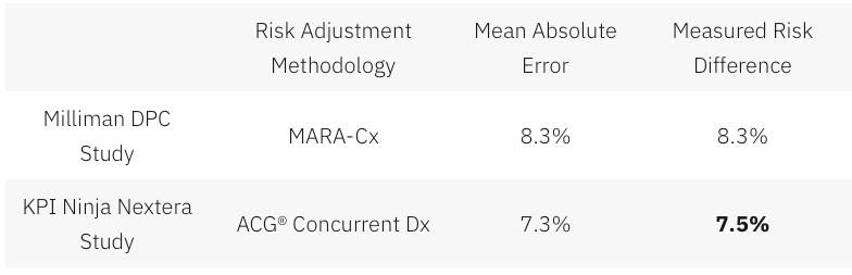
Had KPI Ninja investigated the accuracy of the ACG® concurrent risk scoring model with which they developed the risk scores, they might have run across another Society of Actuaries report, this one entitled Accuracy of Claims-Based Risk Scoring Models; that document would have told them that the mean absolute error (MAE) for ACG® risk group predictions on groups in this size range was 7.3%.
The 7.5% difference KPI Ninja observed was outside that mean absolute error. While this is not ironclad proof the two populations differed, it is certainly substantial evidence of a real difference. If KPI Ninja’s risk measurements have any valid meaning, it is that 7.5% is a significantly more probable measure of the likely population difference than is zero.
In any event, as it is highly probable that these populations differ in health risk, it is deeply misleading to address health risk by declaring that “the two populations are comparable”.
And 7.5% of health care costs is far too large a share to ignore. Consider, again, the Milliman report on DPC for the Society of Actuaries. There, the expert team determined an overall relative risk score difference of 8.3%, and proceeded to apply appropriate risk adjustment to the claims and utilization data. Moreover, the Society of Actuaries study of risk adjustment determined that the risk adjustment methodology used by the Milliman team, “MARA Rx”, had a mean standard error of 8.3%. So, for the Milliman study the measured risk difference merely matched the mean standard error for the risk methodology Milliman selected; for the KPI Ninja study the measured risk difference exceeded the mean standard error for the risk methodology KPI Ninja selected. The case for applying risk adjustment to the data in the Nextera study is, therefore, even stronger than was the case for doing so in the Milliman study.
In a follow up commentary emphasizing the breakthrough importance of their study, the Milliman team wrote, “It is imperative to control for patient selection in DPC studies; otherwise, differences in cost due to underlying patient differences may be erroneously assigned as differences caused by DPC.” What the Milliman team did not say was, “Measure risk, find a case that needs risk adjustment even more than the one we studied, but omit any actual control for patient selection and deny the need for risk adjustment.”
So why KPI Ninja did substitute “zero adjustment” for the 7.5% adjustment indicated by their own risk measurement. Here’s a clue.
Nextera’s cost reduction brag is pegged at 27%; when deducted from 27%, 7.5% gives a hefty haircut of hundreds of dollars to Nextera’s $913 cost reduction claim.
And being able to keep that trim to collar level would turn on the credibility of KPI Ninja’s own calculation of a 7.5% risk differential. But that effort, KPI Ninja’s first ever reported try at comparing risk between two populations, is not credible at all.
There are substantial reasons to believe that KPI Ninja’s diagnosis-based risk measurements are skewed heavily in Nextera’s favor.
The Nextera population skews heavily toward children; this is entirely predictable, because Nextera employees pay $1600 per year less in premiums to add children than do non-Nextera employees. 24% of the Nextera cohort is less than 15 years old, compared with only 13% of the non-Nextera cohort. On other side of the spectrum, those over 65 were nearly four times as likely to reject Nextera. Upshot: the Nextera population is about 6.5 years younger on average and is less heavily female. Based on age and gender alone, per a landmark data set prepared by Dale Yamamoto for the Society of Actuaries, a risk score difference of about 17% could be expected, even in the absence of adverse selection.
But adverse selection is very much in play in the St. Vrain Valley School District. As described more fully in a separate post, the school district’s cost-sharing structure strongly steers those who anticipate moderate to heavy health care utilization into the non-Nextera cohort with cold hard cash, as much as $1787 of it for a single employee and twice that for a couple. This invites heavy adverse selection that would produce risk scores significantly exceeding those based on demographics alone. Moreover, a comprehensive 2016 Society of Actuaries commissioned report on forty different risk scoring methodologies from eleven different vendors, including ACG®, explained that even the best risk adjustment models are not able to completely compensate for adverse selection.
The mere 7.5% risk difference between the cohorts that KPI Ninja ran across requires that the illness burden data for the two populations severely slash the risk gap indicated by age and gender alone. That suggests a perfect storm of the odd: a surfeit of younger, but relatively sick, Nextera members coupled to a surfeit of older, but relatively healthy, non-Nextera members — all working against a tsunami of adverse selection.
That defies belief, especially in light of widely-reported heavy selection bias at the Nextera clinics in the Longmont area. The report to which I refer was prepared and distributed by a surprising source — Nextera itself.
About two and one-half years before Nextera got its first recruits into the school district employee cohort studied here, Nextera enrolled new members from a similar employee population of an employer in virtually the same town. Nextera’s flagship clinic is near both employers, and employees of both use the same doctors at the same clinics. In its own “whitepaper”, Nextera reported that the employees of Digital Globe who declined Nextera had a prior claims history that was 43% larger than the prior claims history of those who chose the Nextera option.
(Interestingly, in the Society of Actuaries report on risk scoring methodology, a study of the effect of “highly adverse selection” was based on a test population with a claims cost history that was a mere 21% higher than the average. Does that make 43% astronomically adverse selection?)
Did Nextera go, in a mere two and one-half years, from attracting a very healthy population to attracting a still young population now weirdly sick beyond its years?
Or was Nextera simply right in their first big whitepaper, when they identified a heavy selection bias in Nextera’s favor, warranting an adjustment of — not 7.5% nor even 17%, but — 43%.
KPI Ninja’s assertion that the risk difference between the Nextera and non-Nextera populations addressed in the SVVSD report is a mere 7.5%, and “not significant”, is extremely doubtful. As we discuss below, something significantly above 17% is far more likely.
ACG® concurrent risk score measurements, the type attempted by KPI Ninja in this study, are vulnerable to a recognized form of bias that results from benefit design.
As mentioned above and described more fully in a separate post, the school district’s benefit structure strongly steers those who anticipate moderate to heavy health care utilization into the non-Nextera cohort with cold hard cash, as much as $1787 for a single member. Because of a $750 HRA not available to Nextera members, non-Nextera members have an effective $1250 deductible rather than $2000; nonmembers also pay only 10% in coinsurance after deductible, half that paid by Nextera members.
The ACG® technical manual notes that “where differences in ACG concurrent risk are present across healthcare organizations, it is almost universally attributable to differences in covered services reflected by different benefit levels and cost structures”. But, if different benefit designs can produce different ACG® concurrent risk score differences for equally risky populations, might there be occasions when different benefit designs will produce similar ACG® concurrent risk scores for populations that have different levels of underlying risk?
Certainly. A concurrent risk score based on current insurance claims data has no way to reflect the risks of the uninsured, and would less effectively capture the risks of the relatively underinsured. Members in a group with higher cost-sharing will under-present for care relative to a group with lower cost-sharing. If the higher cost sharing group was also the less risky group, this “benefit design artifact” would artificially shrink the “true” ACG® concurrent risk score gap.
This artifact is a corollary of induced utilization, and illustrates why the Milliman authors expressly called for studies of direct primary care to address induced utilization and why CMS’s “risk adjustment” processes incorporate both risk measurements and induced utilization factors.
One particular result of a benefit design artifact would be a discrepancy between concurrent risk measurements that incorporate clinical information and those that rely solely on demographics; specifically, a younger population with less generous benefits will have ACG® concurrent risk scores that make it look sicker than it is relative to an older population with more generous benefits.
The Nextera cohort is younger; it looks sicker than its years on ACG® concurrent risk scores; its benefit package requires significantly more cost-sharing; and Nextera cohort members present less frequently for care than non-Nextera members with the same conditions . The Nextera cohort lands squarely atop a benefit design artifact.
On this basis alone, KPI Ninja’s measured risk difference will be too low, even without adverse selection into the non-Nextera cohort.
KPI Ninja’s risk measurements rest on undisclosed and unvalidated methods that were admittedly purpose-built by KPI Ninja to increase the risk scores of direct primary care populations. Anyone see a red flag?
As previously noted, KPI Ninja’s assertion that the risk difference between the cohorts is a mere 7.5%, and “not significant”, is extremely doubtful.
It literally required fabrication to get there.
ACG® risk adjustment, in the absence of pharma data, is fueled by standard diagnostic codes usually harvested from standard insurance claims data. But direct primary care physicians do not file insurance claims, and a great many of them actively resist entering the standard diagnostic codes used by ACG® into patient EHRs. Indeed, direct primary care doctors typically do not use the same EHR systems used by nearly all other primary care physicians. KPI Ninja has referred to a “data donut hole” of missing standard diagnostic codes which it sees as unfairly depriving direct primary care practitioners of the ability to defend themselves against charges of cherry-picking.
Milliman Actuaries are a world leader in health care analysis. The Society of Actuaries grant-funded a team from Milliman for a comprehensive study of direct primary care. That highly-qualified team ended up relying on risk measurements based on age, gender, and pharmaceutical usage in part because, after carefully addressing the data donut hole problem, they could find no satisfactory solution to it.
But KPI Ninja implicitly claims to have found the solution that eluded the Milliman team; they just do not care to tell us how it works. The cure apparently involves using “Nextera Zero Dollar Claims (EHR)” to supply the diagnostic data input to ACG® software. Nextera does not explain what “Nextera Zero Dollar Claims (EHR)” actually are. It might be — but there is no way to tell — that KPI Ninja’s technology scours EHR that typically lack diagnosis codes, even long after the EHR are written, to synthesize an equivalent to insurance claim diagnosis codes which can then be digested by ACG®.
Concerns about the reliability of such synthetic claims is precisely what lead the Milliman actuaries away from using a claims/diagnosis based methodology. KPI Ninja boldly goes exactly there, without telling us exactly how. Only a select few know the secret-sauce recipe that transformed direct primary care EHR records into data that is the equivalent of diagnosis code data harvested from the vastly different kind of diagnostic code records in claims from fee for service providers.
There is no evidence that KPI Ninja’s magical, mystery method for harvesting diagnosis code has been validated, or that KPI Ninja has the financial or analytical resources to perform a validation or, even, that KPI Ninja has ever employed or contracted a single certified actuary.
That KPI Ninja validate its methods would be of at least moderate importance, given KPI Ninja’s general business model of providing paid services to the direct primary community. But validation becomes of towering significance for risk-related data precisely because KPI Ninja’s methodology for risk data was developed for the clearly expressed purpose of helping direct primary care clinics address charges of cherry-picking by developing data specific to justifying increases in direct primary care member risk scores.
Validation in this context means that KPI Ninja should demonstrate that its methodologies are fair and accurate. Given KPI Ninja’s stated goal of increasing direct primary care risk scores, the most obviously pressing concern is that the method increases population risk scores only in proportion to actual risk.
For example, the ACG® technical manual itself warns about risk scores being manipulated by the deliberate upcoding patient risk. Even though sometimes detectible through audits, this has happened fairly often under CMS’s risk-adjusted capitation plans.
There is no evidence that KPI Ninja’s secreted data development process, whatever it may have been, included any protection from deliberate larding of the EHR by direct primary care providers. Then, too, if the “Nextera Zero Dollar Claims (EHR)” process is to any degree automated, a single bad setting or line of program code might bake risk measurement upcoding into the cake, even if the baker/programmer had only the best of intentions.
**********
An outward manifestation of upcoding in a situation like Nextera’s would be a “perfect storm” as described above. In this regard, note that on page 7 of the study, KPI Ninja explains that its risk scoring was built from six categories of risk factors. The most sharply differing of the six, and the only one pointing to greater Nextera risk, was “hospital dominant morbidities”. These are the risk conditions that most reliably generate inpatient hospital admissions. KPI Ninja tells us that the Nextera population carried these conditions at a 37% greater rate than the other group.
Miraculously, despite KPI Ninja reporting this heightened inpatient hospitalization risk for the Nextera population on page 7, KPI Ninja reports on page 10 that Nextera reduced inpatient hospital admissions by 92.7%. It seems likely that something in Nextera’s secreted processing results in inclusion of an unusually large number of erroneous hospital dominant morbidities codes from Nextera’s EHR records.
**********
* Note, too, that even if Nextera had kept the exact same complete EHR records as a standard FFS practice, complete with ICD-10 codes, the fact that such records need never be submitted for third-party audit — as they would for most other entities keeping such records for the purpose of risk measurement — would leave risk measurement subject to self-interested larding. (Favorable self-reports do not become less fraught after being laundered through expensive Johns Hopkins ACG® software.)
More importantly, on a broader level, developing and executing an EHR-to-claims code conversion process required that someone at KPI Ninja create and interpret uniform, objective, and precise standards for doing so. What were the standards? How were they created? Who applies them? What steps were taken to validate the process?
There are only two things we know for certain about the EHR-to-diagnostic claims process: first, that KPI Ninja essentially promised to deliver increased DPC cohort risk scores to Nextera; and, second, that Nextera paid KPI Ninja for its efforts.
No matter how good ACG® software may be in turning accurate diagnostic codes into accurate risk predictions, the risk measurements cranked out for Nextera patients can be no more valid than the diagnostic data generated by KPI Ninja’s secrets.
Because there is no real transparency on KPI Ninja’s part as to how it generates, from Nextera EHRs, the data needed for AGC® risk adjustment, and no evidence that such a methodology has been validated, it is impossible to confirm that KPI Ninja risk measurement of the Nextera cohort has ANY meaningful connection to reality.
Proper risk adjustment by itself would likely erase nearly all of Nextera’s $913 savings claim.
As mentioned above, looking solely at the age and gender distribution of the Nextera and non-Nextera cohorts and applying Dale Yamato’s landmark data set suggests that the costs of the non-Nextera cohort would run 17% higher than the Nextera cohort. But doing risk adjustment on that basis alone is equivalent to assuming that cohort membership is a serendipitous result. In reality, members select themselves into different cohorts based on their self-projections of needs for services.
SVVSD employees and their families did not pick plans based on age and gender. They pick the plan that will best meet their medical needs. Many of those with greater medical needs for expensive downstream care will realize that the non-Nextera plan is less generous to them and reject Nextera membership. When this adverse selection drives plan selection, an increase in, say, the average age of the cohort population is an indirect effect, a trailing indicator of the driving risk differential. Accordingly, the 17% figure derived from the Yamamoto data should be treated as a floor for risk adjustment.
Even a risk-adjustment of 17% — with no other adjustments — would lop off over half of Nextera’s $913 savings claim. If the true risk difference is reflected by the 43% difference between cohort claims histories reported previously in Nextera’s last published study (different employer, same clinic), Nextera may be the costliest move that school district ever made.
Even without taking population health risk into account, I show in other posts — especially here and here — that the KPI Ninja Nextera study still falls far short of demonstrating its $913 claims.
Summary
The Nextera “study” by KPI Ninja misappropriated the prestige of a Johns Hopkins research team to support its risk measurement claims; relied on an undisclosed and unvalidated methodology for obtaining population risk measurements; obtained highly dubious risk measurement results; and sharply mischaracterized the significance of those results. In the end, because applying even their own risk measurement results would have reflected negatively on Nextera, they never actually performed risk adjustment of the cost and utilization data under study.
