Use contact page.
Actuarially adjusted study makes clear that Nextera’s DPC clinic was a flop.
Relying on deeply flawed studies and strained interpretations, as set out here and elsewhere, Nextera and Paladina (now part of Everside) still brag that their respective “school district” and “county government” direct primary care option programs for employer heatlh care plans produce huge overall health care cost savings. 2024 saw publication of two university doctoral dissertations centering rigorous, quantitative studies of direct primary care selection and cost savings — one to address each of these vendor’s “poster-child” programs. Now-Dr David Schwartzman concluded that savings in claims costs fell short of offsetting the school district’s investment in Nextera’s DPC monthly fees. More sensationally, however, now-Dr Gayle Brekke concluded that total medical service expenditures for Union County employees enrolled in Paladina’s DPC rose by more ($107 PMPM) than the amount paid in monthly DPC fees ($106 PMPM); Union County would have been better off shredding $106 PMPM in cash and leaving its health care program unchanged.
Brekke’s result is not as portentous as it may seem; the seemingly outlandish results likely reflect questionable employer decisions more than they reflect hugely cost-ineffective primary care delivery at the county’s direct care clinic. On the other hand Schwartzman’s findings of more moderate cost-ineffectiveness rest on very firm ground.
In this post, I compare Dr Schwatz’sman work to Nextera’s own study. I will address Brekke’s study and a related study by Milliman actuaries in a separate post.
David Schwarzman’s doctoral dissertation for Washington University of St Louis, examined the Nextera DPC program’s results for the St Vrain Valley School District. He addressed the same issues of risk selection and cost-effectiveness discussed in a study of that clinic developed by a Nextera-paid analyst, the now-vanished KPI Ninja. As I discuss in my own 2020 critique of that study, Nextera and KPI Ninja originally misrepresented that the key risk analysis underpinning the bulk of a massive savings brag had actually been performed by “the Johns Hopkins ACG® Research Team”. After Johns Hopkins explicitly denied that, Nextera/KPI Ninja quietly deleted the attribution of the risk analysis to that prestigious university.
Even so, Nextera and KPI Ninja held fast to the same finding they had misattributed to Hopkins, to wit, that there was no significant difference between the health care cost risk of patient-members receiving care at its DPC clinic and that of those who elected traditional fee for service (FFS). Accordingly, when comparing claims costs and utilization between DPC and FFS cohorts, they made no relative “risk adjustment” or other adjustment for adverse selection away from Nextera.
There were, however, clear warning signs in DPC plan design that an accurate claims cost comparison would require some adjustment for selection effects. First, the school district provided significantly richer benefits (details below) for downstream care to FFS cohort members, inviting FFS plan selection by members expecting high costs. Second, the DPC plan’s additional premium charge for an employee’s children was $1500 per year lower per year than that for the FFS plan, inviting DPC plan selection for the young and healthy. In fact, the DPC population was, on average, about six years younger than the FFS population.
Unsurprisingly, Dr Schwartzman, working from two years of pre-DPC claims records, found that those who later elected to receive primary care in the DPC clinic had previously had 22% lower medical spending than did those who declined DPC.
By deeming “insignificant” and then deliberately ignoring substantial population differences between DPC and non-DPC members, the KPI Ninja report gave Nextera a head start of 22% lowered costs of care for DPC members. The Nextera report bragged that “healthcare costs for Nextera members are significantly less than their non-DPC counterparts – about $913 less per member per year”, about 28% lower. Deduct the head start, however, and the purported savings fall to 6% or $195 PMPY. Three-quarters of the Nextera brag simply evaporates.
To be sure, $195 PMPY is still a respectable savings brag. But three-quarters of even the remaining purported savings rests on KPI Ninja failure to include member out of pocket costs in its claims cost comparison. “OOPs” for DPC members were vastly higher than those for FFS members because, with the expressed intention of at least partially defraying the cost of the monthly DPC fees, the school district had chosen to increase cost-sharing for downstream care rendered to DPC clinic participants. DPC members were excluded from a $750 HRA program and their coinsurance rate of 20% was twice that of FFS members. Per Schwartzman’s examination of claims records for the same period covered by the Nextera report, the effect was that DPC members paid an average of $159 per year more than their FFS counterparts.
The differences in claims cost sharing are not mentioned or included in the Nextera KPI. Ninja report . As a result, that report attributes those dollars to the efficiency of the Nextera clinic. Correcting that $159 PMPY misattribution reduces Nextera’s savings brag to $ 36 PMPY, rather than $913 PMPY. That’s about 1% rather than 28%.
After applying both difference in difference (“DiD” analyses that properly account DPC members health cost history, and also instrumental variables (IV) methology, all with a wide range of controls and checks for robustness, Schwartzman concluded:
“Overall, I do not find evidence that DPC reduces total medical spending or non-primary care spending. I also find mechanical increases in spending at lower levels of the spending distribution and increases in patient out-of-pocket medical spending. The results are driven by the increased preventive health spending incurred from the DPC fee without evidence of an offsetting impact on downstream spending.”
My own conclusions in 2020 were essentially the same as those of Dr Schwartzman in 2024, although they came with heavier caveats because I lacked direct access to claims data, and had used indirect methods that applied rough actuarial estimates to the claims and enrollment data presented in the Nexetera report.
Dr Schwartzman also took a stab assessing the relative quality of care delivered by the clinic, finding “some indications that the value of health consumption may increase” for DPC members. Only one finding in this area of his investigation met the test of statistical significance at the p < .05 level: DPC members had a decrease in frequency of low value cardiac imaging, specifically that given to patients who do not have ischemic heart disease, hypertension, or COPD, and are not over 40 with diabetes mellitus. All well and good.
Schwartzman explains this result by positing that more time with their patients allows DPC physicians to substitute away from low value cardiac imaging. I suggest it might be better explained by the higher cost-sharing burden that the school district packaged with DPC membership. Stress-tests with radioisotopes are expensive.
Employers other that the St Vrain Valley School District have also put forward direct primary care option programs where the DPC and FFS cohorts face different cost-sharing regimes. The foregoing paragraphs highlighted how the so-called analyst hired by Nextera failed two challenges raised by such differences. Foremost, mere shifts of claim costs between the employer and enrollees should not be taken as reflecting one way or the other on a DPC plan’s ability to reduce overall health care costs. That challenge can most be simply mitigated by basing plan cost comparison on the difference in total allowed claims costs, inclusive of both employer and members’ shares.
Cost-sharing differences may influence plan selection, to some degree driving higher health risk members toward the more generous of competing plans. The challenge of assuring that cost-sharing differences, if present, do not distort assessments of DPC performance strengthens an otherwise still very strong case for studying DPC using only methods that control for health status.
“Induced utilization” presents a third challenge. All else equal, members of the more generous of two plans with different cost sharing will more heavily utilize the services to which lower cost-sharing applies. Even when risk adjustment results might perfectly control for adverse plan selection, the effect of “induced utilization” by a more generous plan should be considered in any claims-based study of DPC cost-effectiveness.
A DPC plan married to a relatively parsimonious cost sharing scheme, like the Nextera plan, may look a bigger success (or a smaller flop) than it is. A DPC plan married to heavy DPC-specific cost sharing reductions may look like an abject failure. See what that looks like in this post addressing a program by a Nextera competitor, Paladina (now known as Everside).
In what seems his best insight, Dr Schwarzman suggests that the school district’s direct primary program was more successful in delivering cost-effective care to members with higher overall costs. Less healthy patients with greater health care needs provide more opportunities for a direct primary care to deliver meaningful cost reductions. On the other hand, direct primary care for those in good health incurs added primary care expenditures despite limited opportunity for offsetting savings. Unfortunately, as Schwartzman observes, regulatory restrictions make targeting the medically most needy members of an employer group a challenge.
That the Union County DPC experiment was a flop is clear from a careful reading of its two actuarial studies, including the one claimed to vindicate DPC.
This post in a three minute nutshell
Union County created a direct primary care option for its health insured employees. There were two particularly salient features: the monthly DPC fees were extravagant; and the county sweetened the DPC option with cost-sharing reductions (CSR) for downstream care. Despite CSR, the DPC clinic was able to reduce ED utilization; but, evidently because of CSR, specialist utilization rose sharply. Overall health care expenditures, including the monthly fees, for DPC employees rose relative to that of non-DPC employees by about $30 PMPM.
The program was actuarially analyzed in two separate reports, Brekke’s and Milliman’s. Brekke was aware of the extravagance of the fees, but ignorant of the CSR. Thus, her actuarial methodology systematically failed to compensate for most of the measurable effects of the CSR in increasing expenditures, making the clinic itself appear more of a failure than it actually was. Her blindness to CSR led Brekke to atttribute an increase in overall program costs to the operation of the clinic. But that increase had largely been wrought by CSR.
Milliman flipped the script by being aware of the CSR, but ignorant of the extravagance of the monthly fees. Their actuarial methods compensated for nearly all the effects of the increased expenditures resulting from CSR, assuring that these did not contribute significantly to an an unfavorable evaluation of the clinic. On the other hand, their ignorance of the actual monthly fees ($96 PMPM) coupled to their choice to estimate those fee as an “actuarially reasonable” $61 PMPM resulted in the clinic looking less of a failure than it actually was. Milliman’s miscalculation made an actual loss of $30 PMPM look like a break-even proposition.
Moreover, Team Milliman went on to claim that, by a unique methodology, the team had been able to “isolate the impact of the direct primary care model” from the CSR and from the bargain struck for the monthly fee. They purport to have determined that “the model” had performed its part fairly well, reducing overall health services utilization by nearly 13%.
But that significantly higher fee allowed the clinic to provide a greater quantum of services, like same day visits, to its small patient panel. High contact/easy access/small panel is the engine that drives DPC performance. By assuming that the results delivered by a lavishly funded clinic were representative of “the model”, Milliman did the equivalent of road-testing a Corvette and ascribing its performance to a Miata. In short, it’s bullshit.
The full post of 10K words may take an hour; it goes deep into the weeds. An Executive Summary (900 words; 5 minute read) appears a the end of this post.
Introduction: Mistakes Were Made
Relying on deeply flawed studies and strained interpretations, as recapped here and elsewhere, Nextera and Paladina (now known as Everside) still brag that their respective “school district” and “county government” direct primary care option programs for employer health care plans produce huge overall health care cost savings. 2024 saw publication of two university doctoral dissertations centering attempts at rigorous, quantitative studies of direct primary care selection and cost savings — one to address each of these vendor’s “poster-child” programs. Now-Dr David Schwartzman concluded that savings in claims costs fell short of offsetting the school district’s investment in Nextera’s DPC monthly fees. More sensationally, however, now-Dr Gayle Brekke concluded that total medical service expenditures for Union County plan members enrolled in Paladina’s DPC rose by ($107 PMPM), which was more than the amount the county had paid in monthly DPC fees ($106 PMPM).
The Schwartzman and Brekke dissertations were only the second and third studies of direct primary care performance to show even a modicum of actuarial competence. They were preceded by a 2020 case study, also of the Union County program, produced by a team from Milliman Actuaries.
Schwartzman’s findings of the more moderately severe failure of DPC to perform rest on very firm ground. And Brekke’s result is not as portentous as it may seem; her seemingly outlandish results likely reflect questionable employer decisions more than they reflect worse-than-useless primary care delivery at the county’s direct care clinic.
In this post, I assess both Dr Brekke’s disseration work and the Milliman study. I have addressed Dr Schwartzman’s study in a separate post.
Paladina’s poster child for its brand of a direct primary care option is offered to municipal employees of Union County, NC, as an option within its employee health benefits plan. In her focus on that county’s DPC clinic, Dr Gayle Brekke’s dissertation work in health policy at the University of Kansas Medical Center relied on difference in difference (“DiD”) methods similar to the DiD methods in David Schwartzman’s study of the Nextera clinic. Dr Brekke’s 2024 study was not the first in-depth, quantitative, and essentially academic study of that same clinic. In May of 2020, the Society of Actuaries presented an actuarial case study of the Union County program by a team from Milliman Actuaries. The Milliman report was the first actuarially serious report on direct primary care,
Brekke concluded that “DPC increased expenditures” by $107 per member per month (“PMPM”). When certain additional controls were applied, Brekke’s computed increase reached $152 PMPM. Yet, for the cohort she had studied, Union County paid an average of $106 PMPM in DPC membership fees. If even the more modest $107 figure for increased overall expenditures is valid, lower total spending could have been attained if, rather than introducing its DPC option program, Union County leaders had set $106 PMPM on fire and left its employee health care offerings unchanged. Did Brekke’s study demonstrate that a $106 DPC fee was actually worse than completely useless?
Brekke also concluded that “DPC increased specialist visits”. By the end of her study period, Union County DPC members had nearly doubled their average utilization of specialist visits. But, in the largest ever survey of DPC physicians (about 150 responders), a study that was in fact a component of the Milliman-prepared report that also presented Milliman’s case study of the Union County program, only 1% of DPC physicians with prior FFS experience reported doing more specialist referrals than they had as FFS physicians, while 85% reported doing fewer specialist referrals. It is hard to image a DPC clinic that doubles its member panel’s specialist visit rate.
So what did Brekke miss? For reasons I now set out length, I find it likely that the heightened utilization, especially of specialist visits, by DPC members was largely the result of an employers’ decision of which Brekke was, inexplicably, unaware. Union County had coupled DPC enrollment to significant, DPC-members-only, cost-sharing reductions (“CSR”) for downstream care. Even the most cost-effective direct primary care clinic can only do so much to reduce the demand for downstream care when that demand is stimulated by sufficiently heavy downstream care cost discounts.
Milliman’s metholodogy, on the other hand, compensated for somewhere between most of and all of the expenditure increases that resulted from the cost-sharing reductions . So, in seemingly better news for direct primary care advocates, Milliman’s report indicates that the direct primary care program resulted in a modest reduction in overall health care spending, $2 PMPM, about 1%, essentially a break-even proposition.
Reader convenience note, for those who may read the primary source material. The Milliman report was largely directed toward employers, and centers its most comprehensive conclusions on the difference in employer-side health care spend resulting from the direct primary care program. To facilitate comparison with Brekke’s study, which centered total, rather than employer-side, health care spend, I have adjusted Milliman’s computed $5 PMPM increase in employer spend to a $2 PMPM reduction in total spend, to account for Milliman’s estimate that a net of $7 PMPM in cost-sharing moved, under the DPC program, from member spend to employer spend. See Figure 12 in the Milliman study at lines H and I.
But correcting only a single assumption by Team Milliman drives that near-break-even result about a third of the way toward Brekke’s more extreme result. Milliman’s computations were based on estimated average monthly DPC fee of $61 PMPM. Simply replacing that assumption with the actual average monthly fee that appears in the publicly recorded contract between the parties — $96 per month (for the Milliman study’s subjects) — would bring the putative annual net change in health care spend wrought by direct primary care from an overall cost savings of $2 PMPM to an overall cost increase of $33 PMPM.
But Team Milliman went on to claim that, by a unique methodology, they had been able to “isolate the impact of the direct primary care model” from the CSR and from the bargain struck for the monthly fee. They purport to have determined that “the model” had performed its part remarkably well, reducing overall health services utilization by nearly 13%.
But a significantly higher fee allows a significantly smaller patient panel, and small panel size is the engine that drives DPC performance. In effect, Milliman road-tested a Corvette and ascribed its performance to a Miata. In short, it’s bullshit.
The Union County DPC clinic came nowhere near breaking even. A very significant share of responsibility for a huge loss falls to the inability of the DPC clinic to produce downstream care cost reductions commensurate with the especially steep monthly DPC fee to which the County had agreed. Union County’s decision to offer substantial cost-sharing reductions exclusively to DPC members also seems to have cost the county dearly.
Brekke did not know that the direct primary care plan she was studying came with cost-sharing reductions. Milliman put Union County’s monthly DPC fees at two-thirds of the amount the county actually paid, which the Milliman analytical team could have found in publicly available county documents. It is tempting to outright reject any work product from Brekke or from Milliman, but it seems to me more informative to harvest what we can from the Brekke and Milliman reports, and move on.
Fortunately, there is a fair measure to harvest. None of the misconceptions I have identified so far, from either Brekke or Milliman, necessarily compromised either the actual claims and enrollment data on which they drew or the accuracy with which they applied their choices of standard actuarial modeling tools to that data or the accuracy of their account of the processes they followed. The Milliman firm are accredited health care actuaries. Brekke herself was an accredited actuary when she entered her doctoral program in health policy; now she is no less than an “FSA, PhD”. Everyone makes mistakes and comes to misconceptions. Correcting error, we can still hope to draw — from the hard work of Brekke and Milliman — explanations of the data that are more accurate and more useful than their own.
Brekke’s methodology systematically under-compensates for certain risk-factors, which explains some of the gap between the two studies.
Milliman compared costs and utilization for DPC members with those for non-DPC members using a “participant vs participant model”; they used a proprietary “MARA Rx” concurrent risk score methodology to compare the cohorts. In a concurrent model, each population’s predicted claims costs and utilization for the study period is determined using data from the same study period. Concurrent models are used by actuaries to estimate the expected costs for a given time period resulting from both chronic and acute conditions present during that period.
There are also “prospective” risk scoring models that de-emphasize acute conditions; these models are primarily designed for predicting future costs. The Milliman Team report relied, instead, on a concurrent model because its goal was to compare populations during a given historical period.
Among concurrent models, “Rx-concurrent” models have scoring based on member ages, member sex, and member usage of different therapeutic classes of prescription drugs (hence “Rx”) during the study period being assessed. (There are also prospective models which we need not address here.) The therapeutic drug classes are used to mark the likelihood of the presence of particular chronic or acute conditions or groups of such conditions so that expected costs and utilization for the studied period can be determined. Rx models are often used in place of more comprehensive, diagnosis-based (“Dx) models (or others) when, as in the Union County case, certain classes of medical claims data are unavailable or incomplete.
I do not have access to the technical details of Milliman’s proprietary “MARA Rx” classification scheme. I assume that it is similar to that developed at Johns Hopkins for its ACG® risk measurement suite. Relevant features of the ACG® Rx process are set out in Chapter 3 of its technical manual, an item serendipitously available on-line. ACG® uses “Rx-defined morbidity groups”; 20 of these address acute conditions. Of those 20, six acute morbidity groups are identified as having high impact on risk scores, including infections, acute major toxic and adverse effects, severe pain, pregnancy, delivery and female infertility (the latter arguably “chronic”, but presumably treated as if it was an acute issue connected to concurrent efforts to attain a pregnancy).
For some of the acute conditions, like infections, incidence is largely randomly distributed between cohorts typically compared, so each cohort risk score is similarly affected. But there are acute conditions that are, as explained in a Society of Actuaries issue paper discussion of concurrent risk adjustment, “not necessarily random and can contribute to adverse selection”. If, for some reason, Union County women planning to give birth or to address their infertility had disproportionately selected DPC membership, a concurrent Rx methodology like Milliman’s would have raised the relative risk for the DPC cohort, and produced a more suitable, and more favorable, risk-adjusted assessment of the impact of direct primary care on claims costs.
Although the Milliman Team ultimately relied on a concurrent model, it had collected some preliminary data, reported here, that included a tentative comparison of relative risk scores of DPC and FFS cohorts under either an Rx-concurrent model (reflecting both acute and chronic conditions) or an Rx-prospective model (de-emphasizing acute conditions). That comparison showed that the relative risk of the direct primary care cohort grew modestly when acute conditions were considered, indicating that the DPC cohort had a higher share of medically significant acute conditions.
On the other hand, Brekke’s “difference-in-difference”, a.k.a., “pre-post cohort” actuarial model was not controlled for disparity between cohort utilization arising from the treatment of non-random acute conditions. Brekke’s process involved identifying DPC members and comparing their own cost and utilization before and after the introduction of DPC. In other words, she compared members to themselves, “pre” and “post”. The difference in costs and utilization for non-DPC members was also established, and used to adjust for “trends” to which both groups are subject. The difference between the “treatment group” difference over time and the “untreated group” difference over time — the difference-in-difference — is taken as the effect of the DPC treatment.
In using one time period to predict results in a future time period, a pre-post “DiD” analysis can reflect chronic conditions that existed in both time periods. Insofar as it is a comparison of a cohort full of members to their own prior selves, it can be very good at controlling selection bias springing from chronic conditions. But, in regard to acute conditions, DiD more closely resembles prospective risk-adjustment than it does concurrent risk-adjustment. (Caveat: directly comparing “DiD” and risk-adjustment has an apples-to-oranges problem and may cause headaches.)
Despite not being as well controlled as Milliman’s methodology in the way described, Brekke’s methodology is nonetheless generally “consistent with actuarial practice for estimating financial impact”. In fact, the phrase just quoted comes from the Milliman authors themselves, in a piece that granted Milliman Consultants’ prestigious actuarial blessing for the Union County DPC provider itself to assess direct primary care cost-savings using a version of DiD methodology (one that was , in fact, far weaker than Brekke’s) for the provider’s self-study of the same Union County data addressed by Brekke and Team Milliman.
The difference-in-difference method can and typical does incorporate a wide range of additional controls, and typically does so in an academic setting. Brekke undertook a few such controls, one of which is discussed later in this post. But none of Brekke’s additional adjustments addressed acute conditions.
For acute conditions that are randomly distributed among members of either plan and between pre and post periods, Brekke’s claims data may have been noisy, but not necessarily skewed. But if the claims data reflected non-random acute conditions, the complete absence of an apt control would have left Brekke’s analysis more vulnerable to adverse selection than Milliman’s analysis. For example, if for some reason, Union County women members planning birth or pursuing in vitro fertilization or other fertility services had disproportionately selected DPC membership, Brekke’s actuarial methodology would have produced a less accurate, and less favorable, assessment of the impact of direct primary care on total claims costs.
Under the corrected take on the Milliman study I offered above, Union County’s program would have been scored as increasing costs by $33 PMPM. Brekke found a far worst result. Milliman’s more successful adjustment for nonrandom acute conditions can account for a portion of the gap between Brekke and Milliman.
As hinted, part of the gap could be down to concurrent election of DPC and treatment for pregnancy and female infertility, which is often desired, quite expensive, and medically elective. And, while birth cycle issues may be particularly susceptible to adverse selection, ACG®’s Rx-based risk rating system looks at twenty other morbidity groups based on acute conditions. Each morbidity group has some potential for a fortuitous concurrence of imminent elective treatment and the opportunity to grab the cost-sharing reductions available only to DPC enrollees.
In sum: because her methodology systematically fails to account for some of the utilization that may arise from DPC cost sharing, Brekke’s adjustments to DPC utilization were inherently too low. This is but one of the reasons why the Union County program looks worse in Brekke’s analysis than in Milliman’s.
When it comes to induced utilization, the failing was mutual.
To the degree that cost-sharing reductions resulted in adverse selection, Milliman was able to risk-adjust and Brekke destined to miss the mark. And because Brekke was unaware of cost-sharing reductions she was similarly destined to miss any opportunity to adjust the data, her process, or her conclusions to account for induced utilization. Induced utilization adjustment predicts how differences in benefit generosity results in different utilization by plan members, even when the members are identically risky or have been randomly assigned to plans. Induced utilization and adverse selection are, in the present case, separate results of the same cost-sharing reductions.
As mentioned earlier, despite the Milliman authors’ knowledge of the benefit structure and choice of a methodology that was able to compensate for some adverse selection to which Brekke was blind, Team Milliman’s principal report itself failed to address, and its computations did not compensate for, induced utilization. This, they have told us, was their deliberate choice.
Like other programs, Paladina’s Union County program provides direct primary care to DPC members free of deductibles or other cost sharing for primary care services; as far as I know, no employer DPC program has done otherwise. But programs take different tacks on cost-sharing for downstream care. Some come tied to cost-sharing increases, i.e., higher cost-sharing for DPC members’ downstream care than is faced by their FFS counterparts. Others, including the Union County DPC program, are tied to downstream cost sharing reductions exclusive to DPC members.
Either approach to downstream care cost-sharing for DPC can be rationalized. Higher cost-sharing for DPC members can move money from member pockets to an employer’s treasury, a hedge against a direct primary care clinic’s failure to reduce downstream medical spend by an amount sufficient to offset a high monthly DPC fee. As an added bonus, increasing cost-sharing for DPC members would also tend to muffle their utilization of downstream care, a second piece of a rational health care cost control program.
On the other hand, lower cost-sharing for DPC members that shifts costs from employee to employer might simply appear to be an employer blunder. But it might also be a strategic choice, a component of a rational, high-risk, high-reward attempt to get the most value out of direct primary care by attracting heavy utilizers into the clinic where DPC-style cost-reduction magic can take place. It is not clear what considerations actually prompted Union County’s choice of cost-sharing reductions for DPC members.
Whatever their intent, cost sharing differences tend to push members with high health risks toward selection of the more generous of competing plans. Even without cost sharing differences, methodologies that take account of that effect are as essential in studies of direct primary care as they are in countless other studies of health care cost analysis. Albeit with differing scope and levels of success, both Brekke and Milliman addressed adverse selection.
“Induced utilization” presents a related avenue to increased total health care costs when DPC members receive exclusive downstream care cost-sharing reductions. All else equal, DPC members with lower cost-shares will more heavily utilize downstream services than FFS counterparts who pay more. Even when sound actuarial methodology might perfectly adjust claim data for status differences between FFS and DPC cohorts, the failure to adjust claims data to reflect demand induced by DPC-only cost-sharing reductions will result in an underestimation of DPC effectiveness.
Milliman’s published study neither explicitly addressed nor deliberately adjusted for induced utilization. Weeks later, after having been prompted on the issue, the Milliman team added a footnote to an informal discussion of their report indicating that the level of induced utilization was “slight” and that exclusion of an induced utilization adjustment had been both deliberate and justifiable, presenting a more conservative estimate of DPC effectiveness.
Brekke’s doctoral dissertation had also omitted any explicit consideration of induced utilization because, as already mentioned, Brekke had somehow come to believe that the Union County DPC and FFS plans had identical benefits for downstream care.
When it comes to induced utilization, the failing was mutual.
There are clear signs that the cost-sharing structure contributed significantly to the failure of the Union County program to reduce overall health care costs. Blind to the cost-sharing changes, Brekke sought other explanations for the dismal Union County results. Inter alia, Brekke joins me in pointing out Paladina’s extraordinarily high DPC fees. But, in seeking to account specifically for the statistically significant increase in specialist visits under DPC, while unable to proffer either adverse selection or induced utilization as an explanation, Brekke also proposed some novel, thought-provoking theories, which I will discuss a bit later.
Next, however, are some of the specifics of Union County’s generosity to DPC members.
How generous were the cost-sharing reductions Union County granted to DPC members?
Milliman estimated that the DPC plan’s cost sharing reductions transferred an average of $7 PMPM from plan members to the county. But hard facts are available that Milliman might have done well to dig out. The precise difference in cost sharing for all non-primary care services and for FFS cohort primary care could have been directly determined from the claims data on a member by member, claim by claim basis. Although determining the same for services at the clinic may still have required estimation, available harder data revealing actual cost sharing figures for, say, specialist visits would be relevant in assessing the role of induced utilization in the increase in specialist utilization reported by Brekke.
While hard retrospective data would be a valuable addition, we still have useful basic information about Union County cost-sharing that helps us imagine the utilization decisions Union County plan members faced.

Figure 1 illustrates the contours of Union County’s cost sharing for single, adult members of both DPC and FFS cohorts. DPC members face zero cost-sharing for primary care; for downstream care they face a $0 deductible and a 20% coinsurance up to a coinsurance maximum of $2000; the effective maximum out-of-pocket amount (mOOP) for DPC members is $2000 That is the sum of the $2000 coinsurance maximum and the $0 deductible.
FFS members have a more complicated, “kinky” scheme. There are two deductibles; one runs form $0 to $150 of total medical expenses; the second begins at $900 and continues to $1500. The deductibles are like the bread in a sandwich; in between them, the employer pays 100%. When claims, including primary care claims, have reached $1500, the county and member will have paid $750 each. Beyond $1500, FFS members pay 20% coinsurance up to a maximum of $2000; the effective maximum out-of-pocket amount (mOOP) for FFS members is $2750. That is the sum of the $2000 coinsurance maximum and the $750 in split deductibles. For a tabular presentation of the cost sharing plans and other information, please see my Union County cost share Detail Page .
In broad, simplified strokes: DPC members always pay 20% or less of the medical service costs they incur; FFS members get the 20% rate above $1500, but their responsibility for the first $1500 of spend can be as high as 50%; the bad-year worst-case mOOP scenario for FFS members is always $750 worse than that for DPC members.
The cost-sharing scheme favors DPC members at nearly all levels of annual utilization, save a minor anomaly (never worth more than $30 per year to an FFS member, see Detail Page). At the $1000 level of annual claims, the DPC advantage is a relatively modest $50 per year. But from that point upward the DPC advantage grows sharply, providing meaningful rewards to the heavier users — the users that matter most to Union County’s bottom line.
Peak DPC advantage reaches $750 annually where the FFS plan mOOP sets in just below $14,000 of annual utilization, and remains fixed at that level for all heavier utilizers. But even for far more moderate users, all the way down to $1500 annual total utilization, the annual savings for DPC enrollees will be at least $450 annually.
The potential for $450 to $750 savings could justify a member in selecting DPC, but using the clinic solely for routine matters while paying cash, generated by hundreds of dollars in cost sharing reductions, to a non-clinic PCP for any non-routine matters. An example of a generic, modest, but savvy user “gaming the system” in that way is developed on the Detail Page.
“You need the money. So take the DPC option. Let the clinic do the routine stuff. Come see me when it really matters, and I’ll give you a cash payer discount.”
DOCTOR WELBY
Another scenario, alluded to above, is the coordination of direct primary care enrollment with treatment for birth cycle events like maternity care, delivery, and IVF. Expected expenditures are well above mOOP level. If a woman who used no other services were to begin a birth cycle of care with $1500 worth of services in one benefit year and delivery in the following next year, DPC membership would bring $1200 of cost sharing reductions.
Cost sharing reductions of that size might have palpable effects.
The cost-sharing reductions appear to have had palpable effects.
Union County’s direct primary care clinic opened its doors to DPC members in July of 2015. The effects of the DPC-only cost sharing reductions were felt even earlier, beginning in the final quarter of the 2014-2015 health benefits cycle.
Typically, health plan claims expenditures grow throughout the plan year, surge in the final months, and drop precipitously when the plan year turns over, reflecting the familiar annual cycle of cost-sharing thresholds, especially deductibles and, maybe less so, mOOPs. Union County’s abolition of all deductibles for DPC members and effective reductions of mOOPs beginning with claims for services received on or after July 1, 2015 certainly seems to have disrupted the normal cycle. Since, the county’s commissioners approved the DPC option in the third quarter of the 2014-2015 plan year, most prospective DPC plan members had ample new incentives to postpone visits and procedures to the new plan year.
This table compares the overall utilization per member per month for Union County health plan members in the final quarter of the year before and the year of DPC implementation. All members were in the standard FFS plan during the prior year. Members whose figures are shown in the two data columns are classified by whether they switched to the DPC plan when it became available.
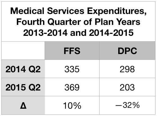
Those who signed up to join DPC on July 1 skipped the second quarter surge in 2015. Instead, they plunged.
Note. Brekke includes the markedly low figure given above for overall expenditures for DPC patients from the second quarter of 2015 as one of six quarters she averaged to established the “pre-treatment” level of expenditures for her difference-in-difference analysis. Doing so lowers her “pre” level average by roughly $20 PMPM, which in turn raises Brekke’s estimate of the overall increase in expenditure associated with the DPC program by that same $20 PMPM. Also, note, to avoid artifacts owing to annual deductible (and/or mOOP) cycles, some actuarial investigators (including the Milliman team that investigated Union County) insist that data be selected to accurately reflect the experience of all parts of a full annual cycle; for many purposes, it is usually considerate acceptable for data to be drawn from two different plan year, provided the data covers twelve continuous months. Brekke’s six month “pre” period included one full year plus an additional third quarter and an additional final quarter, both of which are typically high usage quarters. This further drives Brekke’s and Milliman’s estimates of DPC effectiveness apart.
Specialist utilization showed strong sensitivity to cost-sharing reductions
The typical deductible-driven cyclical pattern, and what happened to it under the Union County DPC plan, is best illustrated in Brekke’s data on specialist utilization set out in Figure 2. For reference, the average specialist visit rate for non-elderly residents of the United States at the time the study concluded was roughly 100 per 1000 patient-months. For the FFS cohort, the cyclical pattern is evident from five peaks in every plan year’s final quarter (three of them after implementation of DPC) and five valleys in every plan year’s first quarter.
The DPC cohort data is very different.
After the clinic opening on July 1, 2015, specialist utilization rose rapidly at first, and continued to rises, albeit less rapidly; eventually the rate roughly doubled the national specialist visit rate. En route to that startling destination, the valleys were shallower, the three peaks following the quarter in which DPC is first implement were more modest, relative to their valleys. Also, the peaks had shifted to the third quarter of the plan year; they now reflected health care need (increased sickness in the winter months) rather than the deductible cycle.

Most interestingly, the DPC cohort data showed a utilization valley in the last quarter before DPC was implemented and a peak during the quarter which began with the arrival of DPC. Figure 3 zooms in on that time period.

This, of course, is a reversal of the normal deductible-driven cyclical pattern, but it is precisely what is to be expected when an imminent abandonment of deductibles is scheduled for a date certain. For the record, the DPC cohort data did not show a peak in second quarter of 2014. Even allowing that the data may be a bit noisy, the simultaneity of data reversal and policy reversal at mid-year 2015 seems far more than a coincidence. In any case, Brekke’s raw data for only the post-period showed DPC specialist visit frequency to be higher than that for FFS, with high statistical significance (p < .0001), even without an adjustment to compensate for the lower risk score of the DPC cohort.
Brekke, Spin #1: “Increasing specialist utilization is not a bug, it’s a (DPC) feature.”
In her 2016 article for the Health Watch newsletter of the Society of Actuaries, Direct Primary Care: Good for What Ails Us, Gayle Brekke enthusiastically reported that:
A British Medical Journal study of Qliance found that DPC patients experienced significantly better outcomes than similar patients who received primary care in the traditional way. Qliance DPC patients experienced
- 35 percent fewer hospitalizations
- 65 percent fewer emergency department visits
- 66 percent fewer specialist visits (emphasis supplied)
- 82 percent fewer surgeries
But there never was a British Medical Journal study of Qliance and, by 2015, Qliance had itself refuted those claims with a study pressing far more modest (if still commendable) cost reductions claims, including a 14% reduction in specialist visits. No matter what the case, Brekke’s dissertation made quite clear her surprise and distress that her own data on specialist visits was diametrically opposed to her priors.
Because Brekke is a frank, almost Messianic, advocate for direct primary care, her concluding, then publishing, that DPC caused a large increase in overall expenditures and, specifically, in specialist utilization is a testament to her integrity. At the same time, however, her messianism might be borne in mind as we examine how she came to end her discussion of specialist utilization claiming that “it is not possible to draw conclusions about whether the increase in specialist visits that is found in this study reflects positively on the practice’s efforts (emphasis supplied).”
Brekke’s principal spin on increased specialist visits began with this: “Importantly, families that enrolled in the DPC option were required to change primary care providers.” She posits this as a sort of artifact that interacts with positive aspects of DPC practice to produce a surge of specialist visits upon the launch of Union County’s DPC.
Brekke asserts that “at any primary care practice, new patient visits include a comprehensive exam and history”. While the quoted language certainly overstates the case, let us stipulate that it probably true (a) that visits by relatively recent enrollees at any primary care practice are more likely to see a comprehensive examination and history than less recently enrolled patients and (b) with Union County’s DPC practice beginning with 100% new enrollees, members of the clinic cohort would be more likely to see a comprehensive examination and history than either those in a concurrent cohort of FFS patients or (in a pre-post analysis) than their own prior selves as pre-DPC members then-served by FFS practices.
Brekke continued to the core of her argument: “Specialist referrals are more likely to be generated by a new patient visit than by an established patient visit.” Through that critical assumption, Brekke links enrollment in the DPC clinic to increased specialist utilization. Her line of argument seems plausible at first blush, and Brekke proposes that “future studies” should explicitly address the mechanism she has proposed.
Such future studies aside, another way to advance this line of argument is to search the literature for evidence on whether new patient visits (or something similar) are indeed more likely to generate specialist visits. So far, my literature search has come up empty — despite having carefully read, several times each, every single word of three articles that Brekke offered to support her argument, “Hill 2003“, “Baker, Bundorf et al. 2014“, and “Schaum 2013“. None of those three references seems to me to address, even tangentially, whether new patient visits (or something similar) is particularly likely to generate specialist visits.
In her introductory chapter, in connection with an earlier citation the Schaum piece just mentioned, Brekke had suggested that increases of utilization following DPC enrollment may arise from discovery of unrecognized needs and pent-up demand for care due to poor access or poor doctor-patient relationship prior to selecting the DPC option. Brekke’s data on plan selection did show that those who selected DPC were less likely to have met her criteria for having had a “usual source of [primary] care” during the pre-period before the clinic existed. However, a special additional control used in her DiD analysis of specialist visits using the same “usual source” variable also showed that the DPC cohort members most likely to visit specialists were not those previously underserved, but were those who already had a usual source of care before the clinic existed.
Still, it remains plausible that the July 2015 delivery of a fresh cohort of members into a brand new Union County direct primary care clinic might have led to somewhat of a surge of comprehensive exams and histories (I call them “Welcome to DPC visits”), in turn leading to somewhat of a surge of specialist visits. At the same time, however, it seems fair to infer, that such a surge should abate within a reasonable period of time.
Conveniently, Brekke’s data follows a stable “full analysis cohort” of DPC enrollees from a full year pre-enrollment through up to thirteen quarters after enrollment. In Figure 2, above, we see that the specialist utilization by direct primary care users began to surge immediately on plan implementation in July of 2015 and seems to still be on a still upward trending path three full plan years later.
By the end of the third quarter of operation, as the clinic reported to the county, 73% of DPC members had already self-reported improved health since joining DPC and that the annual rate of clinic visits exceeded three per member. At that rate, the average DPC member patient would have had six visits before the end of the second plan year; the percentage of the cohort yet to receive some version of a Welcome to DPC visit should have substantially abated. Yet, their specialist visit rate did not abate; to the contrary, in their third plan year of DPC, cohort members visited specialists fourteen percent more often than they had during their first two plan years.
Although Brekke did not specify the relationship between the comprehensive examinations she has in mind and typical preventative annual physicals, it should also be noted that Milliman found — somewhat surprisingly — that DPC members received a statistically significant lower level of preventative physician services, driven in large part by fewer preventative annual physicals.
Of course, Dr Brekke’s proposed future studies might put a finer point on her “new patient” gloss. In my opinion, her existing study makes clear enough that Welcome to DPC visits made no more than a very modest contribution to the surge of specialist utilization by DPC members. By 2017-2018, third plan year, the members of this stable cohort were visiting specialists at roughly twice the rate both of their own pre-DPC selves and of the average US patient of like age. There is no way that “reflects positively upon this practice’s efforts.”
Brekke, Spin #2: “th[is] DPC company may not prioritize reducing specialist visits.”
When a DPC practice is contracted with an employer to provide primary care services to a portion of their employee and dependent population, they may focus more on preventing expensive services such as emergency department and other hospital services, and less on preventing specialist visits.
Gayle Brekke, Dissertation, cited above.
Or might it be that primary care capitation creates an incentive for primary care physicians to refer their patients to specialists even for services they might perform themselves, as noted in studies of primary care capitation by the Urban Institute, the Millbank Memorial Fund, and others?
As a general matter, there is not much daylight between the primary care that prevents ED visits, hospitalizations, or other “more” expensive services and the primary care which “prevents” specialist visits. Primary care preventative visits prevent future problems that may require more expensive non-primary care of all kinds. Primary care sick visits prevent worsening of conditions and so avoid future problems and expensive non-primary care of all kinds; the same applies when a PCP takes a telephone call or text message to triage a possible urgent or emergent case. Slack scheduling of office visits facilitates access for same day/next day sick visits; even when DPC doctors are merely schmoozing the last patient, they contribute to the structure of access that helps the next same-day primary care patient avoid a worsening condition and expensive non-primary services of all kinds. The same applies when she is out on the golf course, off to Europe, or asleep at home, but staying available for telehealth.
The only sense in which there is a choice to be made “preventing” specialist visits and “preventing” other downstream care services is that there is a financial incentive, baked into capitation models, to stint on services that might be, but need not be, pushed off to specialist physicians. Unfortunately, the same work costs more when diverted to specialists than when performed in a primary care setting. Operationally, Brekke’s suggestion that “this DPC practice did not necessarily incentivize fewer specialty visits” is mashup of tautology, apology, and euphemism. A better translation from the original Messianic is, “This DPC decided to shirk.”
Given her priors, I suspect that had Brekke been aware of the benefit structure, she would have gleefully, and in my opinion correctly, attributed the increase in specialist visits to the DPC-only cost sharing reductions, and refrained from euphemism, from overly creative explanations, and from the conclusion that “DPC increased specialist visits.”
And, no matter the benefit structure, there are additional reasons to doubt that direct primary care increases specialist visits either in general or in this specific case. As to the particular case, the Union County plan gave the clinic doctors minimal incentive to shirk. That clinic was supported by extraordinarily high DPC fees, over 55% greater than the national average reported in the massive survey conducted by Milliman and the AAFP for the Milliman report. The patient panel size, for the two physicians, averaged 466 members compared with an average actual DPC panel size of 445, per the aforementioned survey, and an average “target panel size”of 628. The contract between the vendor and the Union County actually authorized a panel size as large as 800 patients. If any direct primary care clinic would have been able to pursue multiple strategies for constraining health care expenditures concurrently, this was the one.
The clinic was paid enough to be simultaneously able to walk the walk of easy access and to chew the gum of performing, rather than diverting, services that might have been diverted to specialists.
Perhaps of equal importance, that gum is delicious.
Brekke herself, citing and quoting Starfield, Shi et al. 2005 , tells us that “[p]rimary care is comprehensive ‘to the extent to which primary care practitioners provide a broader range of services rather than making referrals to specialists for those services.'” It involves “the provision of care across a broad spectrum of health problems, age ranges, and treatment modalities”. (Bazemore et al. 2015, cited by Brekke). And compared to traditional large panel, short-visit, high volume FFS primary care practices, direct primary care practice can fight PCP burnout by providing better opportunity for PCPs to “practice at the top of their license” and “utilize the full extent of their education, training, and experience” (Rajaee, 2022). A well-known DPC thought leader Dr Kenneth Qiu 2023 has expressly, and with obvious pleasure, linked the broadened scope of care made possible in a DPC practice with the movement of care delivery from specialists to direct primary care physicians. Another well-known DPC thought, Dr Jeff Gold, has personally described to me the pleasure he takes in performing services that large-panel FFS physicians typically are constrained to refer to specialists.
To borrow a phrase, DPC attracts primary care physicians who want to be all that they can be. The most rewarding part of any given DPC doctor’s day may well be seizing the moment to do what Brekke calls, “preventing specialist visits”. DPC physicians get to enrich their professional and personal experience and reduce health care costs at the same time.
The Union County physician staff was not driven to “focus less on preventing specialist visits”.
I conclude that neither a welcome visit feature of DPC nor an inexplicable bug causing the county clinic to focus “less on preventing specialist visits” played more than a modest role in to the increase in specialist visits seen in Union County DPC program. The by-far largest share of the observed increased in specialist visits by DPC members was probably the result of the county having lowered DPC members’ cost-sharing for specialist visits.
By the way ..
The Milliman case study did not report on specialist utilization. In their report, the Milliman authors stated that the medical claim data they had been given “was not well populated with provider specialty codes. Without this data, we were unable to consistently distinguish between primary care and specialist physician office visits and thus were unable to assess the impact of DPC on physician specialist utilization rates.” Credit Dr Brekke’s perseverance.
Milliman’s finding of 36% lower ED utilization, before risk adjustment, is considerably more favorable than seen in other studies.
Milliman reported enormous ED savings, enough to account for nearly half of all the downstream care savings that Milliman attributed to the Union County clinic. Milliman’s ultimate (albeit incorrect) conclusion that the Union County DPC program was a near break-even proposition at a $61 PMPM turned on ED savings singlehandedly offsetting almost one third of even that deeply underestimated monthly fee. That’s the rough equivalent of preventing one $1000 – $1500 ED trip for one in every five DPC members each year. That’s a big deal and worth a close look, especially because it is quite a bit more favorable than Brekke’s findings on ED utilization or than the reported experience of other direct primary care clinics.
Both Milliman and Brekke presented actuarially adjusted estimates of emergency department visits. Milliman found a statistically significant risk-adjusted reduction of 41%. Brekke found an adjusted percentage reduction of 20%, which fell short of statistical significance. Less than one-quarter of the final gap can be explained by differences in actuarial methodology. Before adjustments, Milliman says that the DPC population had 36% fewer ED visits than their FFS counterparts. Brekke’s data puts the unadjusted reduction in ED visit rate at only 15%.
Even Brekke’s post-adjustment 20% percent reduction in ED visits, post adjustment, is high compared to that observed in David Schwartzman’s dissertation study of the “school district” employer DPC option run by Nextera, a Paladina competitor. His DiD study found that the studied employer option program had nearly trivial effects on annual ED utilization (which he had measured by ED expenditures), averaging less than $45 per employee member per year over the three year study, which corresponds to roughly an 8% reduction in visit numbers. Unfortunately, the Brekke, Milliman, and Schwartzman studies are really the only studies of direct primary care clinics with both plausible controls for population health differences and an adequately accounted methodology for data collection.
While they lack risk-adjustment, two studies of direct primary care clinics stand out from other work in giving a somewhat credible account of unadjusted claims data, including ED visit counts, they had actually examined. One is Nextera’s self-study of the same clinic studied by Schwartzman, a report that accords well with his dissertation; it yielded an unadjusted ED utilization reduction of 9%. The other somewhat credible report came from the aforementioned Qliance, a competitor of Nextera and Paladina. Their 2015 report described a plausible data gathering process and a large multi-employer cohort size and reported an unadjusted 14% reduction in ED utilization.
Specifically mentioning ED utilization reductions, the Milliman report identified two studies of concierge practice as being both actuarially solid and possibly relevant to direct primary care. One was a two-year study of an elderly population that showed adjusted annual ED reductions of 20% and 24%, the other a three-year project (adult, non-elderly population) showed adjusted annual reductions that never exceeded 11%.
Brekke’s finding of an unadjusted 15 % reduction stands mid-pack among all credibly reported ED savings claim for small-panel practices. Milliman’s finding of an unadjusted 36% reduction in ED utilization stands well apart from other credible report. As there is no direct evidence of error on the part of either, the importance of ED utilization to the entire Union County DPC story begs further effort to explain why Milliman and Brekke differ. Still, the presently available evidence indicates that Brekke’s measure of the unadjusted reduction in ED utilization by DPC members are more credible than Milliman’s.
The risk adjustment Milliman applied to its raw ED data makes some sense, but is at least somewhat too large.
As distant as Milliman’s raw ED utilization figures are from other accounts, Milliman adjusted them in an interesting way that increased that distance. For services other than ED services, Milliman had risk-adjusted the raw utilization numbers for DPC members upward to compensate for the relatively good health of DPC member. For ED visits, however, Milliman risk-adjusted the number of ED visits by DPC members downward, which would tend to compensate for the relative poor health of the same DPC.
By most measures, the DPC cohort was less medically risky than their FFS counterparts; overall, the DPC/FFS relative risk score under the MARA Rx methodology was 0.917, so on average Milliman adjusted raw utilization and expenditure figures upward. Not so for ED utilization, however, as Milliman’s Rx concurrent risk adjustment process indicated that the otherwise-healthier DPC cohort had the greater risk of requiring ED services.
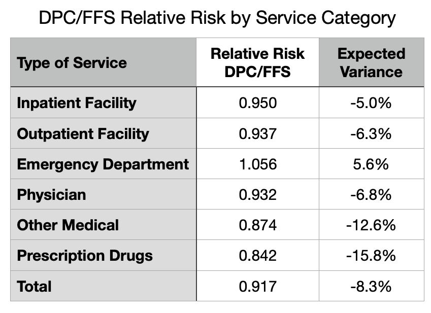
Although the MARA Rx overall risk score showed 8.3% lower utilization for the DPC cohort, that score was composited from separate scores for six different service categories as shown in Figure 4. For five of the six categories, the DPC cohort had an expected utilization between five and sixteen percent lower than the FFS cohort. For ED services, however, there was a large upward deviation so that DPC members were expected to use 5.6% more ED services than FFS members.
MARA Rx concurrent risk are based on each cohort member’s age, sex, and their use of certain classes of prescription drugs that predict morbidities that align with utilization of various medical services. There is a 20% surplus of children in DPC. Children (when neonates are included) are healthier overall, and tend to lower the overall risk level of the cohort. But they have a similar frequency of ED visits to working age adults. So the age differential between the cohorts may contribute to the observed pattern. The excess of children in the DPC cohort means lower relative risk overall for most medical services, but does not lower the the DPC cohort’s relative risk for ED visits.
The other demographic factor used MARA Rx, sex, is probably not a factor. Milliman’s report was silent on the male/female ratio in the cohorts, but Brekke’s enrollment data make clear that DPC had slightly more males than females. Since females tend to somewhat higher ED rates than men, the DPC cohorts propensity for increased ED risk runs counter to this bit of demographics.
As to the actual medical data, as opposed to demographic, data that fuels Rx-based risk adjustment, a stand-out finding of ED risk suggests that the DPC cohort, despite not actually going to EDs as frequently as their FFS counterparts, may have been using an unusually large share of the particular prescription medications that MARA Rx takes as indicating the morbidities that are predictive of ED use. Antibiotics, strong pain killers, and antipyretics are heavily used in EDs.
The results of Rx-based risk adjustment might also have a serendipitous component. Although there are over 900 DPC patients, cohort-wide higher use of the drugs that portend any particular set of morbidities could be the serendipitous result of the idiosyncratic prescribing habits at the clinic. While FFS members have dozens of PCPs from which to choose, the clinic has only two. This could render Rx-based concurrent risk assessment for the DPC cohort vulnerable to chance, as individual doctors are known to vary considerably in the frequency with which they prescribe antibiotics and opiate pain relievers.
Now image a well-run primary care practice that strategically leverages high access, including 24/7 telephone triage, to respond to acute problems while diverting unnecessary ED visits. I suspect such a practice would imitate the way an ER disposes of similar cases: antipyetics, opiates, antibiotics, discharge to home with watchful waiting. At the same time, consider that easy access to primary care with no cost-sharing invites clinic visits — and, therefore, prescriptions — for the kinds of common acute maladies that the FFS cohort might self-manage with over-the-counter medications. In fact, per Milliman, on a risk-adjusted basis, the utilization of all prescription medications for DPC members slightly exceeded that for FFS members.
But finally, notice that the process just described suggests how increased utilization of the health care system induced by cost-sharing differences in itself is likely to raise the relative concurrent risk score of members of the more generously treated cohort. Given that Union County’s DPC members had more generous cost-sharing, Milliman’s risk-adjustment of their ED utilization figures was at least a bit too large.
In sum, Milliman’s applied a somewhat too large risk-adjustment that magnified unadjusted ED utilization numbers that were already far larger than those in Brekke’s study of the same clinic and than those in five other reasonably credible other studies.
For many years after Qliance itself had refuted its own prior study, DPC advocates flogged the wild claim that the prestigious British Medical Journal had shown that Qliance had reduced specialist visits by 66% and ED visits by 65%. In early 2015, Qliance’s busted both figures down to 14%, then later went bankrupt. While some DPC advocates still flog the gaudy unamended Qliance numbers, the more sophisticated DPC advocates have updated to a claim that the prestigious Milliman report to the Society of Actuaries showed that DPC reduces ED visits by a risk-adjusted 41%.
I have no doubt that small-panel, easy-access, 24/7, primary care can reduce care costs in a variety of ways, but most particularly through the mechanism of triaging acute conditions to avoid unnecessary ED visits. At or below some specific level of monthly fees, a direct primary care clinic may be able to pay for itself with lower overall utilization. But even assuming the complete accuracy of Milliman’s application of actuarial methodologies to the Union County claims, it is clear that the average monthly direct primary care subscription fee of $96 PMPM actually paid in Union County had not come near to being low enough to result in net savings.
But what of the adjustment that Brekke never thought of and that Milliman never undertook, the one for induced utilization?
Making an induced utilization adjustment will show the Union County direct primary care clinic in a more favorable light.
As previous noted, although the Milliman Team compensated for the effects of the benefit structure by addressing selection effects, their report left the job incomplete by failing to address induced utilization. After receiving some criticism for that omission, they opined that the cost sharing reductions were modest and omission of an adjustment was mostly harmless. See Milliman’s What Our Study Says About Direct Primary Care. Milliman takes its study as having proven that the direct primary care model could save money. Omission of an upward adjustment to DPC efficiency to compensate for induced utilization, the Milliman Team assured, had merely resulted in a conservative estimate.
Knowledge that he Milliman Team sharply under-estimated the resources by the clinic, shifts expectations downward and changes the omission of an adjustment for induced utilization from a conservative assumption that left Milliman’s proof of the DPC principle intact to an aggressive assumption that may unfairly exaggerate DPC inefficiency, perhaps even depriving DPC of being found cost-neutral or even better.
In the circumstances, Team Milliman should revisit their conclusion that the cost sharing differences were indeed “slight”. Milliman’s estimation of the difference in benefit value had not been careful. For instance, the model presented in their report addressed neither the $750 cohort difference in mOOPs nor the waiver of the 20% coinsurance for primary care; including both will about $8 PMPM to their $7 PMPM estimate of the net difference in the cost shares (see the cost-sharing details page). Precise adjustment for induced utilization can be challenging especially if, as appears the case here, cost sharing difference may have simultaneously increased utilization and increased relative risk scores. Also, Milliman might be able to test the actual claims data to confirm whether their models of the different cost-sharing schemes actually perform as they had estimated. After more carefully estimating the impact of the cost-sharing rules, Team Milliman might determine that effect of induced utilization was now worth including.
Per the Milliman report, data from a large proprietary database of employer health plan claims support an estimate of $10 PMPM for specialist visits of a typical member of an employer FFS plan. If I am somewhat correct that cost-sharing reductions have a big hand in the near doubling of specialist visits that Brekke reports, then an induced utilization adjustment for specialist visits and other economically elastic services might run in double digit dollar PMPMs. Even if slight, an induced utilization adjustment of the claims data will move the putative break-even level of monthly direct primary care subscription fees higher.
My guess: had Milliman fully and accurately completing the actuarial work, the news for direct primary care would have improved, but not by enough to get near the additional $33 PMPM that would support a claim that a $96 PMPM Union County clinic was cost effective.
Cost effective direct primary care may be an impossible dream.
Based on its measurement of the performance of a clinic that it mistakenly believed to be funded at $61 PMPM, Team Milliman reported that amount as an actuarially reasonable monthly fee that would render DPC a break-even proposition. But it is doubtful that a clinic funded at $61 PMPM can produce the same quantum and quality of primary care and, thereby, achieve the same results, as the $96 PMPM clinic Milliman actually studied.
This is not actuarial science, it’s just arithmetic. To raise the same revenue, a $61 PMPM clinic would have to increase its patient panel size, slashing the amount of time each PCP can spend with patients by 37% Instead, the clinic operator could offer a sharply lower compensation package to clinic physicians. But you get who you pay for and, if it proves nothing else, Milliman’s work shows that two PCPs summoned to a lavishly funded $96 gig could barely make the right music.
Small-panel, high-touch, concierge-light direct primary care may be a nice way to reward yourself, your family, and your employees, a luxury item. Cost effective small-panel, high-touch, and concierge-light direct primary care may prove to be impossible.
Bonus
Brekke was a member of the advisory panel for Milliman’s project. Brekke and one of the Milliman report’s principal authors made a joint presentation on direct primary care to a Society of Actuaries meeting in mid-2019; her co-panelist presented preliminary results of the Union County study. The Milliman report came out in mid-2020, the first actuarial study of direct primary care. In mid-2023, Brekke defended her dissertation. Brekke’s dissertation contains hundreds of citations. The Milliman report is neither cited nor acknowledged in Brekke’s dissertation.
Executive Summary
This post examines two actuarial case studies of a single direct primary care clinic in Union County, NC. One study was by a large actuarial firm (Milliman) , the other by a former corporate actuary now active in DPC advocacy (Brekke). Brekke’s conclusions indicate that the clinic was a colossal failure at reducing overall costs. Milliman’s report suggests that the clinic was roughly a break-even proposition. My conclusion on the reports is that each of them is a patchwork of skillful work, blind spots, misjudgments, errors and omissions. I attempt to salvage the maximum insight possible from the successful bits of their hard work. My conclusion on the clinic is it was a smaller failure than Brekke suggests, but that it did fall well short of breaking even.
County plan members could elect to receive primary care either on a traditional fee for service basis or at the direct primary care clinic. Those who chose the clinic also got a sweetener from the employer – cost-sharing reductions for downstream care. Brekke did not know that. When her raw data indicated that DPC members were using downstream care at a high rate she attributed that result to poor clinic performance rather than to county generosity for non-clinic services.
Milliman’s major mistake had the opposite effect; it led them to over-rate clinic performance. Milliman underestimated (at $61 PMPM) the monthly DPC fees (actually $96 PMPM) by over one-third. Milliman’s approach indicates the clinic increased overall expenditures costs by $33 PMPM, an eye-catching loss. Yet Brekke puts the loss at over $100 PMPM, off the charts.
Milliman also claimed that, by a unique methodology, they had been able to “isolate the impact of the direct primary care model” from the CSR and from the bargain struck for the monthly fee; they purport to have determined that “the model” had performed its part fairly well, reducing overall health services utilization by nearly 13%. But since this was not a $61 clinic, but a $96 one, that part of Milliman’s work was equivalent to road testing a Corvette and ascribing the results to a Miata. In short, it’s bullshit.
Brekke’s methodology, but not Milliman’s, systematically under-adjusts for instances of adverse selection based on non-random acute conditions, as when a member joins DPC in anticipation of a pregnancy and delivery.
Neither Brekke’s nor Milliman’s studies adjusted for the related phenomenon of induced utilization, the difference in utilization that would result if the same member(s) were simply moved between cohorts. On this point, both Milliman and Brekke underestimate DPC efficiency.
The ability of cost-sharing reductions to drive choices depend on their size. In this case, we are looking at $450 potential annual savings for relatively modest users of healthcare services, and $750 in savings for every user hitting $2000 or more of total utilization.
That cost-sharing reductions had a palpable effect is apparent in Brekke’s month by month accounting of expenditures and, especially, of specialist utilization. For example, after the effective date of the county’s abolition of deductibles for DPC members, their utilization of specialists no longer tracked the familiar pattern of specialist visit numbers rising as the end of an annual plan period approaches, then diving a day later.
Unaware of cost-sharing reductions, Brekke developed other rationales to account for the increase in specialist visits. One thought was that this was a result of new first visits that unlocked pent-up demand from previously underserved patients. That idea was belied by some of her own data, primarily that data which showed that the increase in DPC member specialist visits did not moderate in later years. Her second idea is best understood as a polite accusation of shirking — DPCPs sending patients to specialist for services that could be equally well performed by a PCP. Given the lavish funding of this particular clinic, and strong incentives to the contrary, shirking seems unlikely.
In the other study, Milliman did not address specialist visit data.
Both Brekke and MIlliman did address ED utilization. Per Milliman, DPC reduced ED utilization by a statistically significant risk-adjusted 41%. Milliman’s ED utilization figures were the principal driver of its claims of DPC success. Brekke saw a much smaller reduction, one not statistically significant. Comparing their raw unadjusted findings, Brekke’s figures, though far lower than Milliman’s, are very much in line with all other credible studies. With risk adjustment, the difference for ED utilization grows and pulls Milliman even farther out of line from other studies.
Neither Brekke’s and Milliman’s risk adjustment methodology would have captured the full impact of the cost sharing reductions on ED visits or any other utilization. Neither contained any adjustment for induced utilization. Any adjustment that more accurately addresses the impact of the cost-sharing reductions would put the clinic in a better light, but it is unlikely that an induced utilization adjustment would be anywhere near large enough for this $96 PMPM DPC to break even.
Had Union County agreed to a $61 monthly fee, Milliman’s analysts assume that $61 would have bought the same quantum and quality of primary care as the real life county received for the $96 it paid to the real life clinic vendor; that assumption is unwarranted.
Milliman’s valuation of DPC health care services at $8 PMPM rests on faulty data.
If I were a direct primary care practitioner, I’d be only mildly miffed at Milliman’s reducing what I do to a series of CPT codes. But I’d be furious that Milliman’s team set the value of my health care services at $8 PMPM.
The $8 PMPM figure Milliman declared as the health care service utilization to deliver all DPC-covered primary care services to DPC patients was based on apparent underreporting, by the studied direct primary care provider, of a single class of data: the quantum of primary patient care actually delivered to DPC patients.
Although this data was of central importance and would have warranted a validation process for that reason alone, Milliman evidently took no steps to validate it. But there were clear warning signs warranting extra attention, including the employer’s public reports — known to the Milliman team — that DPC patients were visiting the DPC clinic about three times a year. Indeed, in a different part of its DPC report, Milliman itself used $23 PMPM, not $8 PMPM, as a representative value of the DPC covered primary care services delivered by FFS-PCPs to their patients, whom DPC practices regard as vastly underserved.
Correcting the $8 PMPM to something reasonable shows that Milliman has wildly overstated net savings associated with DPC.
Note: Original post of 6/11/2020. Text of post updated 08/13/2024.
The resources used by direct primary go beyond what is recorded in CPT codes. DPC docs and advocates used to be the first to tell us that. Here’s a DPC industry leader, Erika Bliss, MD, telling us “how DPC helps”.
A large amount of DPC’s success comes from slowing down the pace of work so physicians can get to know our patients. While it might sound simplistic, having enough time to know a patient is fundamental to providing proper medical attention. Every experienced DPC physician understands that walking into the exam room relaxed, looking the patient in the eye, and asking personal questions dramatically improves treatment. [Emphasis supplied.]
https://blog.hint.com/what-qliance-taught-me-about-healthcare
Slower-paced and longer visits use real resources. As do all the other elements claimed to generate DPC success, such as same day appointments, nearly unlimited access 24/7, extended care coordination. Historically, a principal justification for the subscription payment model has been that too much of the effort required for comprehensive primary care escapes capture in the traditional coding and billing model.
The Milliman report found no net cost savings to Union County from the money it spent on its DPC plan, a negative ROI. But some DPC advocates seek salvation in Milliman’s claim that application of its novel “isolation” model to Union County’s claims data turns that lemon into lemonade.
That model is described below. Amazingly, it was based on CPT-coding of primary care services delivered at Union County’s direct primary care clinic.
[T]he DPC option was associated with a statistically significant reduction in overall demand for health care services(−12.64%).
Milliman report at page 7.
As noted, that computation marks overall demand reduction across the system, in which lowered downstream care demands are measured as part of all demanded health care services including the health care services demanded by direct primary care itself. This involves a comparison like this:
Lemonade by Milliman — initial steps.
Downstream care utilization for both DPC and PPS patients, along with primary care utilization for non-DPC patients was assumed to be represented by the County’s paid claims. Milliman, in other words, felt it was actuarially sound to use the employer’s negotiated fee schedule as applied to CPT codes as the appropriate yardstick to measure health care services utilization for three of the four variables in its comparison.
But DPC providers are not paid on a claims basis; they are paid on a subscription basis for nearly unlimited 24/7 access, same day appointments, long, slowed-down visits, extensive care coordination and the like. How then is the “utilization” of direct primary care services to be determined? Is there anything comparable to Union County’s negotiated fee schedule for fee for service medical services that might fit the bill for subscription primary care ?
How about Union County’s negotiated subscription feee for the direct primary care service from the DPC? That figure averaged $95 PMPM. Had that number been used in Milliman’s alternative model to measure utilization of direct primary care at the clinic, I note, direct primary care delivered by the DPC would have been “associated with” a very substantial increase in overall demand for health care services. Milliman, having found that Union County’s ability to negotiate fees was sauce for the FFS goose, did not find that Union County’s negotiating skill was an appropriate condiment for the subscription DPC gander. So, they went a different route.
How about setting the utilization of direct primary services at an approximation of market price for subscriptions to the bundled primary care services of other DPC clinics. Indeed, the Milliman report itself included a market survey that established the value willing patients and willing providers had set in real life exchanges of money for DPC covered services delivered in Direct Primary Care clnincs. Had this figure — $61 PMPM — been used in Milliman’s alternative model, I note, direct primary care delivered by the DPC would still have been associated with an increase in overall demand for health care services.
But, hey, what do markets know?
Milliman went a different route.
A cost approach, perhaps? I expect that Paladina, Union County’s provider, would have declined, if asked, to provide data on the prices it paid for the inputs needed to provide Union County with the contracted direct primary care services. And it could well be that Paladina is as bad a price negotiator as Union County itself.
But these costs can be estimated, and the result would have more general applicability. Assume a panel size of 500, a PCP salary/benefits package of $254 k/yr (about the AAFP-reported average), and overhead at a mere 35% of PCP compensation (versus 60% in insurance based practices). That’s $57 PMPM.
Using a realistic estimate of the actual costs of putting a PCP into a DPC practice as a means of putting a value on the health care services demanded when a PCP is actually put into a DPC practice seems sensible.
But Milliman took a different course.
Breakthrough in Lemonading: the elements of the Milliman method for computing the health care services utilization of the direct primary care clinic in Union County.
- Assume that utilization of subscription-based holistic, integrative direct primary care can be accurately modeled using the same billing and coding technology used in fee for service medicine.
- Ignore that a very frequently-given, explicit justification for subscription-based direct primary case is that the fee for service billing and coding methodology can not accurately model holistic, integrative direct primary care.
- Ignore that direct primary care physicians as a group loudly disparage billing and coding as a waste of their valuable time, strongly resist it, and do not use standard industry EHRs that are designed for purposes of payment, relying instead on software streamlined for patient care only.
- Rely on disbelieving, reluctant DPC physicians, using EHRs ill-equipped for the task, to have accurately coded all services delivered to patients, used those codes to prepare “ghost claims” resembling those used for payment adjudication, and submitted the ghost claims to the employer’s TPA, not to prompt payment, but solely for reporting purposes.
- Have the TPA apply the County’s FFS fee schedule to the ghost claims.
- Carefully verify the accuracy of the FFS fee schedule amounts applied to the ghost claims.
- Do precisely nothing to verify the accuracy of the ghost claims to which the verified FFS fee schedule amounts were applied.
- Perform no reality check on the resulting estimate of primary health care services utilization
- Do not compare the DPC claim cost results to the utilization of DPC services as reported in articles on Union County you have consulted, referred to, and even quoted in the literature survey elsewhere in this same DPC study.
- Do not compare the DPC claim cost results to any one of a number of readilly available, credible reports of average claim costs for primary care services by members of employer health plans, such as the Milliman Healthcare Cost Guidelines (HCGs) — even though another significant part of this same DPC study rests squarely on the Milliman HCGs for determing the value for the average claim costs for primary care services by members of employer health plans.
- Do not compare the DPC claim cost results to the market prices for direct primary care services revealed in this same DPC study’s market survey.
- Do not compare the DPC claim cost results to the price for direct primary care services you have assumed was paid by this employer to its direct primary care clinic.
Anyone see a potential weakness in this methodology?
This methodology resulted in Miliman’s concluding that the rate of the health care services utilization in the direct primary care clinic was $8 PMPM. Table 12, line D. That tiny amount was the number which, when used in Milliman’s alternative model, showed that direct primary care delivered by the DPC was “associated with” a decrease in overall demand for health care services of a 12.6%.
Milliman identifies its methodology as a tidy “apples-to-apples” comparison of FFS primary care services and direct primary care services measured by a common yardstick. But that look comes with the feeling that the Milliman emulated Procrustes, gaining a fit to the iron bed of the fee schedule by cutting off the theoretical underpinnings of direct primary care model.
Many DPC practitioners, however, are bottom-line people who will endure wholesale repudiation of their ideology lurking in Milliman’s study details as long as the ostensible headlines serve up something they might be able to monetize: a supposedly “actuarially sound” demonstration that the direct primary care model saves big bucks.
Milliman’s conclusion that DPC saved 12.6%, however, hinges on the $8 PMPM result being somewhere near accurate. But that puny figure is at war with reality.
Milliman’s finding $8 PMPM for the claims cost of DPC services rendered in the DPC is patently inconsistent with Milliman’s own estimate of the very same thing which appeared just a few pages later in the very next chapter of their report.
After reporting the $8 finding on page 33 in Chapter 6 of its DPC case study of DPC, the Milliman team turned to a “Case Study Generalized Actuarial Framework for Funding Employer DPC Options”. For that analysis, it estimated — based on the Milliman Health Cost Guidelines for 2019 — the employer share (assumed to be 90%) of national average employer plan claim costs for DPC-covered primary care services would be $22.54 PMPM; this corresponds to total claims for DPC-covered primary care services being in excess of $25 PMPM.
Since the $25 figure corresponds to 2019 figures, it is somewhat inflated when compared to the study period (2016) average. Per the annual announcements of the Milliman HCG’s, $25 PMPM would be a little under 10% too high. On the other hand, $8 PMPM is itself too low, by well over 60%.
Could the cohort members in the Union County direct primary care clinic actually have utilized 60% less of primary care services than the average FFS covered employee in the world at large?
Did DPC somehow decrease primary care services utilization? Isn’t a key, even the key, idea of DPC that easy access and lowered cost-sharing increase primary care utilization?
Union County is not a backwater where healthcare might run cheap. It is a wealthy suburb of Charlotte, which in turn is the headquarters of many of the country’s largest banks.
Milliman’s $8 PMPM result defies known facts and common sense — even as it contradicts core values of the DPC model.
Whether for the average patient panel size (~450) reported in Milliman’s survey of DPC practices, or for the specific panel size (~500) for the DPC practice in Milliman’s case study, $8 PMPM ($96 PMPY) works out to less than $50,000 in revenue per PCP per year. That’s not credible.
That Union County DPC patients see their PCP around three times a year is apparent from the public statements of the employer’s then-director of human resources and his successor. And, it’s right there in an article on the Union County DPC program, an article from which the Milliman study’s literature review quoted verbatim. The three visits are said to have lasted at least half an hour, as long as a full hour, and to be available on a same day basis. $96 a year does not pay for that.
Consider also the logical implications of accepting that $8 PMPM yielded by Milliman’s process accurately reflected actual office visit duration and frequency for the DPC population. Per MEPS data, that’s less than one garden-variety FFS-PCP visit per year. In that case, what exactly is there to account for downstream care cost reduction?
Were those reductions in ER visits caused simply by writing “Direct Primary Care” on the clinic door? Were hospital admissions reduced for patients anointed with DPC pixie dust?
What Milliman misses may be “magic”, just not that kind of magic.
It’s the “magic” of hard, but slowed down, work by DPC practitioners. It’s their time spent doing things for which CPT codes may not or, at least, may not yet exist. It’s relaxed schedules that assure availability for same day appointments. It’s that 24/7 commitment. It’s knowing a patient well enough to ask the personal questions that Dr Bliss mentioned. Achieving this level of access demands more health service resources than are captured by the CPT codes for less than a single annual routine PCP visit.
The data set from which Milliman calculated utilization of direct primary care services underreported the patient care given at the clinic.
The only visible path to Milliman’s $8 PMPM figure for health services demand for the delivery of direct primary care is that the direct primary care physicians’ ghost claims were consistently underreported. That’s kind of outcome is exactly what can be anticipated when disbelieving, reluctant DPC physicians, using EHRs ill-equipped for the task, are expected to accurately code all services delivered to patients, use those codes to prepare “ghost claims” resembling those used for payment adjudication, and submit those ghost claims to the employer’s TPA solely for reporting purposes, i.e., as claims not incentivized by any expectation of claims-based payment.
In fact, Milliman even knew that the coding habits of the DPC practitioners were inconsistent, in that the ghost claims sometimes contained diagnosis codes and sometimes did not. See Milliman’s own report at page 56.
Milliman did nothing to validate the “ghost claims”.
Whatever the justification for Milliman’s reconstructing the utilization of direct primary care health services demand from CPT codes collected in these circumstances were, no meaningful conclusions can be drawn if the raw data used in the reconstruction is incomplete. Milliman does not appear to have spent even a single minute to determine whether the key data set — the set of ghost claims — bore any resemblence to the reality of practice in the clinic.
As a result of its apparent failure to capture the true resource costs of DPC-covered services rendered by the DPC, Milliman’s determination that the DPC model reduces overall utilization by nearly 13% is far too high.
Suppose, arguendo, that D-PCPs provide no more services than a typical ESI covered employee receives from typical FFS-PCPs. For $8 PMPM, we might substitute the Milliman DPC team’s own estimate of the FFS claims cost of DPC covered services, about $22.50 PMPM, and then watch the reduction in observed overall utilization fall to about 8%. To the extent that Union County’s D-PCPs actually provided something more than the short, infrequent visits of FFS-PCPs, the savings yield would fall sharply.
On that score, DPC advocates insist that the quantum of care delivered by a D-PCP vastly exceeds that for typical traditional PCP, starting with longer and more frequent visits, and continuing with slack scheduling to assure same-day/next-day appointments and 24/7 access via phone and text message. At $22.50 PMPM, a 500 member panel generates $135,000 per year for, in Milliman’s language, “the overall health care resource utilization” of a one-physician DPC clinic for the 466 members served in each Union County panel.
A plausible estimate of the resources utilization of direct primary care services is the $61 PMPM average market price of DPC services, per the Milliman DPC study’s own market survey. For just slightly less, $57 PMPM, a PCP can serve those 500 patients, earn $254,000 per annum (roughly the 2015 average for PCPs in the local region), while paying a very modest 35% in overhead (versus 60% in typical FFS practices). Substituting a $57 PMPM market price of DPC services for the $8 PMPM at which Milliman arrived would render the impact of direct primary care essentially neutral, so that an employer paying $57 PMPM to a DPC would receive package of services worth exactly that — with neither loss nor savings.
Is $57 PMPM a reasonable estimate of resources utilization of Paladina’s direct primary care clinic, considering that that number is 2.5 fold higher than the primary care utilization of patients in traditional practices (the $22.50 figure cited by MIlliman)? In their own promotional material during the period covered by the Milliman study, Paladina Health traced their success to “unhurried time with a physician whose panel size is an average of 70 percent smaller than a primary care physician in traditional practice”. At that panel size, Paladina’s docs have 3.3 fold more time to spend with patients.
Relying on the associated $8 PMPM utilization level and the resulting computation of 12.6% savings, Milliman’s summative computation of all variables arrived at an overall employer loss of $5 PMPM. Had they used the $57 PMPM figure, the employer’s bottom line would have risen by an additional $36, to a loss of $ 41 PMPM. But don’t forget that Milliman’s report had also understated the monthly DPC fee, by $34 PMPM. Therefore, Union County’s actual losses are quite likely $75 PMPM ($34 + $41). Investing $95 PMPM in DPC is not worse than useless to the employer, but it’s approaching 80% of the way there.
If DPC members utilize merely twice the primary care resources of typical FFS patients, i.e., $45 PMPM, the county’s bottom line would be a loss of a “mere” $61 PMPM.
The guiding principle of the direct primary care option is to entice members to utilize more primary care resources. During the final quarter of the first year of its Union County clinic, Paladina advised the employer that DPC members were seeing patients at a rate of more than three visits per year. Milliman’s having scored that at $8 PMPM of utilization is literally ridiculous.
Using realistic numbers — numbers that accurately reflect direct primary care’s philosophy and claims of increased access — wholly refutes the Milliman team’s core claim that direct primary care significantly reduces overall demand for healthcare services.
No, Milliman did not find a 50% DPC savings on specialist utilization.
The Milliman team readily admitted that it was unable to assess the impact of DPC on specialist utilization. Then, it overvalued DPC contracts using exactly such an assessment.
DPC advocates broadly insist that DPC members have significantly lower utilization of specialist physician services than do patients who receive primary care under the traditional FFS model. The team from Milliman that conducted the first, and to-date only, published case study of DPC by bona fide actuaries had something truly important to say on that subject .
The medical claim data was not well populated with provider specialty codes. Without this data, we were unable to consistently distinguish between primary care and specialist physician office visits and thus were unable to assess the impact of DPC on physician specialist utilization rates.
Milliman report, page 48; see, also, near identical admission at page 55.
Elsewhere in their report, the Milliman team provided “a generalized actuarial framework that could be used to determine the feasibility of savings for employers”, purportedly based on the case study data. The core of that framework was presented in the following table.

Thus, and despite Team Milliman twice admitting its inability to assess that very question, the line item in the above table that shows the largest “DPC percentage savings” — 50% — turns out to be for specialist physician services. That value is put forward without any attempt to explain how Team Milliman came up with a value that it denied being able to calculate.
A Literature Review section of the Milliman report did briefly present a claim — from a study without risk-adustment — that a now-defunct DPC, Qliance, had produced certain modest reductions in specialist visits; the Milliman report also repeatedly cautioned that data not adjusted for risk likely overvalued DPC effectiveness. And, even at its face-value, Qliance’s claimed savings was a mere 14%, more than three-fold lower than the 50% Team Milliman had, without explanation, inserted into the “actuarial framework”.
As it happens, specialist physician services are a relatively small part of the whole, so that Milliman’s gratuitous inclusion of 50% savings amounts to overvaluing DPC service by a mere $5 PMPM.
In addition to the Case Study and the Literature Review, the Milliman report also contained a Market Study. Milliman’s actuarial framework for employer DPC was apparently sculpted using admittedly “loose” reliance on the Case Study data to demonstrate that an employer could “break even” on a DPC option by contracting with a DPC provider at DPC monthly PMPMs that closely matched the actual DPC monthly fees reported in the Market Study. The $5 PMPM of apparent overvaluation of DPC savings for specialist physician services facilitated that happy coincidence.
The target for monthly DPC fees under Milliman’s framework rounds out to a $60 PMPM composite (based on $75 per adult and $25 per child). I would strongly advise employers considering a DPC option, while hoping to break even, to decline any proposal that sets DPC fees at more than $55.
I urge readers of this post to review my blog’s other assessments (summarized and linked here) of the various strengths and weaknesses of the Milliman DPC report. While I take issue with selected aspects of the piece, including at least one of its principal conclusions, I nonetheless find the report serious, well-intentioned, generally careful, and helpful, as befits its place as the first, and to-date only, study of DPC by qualified actuaries.
The mathmatical core of Brekke’s “Paying for Primary Healthcare is not reasonably supported by the sources to which Brekke points.
Because paying for primary care with insurance incurs administrative costs not encountered in direct pay models, a case can be made that direct primary care should cost a patient less than insured primary care. But most DPC advocates are themselves PCPs and they just might have less to gain from offering discount pricing and more to gain by offering a subscription service featuring deluxe, small patient panel service at a premium price. For direct primary care physicians as a group, the preferred way to square the value circle in patients’ eyes is with the proposition that premium care results in lowering costs for downstream care by more than enough to offset the premium price.
Health Care Cost Institute national claims data for 2017, grossed up to account for administrative costs and profits to the maximum allowed for by MLR rules, indicate that a middle-aged insured effectively pays under $48 a month for primary care. But subscription DPC services are typically priced at $75 a month.
A few DPC advocates appear to have an agenda at least slightly different than that of the collective of all D-PCPs . One such advocate is Gayle Brekke, whose recent e-book, Paying for Primary Healthcare, was supported by the Free Market Medical Association and the Mises Institute. Brekke precedes the gravamen of her ebook with a humble brag of her credentials as an actuary and an academic. Then, before proceeding with her specific defense of subscription based small panel direct practice, Brekke lays out a broader argument purporting to show that using insurance, rather than direct patient to doctor payment, increases the cost of primary care by more than 50%. Per Brekke’s conclusion, then, a middle aged person could have her $48 per month primary care services provided in a direct arrangement for less than $32 per month. That looks like a good deal, but no direct primary practice is offering it.
In prior blog posts — here, here, here, here and here — I addressed at (undoubtedly-too-much) length, many other issues raised by Brekke’s analysis as she originally presented it in blog posts on her own website. A separate post summarizes Brekke’s argument and my chief responses.
By far the largest single factor in Brekke’s quantitive analysis, by itself accounting for nearly two-third of the 50% savings figure at which she arrived, was her estimate of a 25 to 35% range for the overhead of direct primary care practices. In this post, I reprise, refine, and expand a previous analysis of whether the sources from which Brekke has drawn that estimate offer meaningful support for the estimate she makes.
The mathematical core of Brekke’s argument
[T]he overhead for a typical traditional practice is roughly twice the overhead of a typical direct practice.5
5 We use a range of 25-35%, as little information about overhead in a DPC or DPC-like practice is available.
See Bujold and Forest:
Bujold, E., The Impending Death of the Patient-Centered Medical Home. JAMA Intern Med, 2017. 177(11): p. 1559-1560.G, Brekke, Paying for Primary Healthcare
Forrest, B.R., Breaking even on 4 visits per day. Fam Pract Manag, 2007. 14(6): p. 19-24.
Bujold
Dr Bujold’s “DPC-like practice” actually reported 65% overhead in the very article to which Brekke refers. This is most clearly not evidence of 25-35% overhead for DPC practices. What it does evidence is that Ms Brekke, while offering herself as having significant academic credentials, handles source materials — even those of her own selection — with less than reasonable care.
(Bujold + Forrest) – Bujold = Forrest
Taking away the Bujold piece leaves Brekke with only Dr. Forrest’s article to support the idea that typical DPC practices have overhead of 25%-35%. Reliance on Forrest’s piece, however, further confirms Brekke’s carelessness. For, while the two largest items of overhead cost for typical medical practices are payroll and the cost of medical office space, Dr Forrest’s unique accounting methodology openly excludes the largest component of his payroll and actually treats office space as an income item rather than a cost item.
Forrest on payroll:
… I recently added a nurse practitioner, who sees most of our walk-in patients with minor acute care needs. She also helps manage patients with chronic conditions like hypertension, hyperlipidemia and diabetes. …
Our overhead has been consistent at 25 percent of total revenue. … Our overhead figure does not include the employment costs associated with our nurse practitioner. These are paid out of the revenue she generates by seeing patients that I would normally not have the time to see.
Brian R. Forrest, MD, Breaking Even on Four Visits Per Day
Dr Forrest’s rationale is nonsensical. “These are paid out of the revenue she generates by seeing patients that I would normally not have the time to see.” The effect of Forrest’s math is to sequester an important, skilled-labor-intensive, high overhead component of his enterprise, then report the remainder of the business as having low overhead. Beginning NP annual salaries when Forrest’s piece was published were around $50,000 and rose quickly with experience; Forrest reported that his NP earned an income above the average.
A normal medical practice, DPC or otherwise, would consider the costs of each of its employees as part of overhead. And, no matter how Forrest computes his “overhead figure”, he surely lists the amount paid to his nurse practitioner on his practice’s tax return.
Bonus note. At times, small enterprises like DPC practices hire temporary workers to, for example, cover absences due to illness or to staff turnover; overhead for normal firms includes payment to workers for the value thus received. But Forrest is different; rather than employ and pay “temps”, Forrest relies regularly on labor donated by “many well-trained volunteers” – though the amount of these donated services has not been quantfied or valued.
Forrest: my medical office space is even cheaper than free!
Dr Forrest’s practice occupies 2200 square feet and, to rephrase a popular meme, he lives there rent-free — inside his own head. Dr Forrest’s overhead computation shows this.

Dr Forrest reports owning 4400 square feet in an office complex and he rents out half of it to other doctors. After paying the expenses for the “rented half”, the rent he receives still nets him enough, to both pay the costs of “his own” space and to provide him an additional $3600 annually. Presumably, the rental amount paid by his tenants is near the average annual rental cost of 2200 square feet of medical office space near Forrest’s location at the time of his piece. That would likely have been in excess of $40,000.
His use of “his own” space in this situation, however, is not cost-free. It is merely cash-free. To occupy “his own” space, he must forego the opportunity to rent “his own” space, at fair market value, to a third party. Assuming “his own” space and the “rented half” are more or less equivalent, he could be renting the entire 4400 square feet at double the rent he is being paid for the “rented half”.
I do not know for certain whether Dr Forrest understands “opportunity cost”. But I am certain that Dr Forrest’s accountant understands that a doctor who uses space he “owns” rather than “rent” is allowed to use the depreciation, mortgage interest, real estate taxes and other costs of “his own” space to offset the revenues from his practice, i.e., I am certain that Dr Forrest’s accountant tells the IRS that Dr Forrest practice incurs deductible costs for the space he uses.
Without the bizarre accounting, Forrest’s “overhead figure” more than doubles.
A typical DPC practice would arrive at overhead costs using normal accounting principles. That would mean including fair costs for his medical office space, and fair pay for his nurse practitioner.
Add a conservative estimate of $50,000 for the nurse practitioner to a conservative estimate of $40,000 for a 2200 square foot rental. Add this to Forrest’s $78,400, and back out that $3600 profit from Forrest’s real estate side hustle, and a realistic figure for Forrest’s overhead is $164,800. That’s actually more than double the Forrest-computed figure on which Brekke relied — to estimate 50% savings.
Additional bonus notes. Forrest’s budget includes no amortization or depreciation for medical equipment, albeit that cost item might be small because Forrest purchases used equipment. In a similar vein, Forrest recounts multiple other economies, such as foregoing janitorial service (he takes out his own trash); he sets the thermostat to lower the heat when the office is empty. Importantly, many of Forrest’s budget control practices would be available to any PCP, whether they accept insurance or not.
Forrest prides himself on being both an abstainer from insurance and a skinflint; his article gives us no specific information about how to apportion purported overhead savings between those two aspects of his unique persona.***
Upon critical reading, Forrest’s article joins Bujold’s in doing substantially nothing to confirm Brekke’s claim that “the overhead for a typical traditional practice is roughly twice the overhead of a typical direct practice.”
Brekke wrote, “little information about overhead in a DPC or DPC-like practice is available.” Brekke might have looked more closely, before offering an estimate that is not meaningfully supported by the only material she can identify .
I do not deny that provider-side administrative costs are somewhat lower when a patient pays the provider directly for primary care. But the systemic consequences of that depend heavily on the exact magnitude of that effect. It is common for DPC advocates to suggest that provider-side administrative costs savings alone can support three-fold longer visit lengths patient and three-fold smaller patent panels. Brekke’s own effort to support similar claims is worse than guesswork.
*** Despite his longtime DPC advocacy, Dr Forrest’s work has yet to receive proper respect. For example, even despite his having publicized its astonishing findings, many do not recall that Forrest directed a team of NCSU graduate business students in canvassing primary care offices throughout the Raleigh area to observe directly the amount of time FFS-PCPs were actually spending with their patients. Even the students on Forrest’s NCSU team, the very ones he identified as having performed the the field work, have no recollection that the field work actually happened.
Including Primary Care in Health Insurance Policy Coverage Is Reasonable
The missing part 5 of Brekke’s “Paying for Primary Care”, a comment.
Under the traditional insurance model, patients receiving covered primary will indirectly pay significant administrative costs, but they may also gain compensating financial advantages that Gayle Brekke’s multipart “Paying for Primary Care” series fails to recognize, ignores, or minimizes. At the top of the list, insurers bring the combined strength of large numbers of insureds to negotiating payment rates with all providers, including PCPs. Even though providers may have the upper hand in this battle of competing rentiers, insurers’ primary care payments rates are usually significantly cheaper than self-pay rates. That advantage alone may cover the administrative costs of insurance in their entirety. But the financial advantage of insurance does not end there.
Insurers actually pay about 85% of downstream costs. D-PCPs pay not a penny. This gives insurers a bigger financial stake than DPC clinics themselves in DPC’s loudly professed goal of controlling downstream costs. And insurers have some tools to make it happen.
For instance, insurers may use their unique access to both downstream care and cost data and to other primary care quality metrics for each and every PCP on their roster to reward success with incumbency and, when necessary, discharge failure. Curating rosters to maintain, monitor, or upgrade the quality of their PCP team comes at a price, but the investment offers the possibility of reductions to downstream care costs through the improvement of primary care.
Direct pay has no comparable institutional mechanism. Indeed, direct primary care might even provide a haven for PCPs kicked off insurer network primary care rosters1.
Insurer’s integration of primary care and downstream care affords other opportunities for gleaning downstream cost reductions. For example, some insurers leverage integration ”upwards” by sending their PCPs timely, automated updates of individual patients’ downstream utilization. Insurers also leverage “downwards” by collecting network wide health metrics from their PCPs to identify actionable specific needs, then formulate responses (e.g., adjustments to drug formularies). Such gains from systematic integration will entail certain “administrative” costs, but may provide modest net benefits that are not available when primary care is delivered as a literally dis-integrated financial standalone through DPC.
Direct primary care practitioners talk a good game about primary care reducing downstream care costs. But, since insurers write the checks for downstream care, insurers have the deepest and most direct financial incentive to see that their PCPs play a primary care game that actually leads to downstream care cost reductions.
One caveat. Any given insurer’s financial stake in taking positive action today to reduce downstream care costs later will be, to a degree, attenuated by the expectation that their insureds may have changed insurers by the time some of the fruits of “prevention” are realized. On the other hand, attenuation for that particular reason is probably considerably reduced for publicly funded health insurance and for self-insuring employers. However, even where an insurer can expect relatively high churn year-over-year, as in the individual market, the benefits of a good primary care game played today still produce good financial results next week, next month, and throughout the current policy year. On the penultimate day of a patient’s final policy year, her insurer could still have a larger direct financial stake in tomorrow’s downstream care than her D-PCP. And D-PCPs see member churn as well — one prominent DPC advocate has written a whole book about it.
All PCPs, no matter the payment model under which they practice or the compensation they accept, have the identical ethical and legal incentives to provide care that reduces the need for and cost of downstream care. To the good work of dedicated and honest PCPs, using insurance to Pay for Primary Care adds what direct pay can’t — both more of the will (though direct financial incentives) and some important ways (through institutional structure) to shape primary care for the goal of lower downstream costs. Reckoning the net financial effect of Paying for Primary Care with insurance requires attention to both administrative cost burden and to likely or potential benefit.
Inevitably, selling a direct primary care product built around unlimited numbers of nearly on demand thirty minute visits at a fixed price leads D-PCPs to claim that traditional primary care practice is a failure because it supplies a smaller quantum of primary care services than subscription DPC.
Does the traditional model supply too little primary care? Precisely because they attach high value to primary care, the vast majority of insurers set low financial barriers to primary care access. A significant majority of insureds have primary care without application of deductibles; a majority of those both in the individual market and in employer groups see PCPs for a copay of $40 or less. A large fraction of insurance plans provide a set number (2 – 5) of primary care visits per year with no cost-sharing of any kind. And all insured primary care comes with zero cost sharing for a battery of the most important preventative services, like immunizations (flu, covid) and screenings (e.g., PAP smears).
But because primary care is both useful and expensive, insurers seek to optimize the quantum of primary care delivered rather than simply maximizing it. So, while insurers are invested in seeing that patients get all the primary care that is medically reasonable and necessary, they also guard against services rendered in the name of primary care that is neither. For example, some D-PCPs actually commit to a minimum thirty minute visit length; at least one prominent D-PCP has set a 45 minute minimum; and a survey of DPC practices reported an average of 38 minutes. Note that by that standard, a substantial majority of all family physician visits fall well short on ever single day of work of providing what DPC docs would automatically deem appropriate care. Primary care specialists properly seek, and insurers properly allow, a “99214” or “99215” for less than forty percent of primary care visits. Just as they do for other elements of healthcare for which they are on the financial hook, insurers examine claims to squeeze out losses from abuse and overuse. It essentially impossible for self-payers to do this kind of “police work”.
As we contemplate the possibility of overuse, our attention turns to the elephant in the DPC room: unlimited visits without cost sharing. That practice entails costs inflated by moral hazard. With no one obliged to pay even a penny for an additional visit, and all paying the same flat membership, the price of membership must be high enough to pay for all needed primary care and for all the “induced utilization” that results from having unlimited visits with no cost sharing at all.
Insurers have shown that the tension between the value of low cost barriers for primary care and the costs of moral hazard can be modulated by, inter alia, a balanced approach to cost-sharing. But this is far off-brand for subscription DPC, a model that seems almost premised on the idea that primary care can never be overused. DPC’s unique model greets moral hazard at the door, then bars the door to the insurance system’s best tools to mitigate moral hazard.
Once again, we have an insight into why DPC is expensive. After insurers’ efforts to optimize primary care for cost-effective reduction of downstream care risk and cost, primary care total spend is about $450 per year for an adult, privately-insured patient. Grossed up at 125% to allow the maximum amount of insurer-side administrative costs and profits, it still comes to less than two-thirds of $900 spent for an annual direct primary care subscription.
As insurance companies are human institutions, not all aspects of insurance practice will have stunningly cost-effective results. The most effective cost control measure is almost certainly the ability of insurance companies to restrain, somewhat, provider reimbursement rates; these may alone have enough payoff for patents to justify all the extra costs of insurance. At the same time, because PCPs as a group are highly competent, evaluating physicians with quality metrics or downstream care cost comparisons may bring only modest net benefits (and can be dropped if not effective). Lying somewhere in the middle of the cost-effectiveness scale are insurance rules and processes that target fraud, abuse, overuse, or moral hazard; that these rules have real bite is made clear by the squeals of D-PCPs over denied claims.
In any event, Brekke’s method of accounting only for the costs of performing administrative tasks avoided with direct pay without accounting the financial benefits added when insurers perform those administrative tasks helps explain why Brekke’s conclusion is at war with observed reality. Traditional primary care at $450 per annum is half as expensive than $900 per annum subscription-based direct primary care.
The overwhelming majority of DPC advocates confess what Brekke will not. That subscription direct primary care is more expensive than insured-based primary care. Then, they argue that DPC is worth the added cost because (a) vast increases in the quantum of primary care are really, truly, cross-my-heart-and-hope-to-die cost-effective in reducing downstream care costs, so that DPC results in net savings despite high DPC fees and (b) that DPC gives a superior patient experience.
There is essentially no evidence that the first proposition is true. In fact, there is thus far only one actuarially sound, independent investigation of DPC, and the investigators concluded that $900 a year DPC was a break even proposition. Even that study appears to have substantially overstated the case for DPC. Perhaps most tellingly, organized DPC has stood adamantly against D-PCPs actually sharing the risk of downstream care costs.
Does DPC even deliver on the promise of expanded primary care? Only a few DPC clinics have actually reported their primary care utilization figures. One such braggart’s report actually revealed an average of well under two annual office visits per patient, with the only other live contacts being telephone calls at the rate of one every two years. The good news is that the sheer inconvenience of clinic visits may keep moral hazard in check.
The bad news is that this clinic’s annual adult fees exceed $1000 for that pretty ordinary care regime. If DPC patients get neither lower downstream costs nor significantly more primary care than they would get through a $500 annual spend under the traditional model, what do patients actually get when they pay about twice that amount directly to a D-PCP?
The aforementioned improved patient experience, right?
DPC patients are not just Paying for Primary Care. They are buying a bundle of medically necessary primary care paired with medically unnecessary “concierge” services. The concierge add-ons are made possible by DPCs having small, but very well-paying, patient panels. Precisely because concierge services are not medically necessary, and because insurers have not found such services helpful in reducing net costs, insurers have neither a duty nor a reason to pay for them, let alone to police their price. Concierge care is an optional convenience or luxury product, not unlike amusement park queue jumping. A PCP will try to sell it at the best price he can get directly from a patient.
Added concierge services and/or inflated PCP compensation accounts for the vast bulk of the annual hundreds of dollars of excess cost of direct primary care over insured, medically necessary primary care. For marketing and other financial reasons, D-PCPs masquerade the concierge component of their product as an economic and medical necessity. But concierge medicine, even in the “lite” version called direct primary care, is expensive and unnecessary. It is just something nice for both patients who can afford it2 and for the physicians who for their own reasons — laudable or otherwise3 — prefer that model.
FOOTNOTES
1 If a PCP had been formally admonished for negligent practice by his state medical board in 2009, would you be surprised to learn that he started his state’s first ever DPC practice that very year? Don’t be.
2 In discussing multiple forms of moral hazard in Part 3 of her series, Brekke wrote, “physicians may recommend more and more expensive care when they know the patient is insured.” I suggest a more inclusive rewrite. “Physicians may recommend more and more expensive care when they know they can get paid for it, whether through insurance or from direct pay patients with ample non-insurance resources.” There is no demonstrable reason to believe that D-PCPs are necessarily less inclined to profiteering than their FFS-PCP counterparts.
3 Some D-PCPs are true believers. But consider also how attractive DPC must be for those who run afoul of insurer’s effort to police abuse or overuse, or for those who might be unwelcome in networks. Sometimes PCPs ditch insurance network contracts . Sometimes insurance networks ditch PCPs. See note 1 supra.
Brekke’s “Paying for Primary Care”, Comment on Part 4
In the first three installments of her Paying for Primary Care series, actuary Gayle Brekke’s invoked actuarial principles and behavioral economics to scold coverage of primary care on the ground that the costs of primary care are “predictable, routine, likely events over which the customer has a great deal of control”. In her fourth installment, on the other hand, Brekke tenderly embraces subscription-based direct primary care which provide coverage for these exact same “uninsurable” primary care events.
In this response to Brekke 4, we explore some of the foundations of Brekke’s enthusiasm for $900 per year subscription DPC. Doing so actually helps clarify why the traditional insurance model might deliver primary care at a $565 average annual adult cost, a lot less than DPC.
In Part 4, Brekke develops a theoretical perspective on physician financial incentives that declares that patients’ financial interests are certain to be more impaired under the traditional model than under direct pay. In a nutshell, she tells us that too many corrupt, venal FFS-PCPs incur unnecessary visit costs because they are immune to patient dissatisfaction, while all D-PCPs are so fully sensitive to patient satisfaction that they are immune to venality and corruption.
Brekke explicitly accounts this difference to the proposition that “in exchange” for entering agreeing to the terms of an insurers network contract a traditional FFS physician receives “a full schedule of insured patients”. Accordingly, physicians have zero financial incentive to satisfy their patients. Although this is the linchpin of her financial incentives argument, neither Brekke nor other DPC advocates who make the same claim, e.g., Dr Kenneth Qiu, adduce any evidence for it.
Actual evidence points the other way, that insurers rely on patient-satisfying PCPs to keep their member panels full and growing. Almost every insurance plan election platform includes an engine allowing prospective plan members to determine the network status of preferred PCPs.
Brekke, like other DPC advocates, also seems to feel that D-PCPs are ethically superior to FFS-PCPs; there is certainly no evidence of that. What is clear is that all PCPs, regardless of who writes the checks, owe precisely the same duty of patient care, as demanded by professional ethics and enforceable by law.
At her most vivid, Brekke proposes that too many traditional physicians will even “require another visit when the patient has a second concern so that they can charge another fee”. (How is this necessary, or even possible, with those full schedules?) I hear Brekke’s suggestion that a corrupt PCP would require an unjustified second visit just to collect an extra fee. What Brekke cannot hear is this inner voice of that same PCP:
How sad to be a petty grifter sneaking an extra primary care visit charge every now and then, and hoping the insurer doesn’t catch on.
Do’h! I actually need to show up for those visits to make that grift work.
I need a better and bigger grift.
I should be selling — in bulk — prepaid visits, some of which will never even happen, by offering “unlimited” visit primary care subscription packages, at a $900 annual rate for adults, knowing full well that an average adult can be expected to use only about $450 worth of my services and is unlikely to attend more than two visits a year.
Ima Goniff, MD
There is more than one way to violate the duty of putting patients first. As a new and different payment model, subscription DPC necessarily presents those who so incline with new and different avenues for gouging. But where there is a corrupt will, there will be a corrupt way.
One DPC thought leader, at least, has recently asserted that subscription-based direct primary care is, in the hands of some, nothing more than a vehicle for venality; Douglas Farrago, author of the best-selling book on DPC, is actively rallying “push back” against what he regards as multiple, insufficiently virtuous iterations of the subscription-based direct primary care model.
If Dr Farrago is committed to using administrative savings from direct pay to improve patient care, good on him. But merely switching from FFS to DPC is not sufficient to make that happen. Any PCP operating under any payment model who secures overhead savings or who can merely talk his way into higher rates for his services is free to elect any combination of increased personal compensation, reduced personal effort, or increased patent access.
Many will make a laudable decision. Still, whenever some D-PCPs declare it likely that significant numbers of FFS physicians bill for unneeded services just to get more money, it brings to mind the childhood taunt: “It takes one to know one.”
In Parts 1 and 2, Brekke exaggerated by three-fold both PCP-side and insurer-side administrative cost costs associated with paying for primary care under an insurance model. A realistic figure for these two elements combined is about 15% or less. In Part 3, Brekke addressed certain cost-increasing behavioral phenomena, but my analysis suggested that, in today’s actual insurance markets, those factors actually favor the insurance model over DPC.
In Part 4, Brekke identified theoretical incentives that might lead D-PCPs to do good and FFS-PCPs to do bad, but wholly ignored similar incentives for D-PCPs to do bad and FFS-PCPs to do good. Unsurprisingly, either payment model can be abused to extract more money from patients.
If you are wondering where abuse might lie, then, consider following the money. DPC clinics charge an adult $900 a year for primary care. Under the traditional model, primary care providers receive an annual average annual adult spend for primary care of $450.
Most DPC advocates confess the reality that DPC is more expensive, then seek to justify the added costs in one way or another. I can not explain why Brekke insists that paying for primary care with insurance inevitably adds over fifty percent to the cost of primary care. Her four part series fails to supply evidence that this is anywhere close to true.
Moreover, Brekke’s series has an immense blind spot. She made no effort to address whether there are any ways in which “Paying for Primary Care” under the traditional insurance model might, even while increasing some cost components of primary care relative to direct pay, might reduce other components. To address whether there are positive financial “features” of the insurance model that make Paying for Primary Care easier and financial “bugs” of direct pay that make Paying for Primary Care more expensive, Brekke’s Paying for Primary Care needed a Part 5, and a open mind.
I will deliver my take on a Part 5 at this link when it is ready. That post will further explain why, in the real world, the cost of subscription DPC is 50% more than the cost for primary care under an insurance model. I invite Ms. Brekke to respond to Part 5 or, if she prefers, to anticipate it. I look forward to hearing from her.
Brekke’s “Paying for Primary Care”, Comment on Part 3
In Part 3 of Paying for Primary Care, Gayle Brekke discourses on the behavioral economics of shared health cost arrangements to conclude that insuring primary care adds costs not seen in direct pay. These cost, she contends, simply add on to the 50% administrative cost burden of insurance she had already she had already declared in her Parts 1 and 2. Even though these prior parts featured large overestimates of the burden addressed, at least her assessments in those two parts pointed in the correct direction. In Part 3, Brekke changes heading to go in the wrong direction.
Brekke correctly notes that paying for one’s own health care, and only for one’s own health care, will (almost entirely) avoid a cost pooling process in which payers are at risk of a net transfer of wealth to those who receive more of the covered care than themselves. Because health insurance member payments are pooled and priced in a way that does not directly reflect the varying needs and preferences for receiving health care services, health insurance is one example of a pooling process that is potentially vulnerable to both adverse selection and moral hazard.
A second such vulnerable pooling process is subscription based direct primary care in which unlimited care is promised at a single fixed price that does not directly reflect individually varying needs and preferences.
Here, I discuss why, in today’s healthcare world, subscription based direct primary care is significantly more vulnerable to the difficulties of adverse selection and moral hazard than ordinary health insurance.
Remarkably, advocate Brekke does not admit to the possibility that the problems of behavioral economics that concern her can arise under direct primary care. But arise they will — as actuary Brekke should realize. Nor does advocate Brekke’s analysis take into account the ways in which the health insurance world currently mitigates the same set of problems, e.g., by combining guaranteed-issue, community rating, and risk adjustment under the Affordable Care Act — things we would expect actuary Brekke to address.
Neither adverse selection nor moral hazard (induced utilization) have been incurably problematic in employer sponsored health insurance (ESI). As to the latter, an employer sponsor simply determines the level of employee health care utilization for which he is willing to pay; he can address moral hazard/induced utilization, in its various forms and to the extent he deems appropriate, by adjusting employee deductibles or copayments, and even more complex arrangements like HRAs and HSAs.
As for adverse selection, ESI typically does not offer much in the way of employee choice between plans. Because an employer is generally not allowed to discriminate on the basis of employee health status, when there is employee choice the same plans are available to all employees. When choice is offered, even as the richer plans attract the sicker employees and cost the employer more, the leaner plans will attract the healthier employees and cost less. The costs and savings stay in the corporate family, as it were, and the differences do not by themselves generate net cost increases.
If, as sometimes happens, cross-subsidization between employees picking different plans becomes of concern, employers can get help from qualified actuaries in rectifying the relative pricing of the plans. An elegant extension of such “risk adjustment”, which illustrates in passing how less complex risk adjustment works, can be found here.
As it happens, adverse selection once had overwhelming salience in the market for individual insurance. But things have changed.
A sicker than expected person “adversely selecting” into a benefit rich plan certainly causes that plan’s outlays to be higher than otherwise expected, and some care costs are thereby shifted to other plan members. A shift of the costs of care, however much it may be unhappy financial news for healthier plan mates, does not by itself increase the costs of care. The wasteful, destabilizing aspect of adverse selection is that of having a health care system in which profit-requiring guarantors of the financial costs of health care costs are in a price competition and are, therefore, incentivized to recruit the healthy and reject the sick.
To survive such a competition, particularly in the individual market, insurance companies have historically engaged in risk selection (cherry-picking), incurring heavy administrative costs for underwriting and the like. If companies declined to compete for the best risks, their member pools become smaller and sicker through “death spiral” cycles of healthy member withdrawal and increasing premiums. When companies collectively compete, administrative costs grew from the weight of defensive measures. The end point of all this was the near extinction of the market for individual insurance by the first decade of this century.
Even when adverse election still loomed large, it seems unlikely that the generosity or nuances of plan coverage of primary care had much influence on the decisions of putative adverse selectors. It is the needs and decisions of the sickest patients that matter most to the financial health and stability of insurance plans. Patients so sick that they are comparing plans on the basis of their mOOPs care little about the details of the road on which they will be blowing past their deductible.
Conservatives, provided us with an object lesson, not long ago. The 104th Congress was Republicans first chance in many decades to do something about their dream to privatizie Medicare,. But making that happen is more likely when individual insurance markets are reasonably stable. To stabilize the existing situation in private health insurance, Republicans to implement a major countermeasure against adverse selection in the private-insurance-linked Medicare Advantage program. The innovation allowed the adjustment of the rates paid insurers to fairly reflect the relative health risk of the persons enrolled in their particular plans. In effect, “risk adjustment” required that insurers with low risk member panels subsidize insurers with high risk member panels. This vastly reduced the incentive to cherry-pick and, thereby, carrier vulnerability to adverse selection. Because risk-adjustment mechanisms stabilize private insurance markets they have had support across the Republican spectrum from the Heritage Foundation through Mitt Romney as well as from Democrats.
As under Medicare Advantage and RomneyCare, health insurance policies under the Affordable Care Act have guaranteed issue and are community rated. Underwriting and other practices that discriminate on the basis of health status are barred. And, the ACA extended risk adjustment of insurer payments to the entirety of the individual and small group insurance markets. It is likely the least controversial aspect of the ACA. As noted in multiple actuarial publications, ACA risk adjustment has worked effectively to significantly mitigate the problem of adverse selection. And, even the Trump Adminstration recently bragged about just how stable the individual insurance market has become.
Once the destroyer of the individual insurance marketplace, adverse selection is no longer an overwhelming driver of wasteful overhead costs in the individual insurance market. While risk-adjustment is still being refined, a major part of the work is done.
On the other hand, there is no risk adjustment apparatus to relieve the problem of adverse selection between competing direct primary care subscription plans. There is a substantial incentive for a DPC firm to seek a pricing advantage in order to grow market share; and it can do this by beating its competitors at enrolling lower risk, lower utilization members. A subscription-based D-PCP unwilling to pick cherries can easily be left with a panel of lemons. We know where enrollment races can lead.
A tacit understanding among D-PCPs to refrain from price competition could mitigate the problem, if it held. But competition for direct pay subscriptions is a growing reality; at least one DPC thought leader has already complained of some direct pay price competitors as hijackers, and he promised “push back”, equating them to a venereal disease that needs to be eradicated. I have no doubt that this summer’s Direct Primary Care Summit will have at least one speaker complaining of a “cream-skimming” competitor.
Thanks to legally mandated risk adjustment, the chance of a purchaser of individual health insurance having to bear significant, unnecessary administrative costs resulting from the phenomenon of adverse selection is small, and shrinking. On the other hand, if that phenomenon has real salience for the question of how to pay for primary care, it is because the absence of risk adjustment renders the subscription model of direct primary care subscriptions wide open to adverse selection and susceptible to cherry-picking competitions.
In sum, adverse selection is more likely to drive up the costs of paying for primary care through a direct primary care subscription than for primary care through individual market insurance.
In his seminal work, The Economics of Moral Hazard: Comment, Mark Pauly had, according to this account, the “key insight … that full coverage may not be optimal under conditions of moral hazard, that is, when consumer demand for health care responds to the reduced marginal cost of care to the individual.” In Pauly’s own terms, “[When] the cost of the individual’s excess usage is spread over all other purchasers of that insurance, the individual is not prompted to restrain his usage of care…. [Some] medical care expenses will not and should not be insured in an optimal situation.”
Pauly’s attention was directed most pointedly at routine matters like physician visits. Brekke’s scolding, repeated in Parts 1, 2, and 3, that actuarial principles command that patients should simply budget for these “predictable, routine, likely” events rather than buy coverage for them closely echos the Pauly view. Pauly was a genius to figure this out, and Brekke was wise to listen. But she has not applied Pauly’s wisdom across the board.
Pauly’s observation sparked attention to the role of health insurance deductibles as mitigators of moral hazard and seeded the movement toward high deductible health plans (HDHPs). These couple coverage for the “big things” to the use of uninsured cash pay market discipline in regard to shoppable, discretionary services. A high deductible plan is a plausible solution for consumers worried about paying for the excess utilization of primary care services of fellow plan members who succumb to moral hazard.
Given that the average deductible in the individual health care insurance market is well north of $3000 for an adult, while typical annual primary care expenditures are less than $1000, moral hazard has largely been mitigated as a contributor to costs — especially costs of primary care — in the individual insurance market.
On the other hand, a consumer who fears paying for excess utilization of primary care services by her fellow plan members had best avoid subscription-based direct primary care plans, which provides unlimited primary care visits at zero marginal cost per visit. Even low deductible insurance policies exert at least some restraint on excess primary care usage, while subscription-based DPC clinics and their most loyal supporters swoon over the complete absence of any such financial restraint. For a recent and typical example, see this blog post — by Gale Brekke! And, it’s part of this very series!
In fact, there is probably no worse primary care scenario from a moral hazard perspective than buffet style, unlimited visit direct primary care. Professor Pauly can be reached at (215) 898-5411; ask him.
Advocacy: DPC gives you unlimited primary care for a regular monthly premium subscription fee. But don’t call it insurance.
Reality: Call it what you whatever you want. Moral hazard will still inflate its costs.
Remarkably, if you peek ahead to Brekke 4, you will see that in her enthusiasm to embrace subscription-based direct primary care, Brekke turned 180 degrees and praised the fact that direct primary care clinics provide subscription-paid coverage for these exact same “uninsurable” primary care events in unlimited number without any per event charge. What was a bug when Brekke 3 applied moral hazard to insurance-based primary care became a feature in Brekke 4 when applied to direct care.
I think Brekke was probably right to the extent she concluded that lower barrier primary care is worth the risk of moral hazard. Still, the moral hazard problem is obviously greatest when the marginal costs of additional visits is zero, as it is in subscription DPC. Brekke was therefore completely wrong in counting moral hazard costs as increasing the relative price of insured primary care over subscription based direct primary care.
To the extent that moral hazard and/or adverse selection are relevant to the choice between paying for primary care with health insurance and paying for primary care directly on a subscription basis, each phenomena would bring higher costs to the direct primary care subscription model. In my responses to Brekke 1 and to Brekke 2, I computed that admin costs of using insurance for primary care could be as high as 15%, shrinking by two-thirds a 50% gap that Brekke had projected. Our review of the issues raised in Brekke 3 makes clear that the cost increases associated with moral hazard and adverse selection can only reduce, and may even reverse, that difference.
We are well on our way to understanding why the $900 annual cost of adult primary care delivered through subscription-based no-insurance direct primary care is more than 50% greater than the $565 annual primary care cost for an adult paying under the insurance system. My response to Brekke 4 will bring us close to home; it should appear at this link when ready.
Brekke’s “Paying for Primary Care”, Comment on Part 2
In Part 1 of “Paying for Primary Care”, actuary Gayle Brekke (mis)computed the provider side administrative cost burden of paying for primary care insurance at about 28%; in a response, I showed it likely that the true number was less than 9%, indicting that Brekke had inflated by more than three fold. Now we turn to Brekke’s Part 2, in which she raised (and compounded) the stakes by factoring in an additional 17.5% of primary care costs for insurer-side profit and other administrative expenses. I argue here that Brekke’s Part 2 analysis rests on some apparently mistaken assumptions about the nature and practical effect of the Affordable Care Act’s rules on Medical Loss Ratio (MLR). For insurer-side profit and administrative costs associated with paying for primary care with private insurance, Ms Brekke has yet again inflated reality by about three fold.
The Affordable Care Act sets a maximum allowed amount that private insurers can pass on to consumers for profit and other administrative expenses. That maximum is measured in relation to the amounts the insurers spend for medical care, its “medical losses”. In the employer insurance market on which Brekke bases her computation, insurers are required to maintain an MLR of 85% or greater. This allows them profit and other administrative expenses up to to 17.5% of their medical spend. Since non-profit insurers like Medicare and employer self-insurance have low insurer-side administrative costs (about 3% for all Medicare administrative costs), it is highly likely that somewhere between 60% and 80% of the actually usable share of potentially allowable non-MLR expenses reflects profits.
But roughly half of the people paying for primary care with FFS insurance are in non-profit plans (over 90 million in self-insured employer sponsored plans, over 30 million in traditional Medicare and over 25 million in fee for service Medicaid and CHIP). With just the one misstep of ignoring the diminished role of profit for these insurers, Brekke inflates potential insurer-side savings for the non-profit half of the market by about three-fold. And that misstep is one of many Brekke mistakes.
Within the for-profit half of the market, Brekke’s computation inflates insurer-side costs of primary care by assuming that insurers can realize the full allowable non-MLR share on every dollar of medical costs. But health insurers are currently in profit-constraining competition, even in the individual market, where prices have fallen for four consecutive years. One fairly large player in the individual and small group markets, Oscar, has never turned a profit. More broadly, a 2018 report by the National Association of Insurance Commissioners indicated that average company profits percentages were in the low single digits, (3.3% for 2018, 2.4% for 2017). Even in regard to the for-profit sector, Brekke is in the ballpark of a three-fold plus level of exaggeration.
Brekke herself explains that health insurance for the “big things” is warranted, and all DPC clinics advise subscribers to keep or acquire wrap-around coverage. Many significant contributors to insurer-side non-medical administrative costs, such as advertising, licenses, and governmental relations, are incurred on an enterprise-wide basis; others, like enrollment costs, some membership services, billing for premiums, are on a a per member or per policy basis.
In fact, for the individual and small group markets, CMS makes insurer payment adjustments of about $1.5 billion annually based on its determination that 17.5 % of MLR are attributable to those administrative costs (including profits) which are independent of claims. See rule at 81 FR 94058, at 94099 et seq. In those markets, MLR rules allows administrative costs of up 25% of MLR, suggesting a maximum 6.5% for the claims dependent component of insurer side administrative costs. For these markets, then, Brekke’s factoring in 17.5% of MLR would be a 2.7-fold exaggeration.
Administrative components are baked into all health insurance policy premiums for all policy holders, will barely budge if, say, any given number of policy holders move between a plan with a low enough deductible to effectively insure primary care and a high deductible plan that effectively excludes some coverage for primary care. Whether in the profit sector or the non-profit sector, insurer-side administrative costs that are actually salvable when PCPs ditch insurers are more or less limited to claims processing costs. A conservative estimate is that Medicare accomplishes that task for less 2.0%. Medicare pays carriers less than one dollar per adjudicated claim.
For the half of the insured in the for-profit world, based on the NAIC pegging average health insurance profit at 3.3%, 4.4 % would be a reasonably conservative estimate of profit on primary care medical spend; for the half insured with non-profits, the corresponding number is zero. The average insured patient being equally likely have for-profit or non-profit insurance, the expected value of potential insurer-side profit savings is fairly estimated at less than 2.2%. Adding that to the 2.0% in salvable insurer-side administrative costs, brings average insurer-side non-MLR costs to about 4.2%. Tack on another 25% to provide an additional margin of error, yields 5.25% and is well less than a third of the 17.5% Brekke computes. Once again, Brekke’s calculation seems to exaggerates by more than three-fold.
For Part 1, I computed provider-side administrative costs of insurance at 8.8% when an actually reasonable value of provider insurance overhead was substituted for Brekke’s first 3X+ exaggeration. Performing the second adjustment of Brekke’s methodology, but again substituting a more reasonable value (5.25%) for Brekke’s second 3X+ exaggeration, yields a net result of less than 15%.
Through two parts of Brekke’s four part analysis, using insurance to pay for primary care would seem to add less than 15% to costs, far less than the 50% Brekke hypothesizes.
In none of her four parts, by the way, does Brekke contemplate that a 15% (or even 50%) “vigorish” might pay for itself through the power of insurance companies to negotiate lower primary care pricing. In her own part 4, Brekke decries the economic power that insurers can exert on providers. To my mind, that power goes most of the way toward explaining why the $900 annual cost of adult primary care delivered through subscription-based no-insurance direct primary care exceeds by more than 50% the $565 annual primary care cost average for an adult paying under the insurance system come to half . I return to these considerations in a Part 5 response to Brekke’s Paying for Primary Care. When ready, it should appear at this link.
By the end of Part 2, still oblivious to the reality that direct primary care has proven more expensive than insured primary care, Brekke was still not done theorizing the exact opposite. Looking ahead to Part 3, in which she would apply her actuarial acumen to behavioral economics in the medical context , she promised to show us even more ways that using insurance increases the cost of primary care when compared to direct pay. Here’s my response. (Preview: the very behavioral economics and actuarial principles Brekke invokes throughout Parts 1 through 3 apply with greater force to unlimited free visit direct primary care than they do to insured primary care.)
Brekke’s “Paying for Primary Care”, Comment on Part 1
In the winter of 2021, actuary Gayle Brekke penned a four–part–blogpost–series arguing that the cost of insurance primary care delivery in the insurance system is at least 50% higher than the cost of delivering primary care through subscription model DPC. Notably, Brekke’s work was theoretical rather than empirical; she attempted to compute the relative costs of primary care under the two models, rather than simply measure them. In this post series in response to Brekke, I argue that the measured version of reality came out differently than the reality she computed because of analytical errors and omissions, mistaken presumptions, and misinterpreted references on Brekke’s part.
Health Care Cost Institute data presenting the 2017 primary care costs of millions of insureds shows an average annual primary care spend for 25-50 year olds of just less than $450. The total costs of paying for primary care are larger because they include, in addition to the spend, the amounts that insurers are allowed, under medical loss ratio (MLR) rules, to recover for associated administrative costs and profits up to 25% of the insurers’ share of that spend. As direct primary care advocates point out with remarkable regularity, however, annual deductibles result in a disproportionate and large share of primary care costs being paid by insureds rather than by insurers.
Therefore, assuming insurers’ administrative and profit allocable to primary care medical loss spend are a full 25% of 100% of primary care medical loss spend, then taking 125% of the primary care medical loss spend should be a safely over-generous estimate of the total cost of paying for primary care through insurance. That would come to $565 per year.
For the same period, the cost of direct primary care for same-aged subscribers was $900. Although you might consider direct primary care for its concierge-like (or concierge-lite) features, direct primary care hardly seems a cheap way of meeting primary care needs; in fact, primary care delivered under the $900 subscription model appears to cost at least 50% more than that under the $565 insurance-based model. But I’m not an actuary like Brekke.
Provider-side billing costs savings from direct versus insured pay.
A certain Dr Bujold made an observation relating to primary care practice overhead in a JAMA letter; specifically, he noted that when he began doing fewer hospital calls, which have low overhead,his practice-wide percentage of spending on overhead went up. Duh.
Since the same kind of shift would have occurred whether he was an FFS-PCP or D-PCP, Bujold’s observation has no implications whatsoever for determining the effect of different payment model on billing and insurance costs. There’s nothing in Bujold’s letter that indicates any effort or intention to compare insurance based and direct pay overhead costs. If you want to waste your own time trying to figure out why Ms Brekke cited Dr Bujold’s article as one of two references footnoted as if to support her computation that sets FFS-billing and insurance at nearly 60% of FFS-provider overhead, be my guest; it beats me.
The “actual” numbers on which Brekke bases her computation of provider-side billing savings come from her second, and her only other, cited source. In an AAFP practice profile, a certain Dr Forrest contrasts a somewhat widely accepted 60% figure for total overhead in family practices to what he claims are 25% overhead costs in his own, solo direct pay practice. If you know enough about accounting to giggle when you read his explanation for excluding from his computation any cost for the nurse-practitioner who works with him during patient visits, your sides may split when you also note that he actually claims that his overhead for office space is negative. If recognized principles of accounting were applied, Forrest’s overhead would plainly be vastly higher than he claims. And Dr Forrest accounts himself a significantly bad-ass cost reducer across all of the overhead board, for example, buying bargain basement equipment and supplies and taking out his own trash.
Most importantly, most of the tactics Forrest identifies for reducing overhead are independent of his payment model choice. If his fantasies were actutally true, Dr Forrest could use both zero-cost nurse-practitioners and negative overhead medical space arrangements (if such things existed) while taking his own trash out of the door of an FFS practice. Forrest gives us no basis to determine how much of the purported 60% to 25% overhead cutdown is simply an artifact of his bizarre accounting methods, how much the result of his having perfected parsimony, and how much the result of his decision to ditch insurance as a payment model.
The only thing that can reasonably be inferred from the Forrest article about how much direct pay reduced Forrest’s billing and insurance costs is that the amount was significantly smaller than a 60% to 25% cutdown.
But Brekke took the full 35% cutdown as if every penny represented provider side billing and insurance costs savings. She also assumed that Forrest’s practice (despite his claim to be paying negative office rent and taking out his own trash) was typical of DPC practices. Her resulting computation came up with a net provider-side billing and insurance cost burden of nearly 30%, a step that by itself accounts for most of the money in her final computation that insuring direct primary care imposes a 50% drag on primary care.
On this calculations page, I have set forth of Brekke’s calculation and a parallel calculation in which I have substituted a value derived from an alternative to Dr Forrest’s one-off personal saga. Look at this 2014 quantitatively detailed, peer reviewed academic study by Jiwani et al of “Billing and insurance-related administrative costs in United States health care“. Its evidence-based figure for billing and insurance-related costs in physician practices puts it at thirteen percent (13%) of gross revenues. This works out to a bit under 22% of a 60% overhead.
If you know a better study, let us all know by posting it in the comments. I will give it its own column in the calculator.
Brekke cast her computation in terms of finding a payment that would leave a direct pay practitioner with $60 in compensation; according to Brekke such a visit would cost $75 with direct pay and $96 with insured pay which she computed to be $96 using the values she derived from Forrest’s bizarre accounting. Using the values from Jiwana, I compute that such a visit would require a direct pay practitioner to charge $88.20.
Accordingly, using the result based on actual published, peer-reviewed research, additional provider side administrative costs when insurance is used would appear to be no more than 9%.
Based on her own misconstruction of already dubious figures from Forrest’s practice small solo practice, Brekke built the foundation of her argument on a number that was inflated at least three-fold.
Furthermore, the 9% figure based on the Jiwana paper, represents an upper limit on possible provider-side admin costs saved by ditching insurance. For the computation shown, I made the assumption that all billing and insurance costs would be eliminated under direct pay. But eschewing insurance pay does not remove all the provider side billing costs; in fact, direct pay can add some provider-side non-medical costs all its own.
Direct pay physicians have non-zero billing cost. For subscription direct PCP’s, there are both monthly fees to be billed and collected, and fees for primary care services not covered by the monthly fees. Direct pay physicians are not able to lean on insurers for items like enrollment and roster maintenance or patient identification cards. A look at subscription DPC social media, meanwhile, should make clear that direct pay physicians have had to be more active in recruiting patents. On the other hand, direct pay FFS-PCPs still must still bill and collect for itemized services.
Furthermore, many D-PCPs seek and enter contracts with self-insuring employers, some with multiple self-insuring employers. There’s plenty of administrative burden to go around, including reporting quality metrics to a myriad of employers.
Patients who rely on insurance for downstream care will still need their direct primary care physician, whether subscription or cash FFS, to document the clinical information needed to justify high priced downstream services for which insurers ask prior authorization. In other words, direct pay does not eliminate the PCP-side administrative costs of prior authorization.
Factors like these indicate that net PCP-side additional administrative costs when insurance is used are appreciably less than the 9% from our calculations page. Brekke’s result may be off by four-or-more-fold rather than three-fold.
Before we leave this discussion of Part 1, take a second to note that a frequent claim of direct primary care advocates is that provider-side insurance related savings are by themselves sufficient to fuel a tripling the length of primary care appointments. Even the 35% figure Ms. Brekke used falls far short in that regard.
Further commentary on Brekke’s series can be found here:
Paying for Primary Care with Insurance Makes Considerable Sense
Brekke’s “Paying for Primary Care”, Comment on Part 4
Brekke’s “Paying for Primary Care”, Comment on Part 3
Brekke’s “Paying for Primary Care”, Comment on Part 2
DPC, one year after receiving a heart transplant, prepares to have old heart reimplanted.
I’m old enough to remember pro-DPC advocacy focussed on the long, in person, face-to-face primary care visits, the very “heart of direct primary care”. Surely that’s what motivated Doctor Steve Springer when he proudly opened Southwest Louisiana’s first direct primary care clinic. I say this because it certainly wasn’t telehealth Springer had in mind. After all, he barely did any telehealth prior to two days in mid-March of 2020.
On those two days, though, he seems to have increased his telehealth practice by about 2000%, apparently going from about one virtual visit a week to about 40 visits per day. Here’s his tweet from 3/18/2020

I teased Springer for the obviousness of his opportunism in a reply tweet. Over the next few days, I watched the DPC advocacy community pull together a new spin in its long-standing pitch for DPC legislation, now presented as the definitive Congressional emergency response to the pandemic, even calling it “our bill . . . expanding virtual care to 23 million more Americans “. My favorite part of this effort was learning that the direct primary care movement had, much like Dr Springer, apparently had a sudden heart transplant, now proclaiming in near unison that “telehealth is the heart of direct primary care.”
Those 23 million Americans managed to get through the next 60 days without suffering from the lack of direct primary care’s Telehealth SuperPowers. By mid-May, as pointed out by the Larry A Green Center (a strongly pro-DPC health innovation think tank) 85% of all primary care providers of any stripe were using a significant measure of telehealth capability. Dr Springer was not the only one going from zero to sixty in a pandemic moment. Then, too, by mid-March 2021, in person visit rates had nearly returned to pre-pandemic levels.
Not that telehealth was just a flash in the pan. Some game-changing lessons for primary care were apparently learned, although not necessarily by the “traditional” direct primary care movement. One possible major development is underway at Amazon.
That company had been experimenting with providing its employees with primary care from Amazon employed or contracted doctors. The company was quick to start using telehealth during the pandemic. One thing they noticed was that the children of their employees were falling behind their vaccination schedules. They started a program of sending out vaccinators to employee homes. Then, the idea grew to embrace home delivery of many other services, like blood draws. It was, of course, particularly easy for Amazon to integrate home delivered medications and pulse-ox devices.
A year to the day after noting Dr Springer’s tweet, I saw a tweet from a national health care reporter that linked an announcement that Amazon was “expanding to bring virtual-first primary and urgent care to more Amazon employees, their families, and for U.S-based employers.” Backed by Amazon’s ability to deliver goods and services into the home, Amazon could well deliver a vastly more comprehensive “virtual-first” primary care package into the home that anything ever seen from any existing direct primary clinic.
Another staple of DPC advocate pride is the facilitation of discounted rates for downstream services like advanced radiology. But Amazon is potentially far more effective at “pricelining” MRIs and such than any network of small DPC practices, just as Expedia is more effective than private travel agencies.
And, while Amazon projects its service as “virtual-first”, the company also expects to backup with in-person sites.
The likeliest challenge facing Amazon’s service would appear to be in the area of establishing ongoing relationships between patient and a single primary care physician. Accordingly, within a few days**, I expect to hear from the DPC advocacy community that Amazon telehealth is just a shiny object of minor impact, but that what matters most are those long, in-person visits. Those visits will be born again as the heart of direct primary care.
Which is probably as it should be, because that premium, small panel service is the thing that small independent practices are likely to do fairly well. It actually makes very little sense for highly trained PCPs to spend their time drawing blood or chasing lab and MRI discounts. Whatever the semantics employed, small DPC is “concierge lite”. Premium small panel service takes a lot of valuable PCP time. That, in turn, requires DPC patients to pay significantly more money to their chosen PCP, even after insurance costs are squeezed out.
DPC docs should simply welcome that position in the health care world with, “We’re worth it!”.
** That was quick. Here’s a commentary from a DPC thought leader comparing efforts like Amazon’s to a venereal disease.
Do economic forces lead to healthier patients self-selecting to member- funded DPC practice?
Yes.
And, favorable selection to member-funded DPC is likely even greater than that already actuarially documented for employer funded DPC.
[D]o economic forces lead to healthier patients self-selecting to a DPC practice? . . .
. . . The value proposition for chronically ill patients– needing frequent visits and savings on ancillary services (labs, meds, etc.)– is obviously higher. Given this, the bias for patients seeking care in the DPC model would lean towards sicker patients; not towards healthy people who don’t expect to have great medical needs.
R. Neuhofel, 2018.
In those words, a founding member and then-current-president of the Direct Primary Care Alliance asked an important question and provided his answer. That answer has been offered time and again, before and since, by DPC advocates. It’s also an answer with some significant truth; I address below why it is also a profoundly incomplete answer. But let’s start with some relevant evidence that points away from Dr Neuhofel’s conclusion.
Dr Neuhofel mentioned that studies of the demographics and health status of DPC patients were underway. And, in May 2020, we learned the results of the only independent study of DPC conducted by actual actuaries, that by a team from Milliman on behalf of the Society of Actuaries. That study found that patients electing a direct primary care option as part of their comprehensive employer health coverage had a significantly more favorable health status than those who elected a competing fee for service primary care option. The difference, in fact, contributed substantially to the reduction of what was once the DPC world’s poster child brag to post-Milliman rubble, from “Union County saved 23%” to “Union County lost 1%” .
The Milliman’s team finding is not wholly dispositive of Dr Neuhofel’s question. For one thing, it was only a single study of a single employer’s program. Other employer’s programs might be different, although no one has expressed any general reason to expect a significant departure. In fact, the only post-Milliman report of measurement of health status of the members of an employer’s DPC plan and its FFS plan indicates a selection bias differential that falls within 10% of that observed for Union County.
More importantly, direct primary care provided through an employer as part of a comprehensive health coverage package differs in potentially consequential ways from direct primary care offered directly to consumers by DPC clinics. The Milliman team itself suggested that might be the case, largely echoing Neuhofel in its rationale — and fleshing that out with an interesting example:
Members choosing to enroll in DPC and pay on their own may be less healthy simply because they are better able to justify the recurring monthly DPC membership fee (which is likely in addition to major medical insurance premiums) than members not choosing to enroll in DPC on their own. For example, assuming copays of $35 and $50 for PCP and specialist, respectively, under traditional coverage, an individual with a chronic condition would only have to see either a PCP or specialist roughly twice a month on average (total cost of $85) to justify paying the DPC membership fee, where there are typically no copays. Members without the need for this level of recurring primary care may be less likely to see the financial value in enrolling in a DPC practice.
It is all but a given that among potential members with differing health status, if their ability to manage health costs coverage remains otherwise identical, the less healthy will have a stronger incentive to enroll in direct primary care. The problem with relying on this truism is that potential members will often not be “otherwise identical” in their ability to manage health costs, particularly when they do have differing health status.
Health status and health insurance
The sick may be “better able to justify” add on DPC fees, but as their level of sickness increases they are also increasingly “better able to justify” the higher monthly premiums of benefit rich policies, with lower cost-sharing, including lower deductibles and lower mOOPs. This is plainly an adverse selection environment for low deductible plans, the sicker one is the better the “value proposition” of gold policies over, say, bronze. This is demonstrated over millions of policies each year in the individual market.
But paying DPC fees is far less valuable for gold buyers than it is for bronze buyers. DPC is worth a lot less to those who hit their deductibles than to those who do not. So, the adverse selection into low deductible plans, leaves a pool with lowered sickness levels for DPC.
Consider the exact example offered by the Milliman team as quoted above: potential plan members who anticipate two dozen office visits in a coming year, half of those to specialists. They are so obviously not healthy that the vast majority of them likely have bigger medical cost worries than their primary care copayments. The vast majority of them, whether with employer or individual coverage, are happily avoiding high deductible plans. And even those whose coverage comes from the 20% of all employers who offer only high deductible plans are incurring medical costs at a level that not only exceeds their deductible ($2300 for an average employer HDHP plan in 2020), but approaches or exceeds their mOOP.
In any case, even among the relatively small universe of potential DPC members who are strictly limited to high deductible plans, and even given that the “least sick” have less reason to choose DPC than the “somewhat sick”, the “somewhat more sick” may see smaller net gains when from choosing between DPC and making cost-sharing payments, while the “OMG even more sick” may see net losses from the process.
So yes, even within an obligate high deductible sub-universe, there is likely to be a “Goldilocks” level of sickness at which is DPC the best value proposition. But beyond that point on the sickness axis, the net economic selection force for DPC is gradually diminished, then reversed.
Age, risk, and premiums
Under the ACA’s age banding system, even in the unsubsidized individual market, premiums for young are disproportionately high, making insurance less attractive to the young than the age-based odds warrant. In the subsided market, moreover, the premium skew against the young is actually magnified by the subsidies. Yet, for those who are both relatively young and relatively sick, insurance remains attractive. The upshot, as predicted (with a mix of crocodile tears and evident glee) by some ACA opponents, has been a disproportionate share of the young and healthy opting out of insurance coverage altogether, or choosing high deductible coverage.
DPC clinics benefit from the resulting enrichment of youth and health in the resulting pool of likely enrollees..
To be sure, of those have no (or reduced) insurance coverage, the least healthy are more likely to select DPC as Neuhofel would predict. But each of those drawn in will have been drawn from a group enriched with youth and health — they will be no more than the “sickest of the least sick”, a tail likely insufficient to wag an entire dog.
In the employer-based insurance world, age-driven effects are mitigated because employee shares of premiums are essentially level over all adult ages. DPC enrollment under employer DPC options is, therefore, not subject to the age-driven influx of good risks described above. Accordingly, we would expect consumer-paid DPC to have an even larger selection bias in their favor than the substantial selection bias already documented for employer paid DPC.
Wealth and social determinants of health
Another way in which economic factors leads to a disproportion of healthier patients in DPC panels is less direct, but likely consequential. Consumer-paid DPC is more accessible to those financially better able to add monthly DPC to whatever other financial arrangements they have for health care. Having a higher income helps in buying anything. As well, consider that high deductible plans that work best with DPC are also more financially accessible to those with accumulated savings.
In whatever form it takes, the same financial advantage that inevitably facilitates payment of DPC fees and election of high deductibles correlates with a long list of social determinants of health, such as the availability of stable housing or employment. A broad wealth/health nexus is real and well documented. That nexus pushes the mean of consumer-paid DPC panels in the direction of a healthy population.
Note, too, how this issue of economic status again distinguishes employer-paid DPC from consumer-paid DPC. When an employer offers DPC to all employees, any wealth/health effect pushing employees toward DPC is attenuated. Accordingly, on this score as well, consumer-paid DPC choices should actually skew healthy relative to comparable employer-paid DPC options already demonstrated to skew healthy.
Some DPC advocates claim to serve more than a few uninsured subscribers. As I have suggested, at any level of income at which the choice to be uninsured is voluntary, the population so choosing will skew healthy. But what of those whose low incomes make the purchase of insurance impossible?
There is a large population with incomes below the poverty line that have no realistic possibility of paying for insurance coverage. Low incomes even skew high risk. Does the low income population significantly tip the balance of DPC panels? In over two-thirds of the states, they are Medicaid eligible. But in the remaining “non-expansion” states, there is a population in poverty who are eligible for neither “expanded Medicaid” nor for ACA subsidized private insurance. How many of these can muster $75 a month for a DPC membership? Arguably, some of the most sick of these might be able to justify DPC as the closest they can get to insurance. But note that many of the sickest of the poor can eligible for traditional, “unexpanded” Medicaid and/or Medicare coverage by reason of disability.
I’ve seen no evidence that DPC seeks or obtains significant numbers of sub-poverty level subscribers, let alone whether the handful they may get skews high risk.
Casual shout out. I know D-PCPs who are doing great things for some quite sick, low income, uninsureds, even doing tasks for which they would refer their insured patients to specialists. And here’s a second shout out to FFS-PCPs who do the exact same thing.
Hard actuarially sound evidence has already shown that employer-DPC skew young and healthy. We await comparable study of the demographic and health status of consumer-paid DPC.
Still, when we put the value proposition of DPC for the sick vs DPC for the well in the context of a broad, real world dynamic of available economic factors, it is far from obvious that consumer-paid DPC skews sick. Instead, the economic considerations point toward consumer-paid DPC skewing young and healthy — to an even greater extent than already demonstrated in employer-paid DPC.
After noting, as above, how employer-paid DPC seems likely to mitigate some of the selection pressures toward the sick in consumer-paid DPC, I gave some thought as to whether there were other structural differences tied to payment source that might predict other differences in skew. Paying DPC fees out-of-pocker puts more patient “skin in the game”; one predictable consequence would be to increase the tendency of the healthiest potential to eschew DPC; on the other side of the previously suggested “Goldilocks” point, however, employer payment of the DPC fee liberates the least healthy potential enrollees from the risk of unnecessarily leaving their own money on the table. Pending an injection of wisdom from somewhere else, I will reserve opinion on the net effect of transferring this bit of skin in the game until we see some actual study results.
Even so, I’ve seen enough to now attempt to monetize this blog in the following way. I will bet that the first credible, independent academic or actuarial study of the health status of broadly representative consumer-paid DPC patients shows that as a group they are healthier than the average commercial patient population. I invite those who disagree to negotiate with me an even-money wager contract in an amount sufficient to both provide significant stakes for the winner and to fund adjudication of a win through standard arbitration procedures. I am happy to afford each of us the opportunity to put our money where our mouth is, and into a escrow account.
Fauxtrage
While strongly endorsing direct primary care, the AAFP’s May 25, 2018 position statement to CMS on direct provider contractor models invoked the structural risk that the prevailing fee for service primary care practice model incentivizes the provision of unnecessary primary care services.
As yet, the fee for service primary care physicians who comprise the vast majority of AAFP members seem to have declined to throw a hissy fit about how their ethics and professionalism had been impugned.
Less than two months later, in an opinion piece in JAMA, Adashi et al., wrote :
[DPC models] are limited by a variety of structural flaws. Foremost, DPC practices lack specific mechanisms to counteract adverse selection that threatens equity in access to care. DPC presents physicians with an incentive structure built on accepting healthier patients with limited health care needs and a willingness to pay a retainer fee. Practices directly benefit when targeting healthier patients and declining coverage to the ill. (Emphasis supplied).
Direct Primary Care: One Step Forward, Two Steps Back
Adashi, et al. JAMA (2018) 320: 637-638
Within two weeks of online prepublication of the JAMA piece, the then-President of the Direct Primary Care Alliance, signing his piece with his official title, replied:
I find such a perspective completely out of touch and offensive to the entire primary care community. . . . disparaging the ethics and professionalism of over 1000 [DPC] physicians.
Ryan Neuhofel, A Response to a Clumsy Critique of DPC in JAMA
For good measure, Dr Neuhofel tossed in a direct accusation of academic dishonesty.
Doth protest too much, methinks.
New DPC leader is incredible – unfortunately, not in the good way.
Let’s meet Cladogh Ryan MD, one of the new board members for DPC Alliance for 2021 who picked up the torch from some of those golden oldies.
Dr Ryan cranked up a town meeting style event to recruit some of her Cook County, IL, fee-for-service patients into her new enterprise, Cara Direct Care. She layed on a familiar pitch: “Pay me more, it will cost you less.” In this case, $4,384 less per couple!
Here’s the key content from the video of her 2017 presentation, still proudly displayed on YouTube and on Cara Direct Care’s current homepage.

Really? Taking on an additional $3500 in deductible in 2017 cut insurance premiums by over 66% — by over $7,000 for a young couple in the middle of a 19-44 years old range?
No, it didn’t. It’s not even close.
In the real world outside Dr Ryan’s town hall, the premium spread between otherwise similar plans that differ only by a low versus high deductible was slightly over ten per cent for employer sponsored coverage, per Kaiser’s Employee Health Benefits Survey. In the ACA individual market for 2017, when Ryan made her presentation, the premium spread in her own Cook County, IL, between the policy with the lowest deductible policy and an otherwise similar policy having a $3500 larger deductible was less than 20%. See for yourself,**
The supposed point of Dr Ryan’s patient pitch, of course, is that the alleged premium spread of 66%/$7084 is sufficient to cover her proposed DPC fees, and other expectable costs, and still leave thousands in resulting savings. But the real premium spread was nowhere near $7K. At 2017 pricing levels in the ACA market in Cook County, that spread was under $1700 for a couple in the age bracket Ryan discussed. Her 2017 DPC fees swallowed over two-thirds of it.
Doc Ryan’s analysis began with a premium spread error of over $5,000 for the couple. Yet, even with the head start of a $5K falsehood, Dr Ryan ended up computing typical “DPC savings” of only $4384 for that couple. With real premium numbers, Dr Ryan’s own computation means a loss on DPC, not a savings. Dr Ryan’s analysis is nonsense.
By the way, the cheapest policy in the 2017 individual marketplace for a 21 year old couple near the bottom of Ryan’s range of 19-44, $5308 per year, about $2000 and 50% higher than the figure used by the good doctor for a presumably typical HDHP policy.
I decline to accuse Dr Ryan of addressing her potential patients in bad faith in 2017. But DPC thought leaders seem almost never willing to critically examine DPC-favorable information when it comes along. And, no response has been received from Dr Ryan to dpcreferee.com’s request for her comments on the material developed for this post.
** Here are tables of relevant offerings in the ACA individual market, for Cook County IL as follows: 2017, all policies; 2017 all silver policies; 2020 silver policies. All are sorted by deductible.
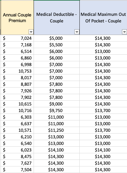

Note, for example, that in the current ACA individual market, the difference between a silver plan with the smallest deductible ($2000) and a silver plan with the maximum allowable deductible of $17,100 is less than $2681 — that’s a deductible spread of $15,000 (more than four times as large as Dr Ryan’s $3500), priced at a 27% premium spread (well less than half the 66% Dr Ryan’s calculation used.)
Nextera and Paladina (Everside): a race to the top of Mount Brag
Updated 9/4/21
In 2015, Qliance still towered over all in the Direct Primary Care Bragging World with its claim of 20% overall cost reductions. Even that, of course, was quite a come down from the extravagant claims previously spewed under the Qliance banner; fond memories still linger of those heady days when the Heritage Foundation drooled over a non-existent British Medical Journal study alleged to have found that Qliance’s patients had 82% fewer surgeries, 66% fewer ED visits, and 65% fewer specialist visits.
Yet, by the middle of 2016, Qliance was toppled; the pages of Forbes proclaimed the attainment of 38% reductions in medical costs by a Qliance rival, Paladina, at its clinic in Union County, NC. By November of 2016, even upstart Nextera Healthcare was bragging its “DigitalGlobe” study at the 25% level. The following month Nextera reached the brag-summit when Paladina’s Union County brag shrank to a still competitive 23%.
In early 2017, while DPC World eagerly awaited a counterpunch from its former leader, Qliance instead went bankrupt. But at least the torch had been passed!
For various reasons, including a bit of good luck, Paladina’s Union County clinic emerged in the three ensuing years as the principal poster child of the DPC movement.
In May of 2020, just as the Union County clinic’s iconic status reached it apogee, the game-changing Milliman study came along, . The tools of actuarial science, risk adjustment most prominently, were brought to bear in an independent study of the cost-effectiveness of a single clinic, and that one just happened to be Paladina’s Union County clinic. The result was not pretty.
The Milliman study essentially kicked to the curb ALL prior DPC cost-effectiveness studies, including both the Paladina and Nextera studies, rejecting the lot for want of proper risk adjustment. In fact, the Milliman study found that after claims cost risk adjustment to account for the health differences between the studied Union County populations, even Paladina’s most current and more modest savings claim of 23% vanished. The Milliman team made plain as day its estimate that Paladina’s Union County clinic program had not produced any significant cost savings at all.
Worse, the Milliman analysis had been wildly over generous to Paladina; it’s conclusion that Paladina’s program was only slightly worse than a break even proposition for the county was based on an estimate of $61 PMPM for the average DPC fee paid by the County. In fact, the publicly available contract between Paladina and the county, makes clear that the average DPC fee paid was $95 PMPM. While DPC supporters had bragged of over $1,000,000 in net annual savings, what the Paladina contract wrought was a net annual increase in the County’s health care costs in excess of $400,000.
The Milliman team also admonished that:
It is imperative to control for patient selection in DPC studies; otherwise, differences in cost due to underlying patient differences may be erroneously assigned as differences caused by DPC.
Grzeskowiak and Busch, What our study says about Direct Primary Care
This admonition might have had a useful, if sobering, effect on direct primary care, if the DPC community were actually interested in advancing the movement based on the proficiency of DPC medical doctors rather than on the shamelessness of DPC spin doctors.
I can honestly say that the previous champions of DPC cost-effectiveness data, Nextera and Paladina, have met this challenge with more than mere lip service. Instead, they mixed fraud and incompetence with that lip service, and raced anew to the top of Mount Brag Bullshit.
A few months after the Milliman report was published, Nextera made the first move, a bold coupling of a brag at the 27% level with a remarkable stunt:

“KPI Ninja** conducted risk score analysis in partnership with Johns Hopkins’ ACG® research team [.]” KPI Ninja’s Nextera study, page 7.
“KPI Ninja brought in the Johns Hopkins research team that has significant expertise in what is called population risk measurement. . . . We took that extra step and brought on the Johns Hopkins team that has this ability to run analysis. It’s in their wheelhouse and they applied that . . . [The] Johns Hopkins Research Team did the risk analysis[.] Nextera presentation at 2020 Hint DPC Summit meeting.
Ah, but:
“We were not directly involved in this analysis.” Associate Director, HopkinsACG.org.
Not only was there no academic team involved in Nextera’s deeply flawed study, there was no risk adjustment actually performed. It was an heroic risk adjustment charade.
When Nextera bragged a 27% cost savings sporting both fake academic robes and fake risk adjustment, imagine how alarmed competitor Paladina – still reeling from Milliman’s conclusion that risk -adjustment brought the Union County savings down from 23% to 0% – would have felt, if they took Nextera at its word.
Don’t fret; knowing the truth of Milliman, Paladina understood at once that all they had to do was launch their own charade.
Paladina, on its website, moved in January of 2021. After its own lip service to risk adjustment and its own lavish praise of the Milliman study, Paladina’s spin doctor went on to declare that “Paladina Health’s Union County client, the employer case study featured in the Milliman report, also prospered from adopting the direct primary care model. . . . Union County taxpayers saved $1.28 million in employee health care costs . . .. 23% . . ..” No matter that the Milliman team had actually exploded that very conclusion when it concluded that the County had barely broken even.
And, as noted above, the reality is that the Paladina adventure cost the county $400,000 more per annum than the Milliman team had assumed. The net size of Paladina’s deception is over $1.7 million dollars.
Consider, too, the sheer misrepresentational brilliance of the Paladina webpage’s careful selection of two raw data apples and two risk-adjusted data oranges drawn from four of each in Milliman’s basket.

Paladina is okay with using risk-adjusted data, or not – depending only on which choice cuts in Paladina’s favor.
But wait. Paladina’s spin team wasn’t quite done. Six months later, they went ahead and matched Nextera’s invocation of academic work from Johns Hopkins that never took place by invoking academic work from Harvard that never took place. With Paladina newly rebranded as Everside, the spin team trotted out a “white paper” that, in addition to repeating their misrepresentations of the Milliman study, relied substantially on additional findings, favorable to the DPC model, from ” the Harvard DPC cost study”.
There was no “Harvard DPC cost study”. There was a Harvard study of the effect on insurance based fee for service providers of receiving PMPM payments to supplement fee for service payments. That study did not address, or even mention, direct primary care practices that eliminate FFS payment and rely on membership fees.
Technical query. Given that Nextera ventriloquized Johns Hopkins and Paladina ventriloquized both Milliman and Harvard, is it still “Charades”’?
Instead of racing to the top of Mount Bullshit, why not stick to calm, truthful analysis that reveals direct primary care’s actual ability to reduce the costs of care?
[**] KPI Ninja is an “analyst” that has a special division dedicated to compiling brags for Nextera and other DPC companies. See here for more on KPI Ninja.
In rural areas, decreased primary care panel size is a problem, not a solution.
Montana’s last governor twice vetoed DPC legislation. He was not wrong.
Over the last month or so, DPC advocates from think-tanks of the right have trotted out the proposition that direct primary care could be “the key to addressing disparities in health care access in underserved areas of Montana facing severe shortages of primary care”. They are very excited that eight DPC clinics have “opened” in Montana in just a few years. Yet, when the very same advocates testified before the Montana legislation, they brought along some real MT DPC docs whose own testimony made it clear that what really happened is that eight existing clinics or practitioners in Montana decided to switch to subscription model care.
And, no doubt, each such D-PCP significantly reduced the size of their patient panel. Typical DPC clinicians brag about reducing patient panel sizes to one-third the size of those in traditional practices. Indeed, some members of the same pack of DPC advocates in the same hearing stressed the glories of tripled visit times.
But reducing patient panels sizes by two-thirds obviously aggravates the problem of primary care physicians shortages.
The most common response of the DPC community has been that DPC lowers burnout, lengthening primary care careers, presumably mitigating that aggravation – to some unknown degree and at some unknown point in the future.
I did some math.
Each PCP who chooses DPC and reduces patient panel sizes by two-thirds would need to triple the length of his remaining career to cover the gap he created by going DPC. And it would take decades to do so.
Assume an average career length of 20 years for a burning out PCP, with retirement at the age of 50. Let’s suppose that DPC makes PCP life so sweet that he works until he is 80 years old.
By the end of those 30 additional years, the equivalent of one-quarter of the patients he left behind by going DPC will still be left in the cold Montana snow.
To fully close the gap his switch to DPC created, he would have to work until he was a 90 year old PCP. The good news is that he would be very experienced; the bad news is that some 90 year-olds might struggle with “24/7 direct cellphone access to your direct primary care physician”.
To supplement the patent insufficiency of this bleak scenario, DPC advocates further argue that DPC will lead to increases in the percentage of young professionals choosing primary care practice instead of other specialties. One of the think-tank “experts” from the Montana expedition has said that “we know” this to be the case, but provided no evidence other than the naked claim “we know”. Is this knowledge, or just speculation? Feel free to put a link to any significant evidence in the comments section below.
Even if there was hard evidence that DPC had shifted or might shift career choices toward primary care, it would still be wise to “be careful what you wish for”. Physician shortages in rural areas are not limited to primary care. To the contrary, there is ample evidence, such as this study from a Montana neighbor state, that rural communities face shortages of specialists that are even more consequential than the shortages of PCPs.
If a potentially gifted surgeon is willing to return to her roots in Whitefish, why turn her into a PCP?
Montana officials, beware.
Nextera brags about THIS? Really?
In its recent report from KPI Ninja, Nextera Healthcare bragged unpersuasively about overall costs savings and reduced utilization of downstream care services. But they also bragged about the following utilization figures for a group of 754 members for whose primary care they were paid $580,868 in DPC subscription fees over the equivalent of a ten-month [1] study period:
- 1079 office visits
- 506 of which included additional in-office procedures at no extra cost
- 573 visits with no additional procedure
- 329 telephone visits
- 1868 text message encounters
To determine whether the amount paid represented a plausible value compared to what might have been spent for the same volume of comparable services if obtained through fee for service primary care physicians, we made assumptions that strongly favored Nextera at every point. For example, although the Kaiser Family Foundation compiled studies that showed, on average, that private pay rates for physician services were 143% of Medicare rates, we set our comparison rates at 179% of Medicare, corresponding to the highest value found in any of the studies Kaiser identified.
We applied that adjustment factor to Medicare rates for the services KPI Ninja had enumerated based on the following, extremely generous, correspondences.
- we treated visits to a Nextera clinic in which no additional services were performed as equivalent to “Level 5” Medicare office visit for a group of patients, one-third of whom were new patients (coded 99205) and two-thirds of whom were established patients (coded 99215).
- Level 5 is rarely used for FFS office visits, i.e., about 5% of all visits; it assumes long probing visits, typically 40 minutes or more
- our choice resulted in treating $264 per PCP visit as the FFS cost for a routine Nextera visit
- in preparing its report based on its knowledge of payment rates used by the SVVSD, by contrast, KPI Ninja itself assigned a much lower valuation ($115) to an average PCP visit[2];
- we treated Nextera’s average telephone call as equivalent to Medicare mid-level visits with an established patient (99213)
- these are standard visit rates for problems up to moderate complexity
- 99213 is the code most commonly billed E & M code
- we treated text encounters as the equivalent of Medicare e-visits performed asynchronously via patient portals (G2012)
- these type of visits typically cover exchanges via portal for up to a week and require significant subsequent engagement in response to a patient inquiry
- many of what KPI Ninja scored as “text encounters”, as actually delivered, would likely have fallen short of G2012
- for example, KPI Ninja’s scoring rule would have counted three texts spread beyond 24 hours as two separate “text encounters”; with a spread of up to a week this would have been a single G2012
- similarly, KPI Ninja’s scoring rule counted a simple text to, e.g., request a prescription refill request as a “text encounter”; a G2012 would not have been allowed for such a minimal activity
- we treated those visits to a Nextera clinic in which additional services were performed as the equivalent of visits to an urgent care center costing an extreme $528.00, the equivalent of two level five visits
In short, we bent over backwards to try to find higher cost correspondences to cast Nextera in a good light.
With these profoundly generous assumptions in Nextera’s favor, the private-pay fee-for-service world would still have delivered these or better services – the 40 minute visits, the phone calls, the asynchronous messaging, the in-office tasks like suturing and making arm casts – at less than the amount Nextera received. Computations here.
What’s more there is no data in the KPI Ninja/Nextera report that actually demonstrates that Nextera delivered more primary care to its members than they would have had under the fee for service alternative studied in the report. Over a dozen times in an eighteen page report (falsely claiming major cost savings for Nextera plan members), KPI Ninja expressly attributes spectacular results to Nextera patients receiving a greater quantum of primary care.
But Nextera did not present any measurement of the amount of primary care received by members of the competing FFS plan. And there is good reason to think that non-Nextera patients from the control group used in the Nextera-KPI Ninja report received plenty of primary care. Instead of Nextera membership, the competing plan’s members received other benefits, including a $750 HRA providing first dollar coverage. That’s more than enough to cover the quantum of care Nextera actually delivered.
Face it. Nextera’s brand of primary care is no big deal, not really much above average. Nextera patients average 1.65 primary care office visits per year (versus a national average for all patients including the uninsured of 1.51); they get half a phone call every year, and they send or receive three annual text messages[1]. Taking $839 a year for that level of service is not exactly a big deal.[3] Claiming that this is some kind of patient access breakthrough is a new frontier in nonsense.
Nextera’s CEO is an acknowledged DPC leader and co-founder of the DPC Coalition. Nextera has 100+ physicians in eight states and a bevy of employer group contracts. Sadly, the KPI Ninja study of Nextera is direct primary care, putting its best foot forward.
So, now we know where a decade of direct primary care “data” has arrived.
[1] Although the study period covered claims from a one-year period, KPI Ninja included a large number of part-year members in the studied cohort. The figures they presented reflect a membership that averaged only 10.1 months of membership in the study year. Per annum values, when presented in this post, have been correctly adjusted.
[2] This can be calculated from their claims, at page 16, regarding Nextera member savings on primary care visit coinsurance.
[3] Taking in an amount somewhat in excess of the average value of services delivered might be thought of as necessary to facilitate a direct primary care system that, while having only modest value for a large percentage of members in relatively good health, funds the more substantial needs of members in relatively poor health. This is a valuable type of financial service that can be supported by allowances both for added administrative expenses and for a reasonable profit.
That type of arrangements is usually called “insurance” and, in all jurisdictions similar arrangments have been made subject to the will of the people as expressed in law. Under current “insurance” law, for example, administration and profit amounts are limited to 15% or 20%. But even though direct primary care providers collect and pool monthly fees and use the use the pooled fees to fund variable service levels based on differing medical needs, DPC leaders insist that their clinics are not involved in “insurance”.
That move is calculated to permit DPC clinics to capture the profits, but avoid the regulations. Yet, without regulation, expansion of direct primary care would likely unlock a primary care microcosm of all the health economics problems addressed by contemporary regulation, particularly those relating to adverse selection. pre-existing conditions, and moral hazard.
Also note that paying a fixed known price for a basket of direct primary care services does not provide fully meaningful transparency if the contents of the basket can vary depending on the purchaser’s changing health status. Every holiday season, my local rock and gem club offers a $2.00 mystery bag of rocks; the price is known but the bag is opaque. For a meaningfully transparent transaction you need to know both the price of the container and the identify and quantity to its exact contents.
:
KPI Ninja/Nextera report: every single cost comparison has a 10% benefit design error.
In KPI Ninja’s “School District Claims Analysis” comparing claims costs under the Nextera plan and the competing fee for service (Choice) plan, the “Analyst” overlooked two major differences between the plans in how the “School District” pays “Claims“.
- Nextera members pay post-deductible coinsurance at a 20% rate and the district pays an 80% share. But for the exact same claim by a member of the competing fee for service plan (Choice member), the split is 10% and 90%.
- While both cohorts have the same $2,000 deductible, in theory, only the Choice plan members have access to an employer-paid $750 health reimbursement account that provides first dollar claims coverage, delaying the onset of the deductible and effectively reducing it to $1,250 dollar.
When two claims for exactly the same service rendered can draw different employer payments for Nextera members and Choice members, that difference payment has nothing whatever to do with Nextera’s effectiveness. Yet, the different effective rates at which claims are paid obviously have substantial effects on the total claims amounts for each group. Accordingly, a large part of any difference between the totals for the two groups is the result of SVVSD benefit design, not the result of anything Nextera does that reduces costs.
To accurately reflect only the savings attributable to Nextera, it is necessary to normalize the district’s average payment rate between the two populations. KPI Ninja did not see the need to do this.
Our method for doing this was to estimate and compare the actuarial values of the medical coverage in the two plans using the publicly available CMS actuarial value calculator developed for the Affordable Care Act’s individual market coverage.[**] We arrived at a downward adjustment from Choice plan total employer costs given by a factor of 0.905.
Correcting just this one oversight by KPI Ninja makes a difference of $311 in the overall savings claims, deflating Nextera’s brag by over one-third. See the computations here.
Every one of over two dozen claim cost comparisons in the KPI Ninja report needs this same adjustment (plus others discussed both in other posts at this blog and in the Nextera Manuscript that can be viewed through a menu item above).
A happy by-product of understanding how claims are divided between the district and its employees is that it essentially resolves KPI Ninja’s concerns about not having been provided employee payment data. Once we have put employer payments for the two groups on a normalized scale, the details of how the employer and employee divided the costs of particular claims among themselves is of little or no value in assessing Nextera’s aggregate contribution to overall savings. In other words employee cost-sharing issues need not impair our ability to evaluate Nextera’s performance.
[**] The paired plans have AV of 78.0% (Nextera plan) and 86.2% (Choice plan) , giving a ratio of 0.905. That ratio represents a conservative adjustment of the employer payments reported by KPI Ninja for two reasons. First, the computed AVs include both medical and pharmaceutical claims. For pharmaceutical claims, however, the cost sharing is identical, so pharmaceutical claims (about one-fifth of all claims) play no role in generating the difference. All of the 10.5% overall AV difference is generated from the difference between the paired medical claims, which must therefore be appreciably larger than 10.5%. Also, the study data included claims from two plan years, 2018 and 2019. The 80:20 coinsurance split for Nextera patients applied to 2018. For the 2019 calendar year, for Nextera patients, the district replaced coinsurance with copayments for several selected services, including e.g., $200 for advanced imaging and ED visits and $60 for specialist visits. See SVVSD 2019 benefits guide. We determined the actuarial value of both the 2018 Nextera plan and the 2019 Nextera plan. For 2019, the Nextera plan had an ever lower actuarial value, i.e, the net effect of the 2019 changes was to decrease overall employer payments for Nextera members.
KPI Ninja’s Nextera risk measurement charade
Abstract: The Nextera “study” by KPI Ninja misappropriated the prestige of a Johns Hopkins research team to support its risk measurement claims; relied on an undisclosed and unvalidated methodology for obtaining population risk measurements; obtained highly dubious risk measurement results; and sharply mischaracterized the significance of those results. In the end, because applying even their own risk measurement results would have reflected negatively on Nextera, they never actually performed risk adjustment of the cost and utilization data under study.
It was a charade.
UPDATED, 12/16/2020. View between two rows of red asterisks (**********) below.
Context.
When KPI Ninja’s analysis of Nextera’s SVVSD clinic and the attendent social media blitz first hit the public, Nextera used the following language to misappropriate academic prestige to support the report’s handling of population risk measurement.
“KPI Ninja conducted risk score analysis in partnership with Johns Hopkins’ ACG® research team [.]” Before being sent down the rabbit hole, this language appeared in two prior versions of the study, dated 10.13.20 and 9.22.20 versions of the report. Similarly, a published program of a direct primary care summit meeting noted that, “The case study came together though partnership with KPI Ninja and the Johns Hopkins’ ACG® research team.” In a Youtube video, Nextera’s CEO declares: “[KPI Ninja] brought in the Johns Hopkins research that has significant expertise in what is called population risk measurement”. And on he goes, “We took that extra step and brought on the Johns Hopkins team that has this ability to run analysis. It’s in their wheel house and they applied that [.]” Specifically asked about adverse selection, he went on, “[The] Johns Hopkins Research Team did the risk analysis . . . and that allowed us to get to the $913 [in savings].”
Here’s a screenshot from that video.
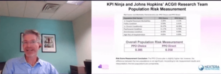
And, here is reality.
“We were not directly involved in this analysis.” Associate Director, HopkinsACG.org.
In general, any direct primary care provider should earn some credit for acknowledging the relevance of population health metrics to assessments that compare results between direct primary care populations and other populations. Not here.
In this case, Nextera’s analyst KPI Ninja performatively measured population risk to anticipate criticism, but stopped short of actually applying any actual risk adjustment, even one based on its own measurements, because doing so would have weakened Nextera’s coat reduction claim.
There is no indication that KPI Ninja actually performed a risk adjustment.
Big talk about risk measurement. No actual action.
KPI Ninja computed the risk scores for the two populations at 0.358 (Nextera) and 0.385 (non-Nextera), a difference of 7.5%. The appropriate way to present statistical risk adjustment work is to present unadjusted raw claims data, apply to the raw claims data the relevant calculated risk adjustments and, then present the adjusted claims and utilization data with a confidence interval to assist those using the data in making such judgments as they wish. As the landmark Milliman report on direct primary care for the Society of Actuaries shows, this is done even when presenting differences deemed not statistically significant.
Instead of following standard statistical practice KPI Ninja pronounced the difference “insignificant” and pronounced their own “interpretation” that the two populations were “comparable”, then excused itself from actually applying any risk adjustment to modify the raw claims or utilization data at all, as if no measurement had ever been made. In effect, they treated the data as if their risk measurement had yielded zero difference.
This is nonsense, not analysis. As an initial matter, in common statistical practice with which all analysts, data modelers, and academic researchers (even medical practitioners) should be generally familiar, there are rules for calculating and expressing the statistical significance of differences. KPI Ninja purports to have a crack team of analysts, data modelers, and academic researchers who should know how to do this. What number did they get? Did they bother to determine statistical significance at? They aren’t saying.
Had KPI Ninja investigated the accuracy of the ACG® concurrent risk scoring model with which they developed the risk scores, they might have run across another Society of Actuaries report, this one entitled Accuracy of Claims-Based Risk Scoring Models; that document would have told them that the mean absolute error (MAE) for ACG® risk group predictions on groups in this size range was 7.3%.
The 7.5% difference KPI Ninja observed was outside that mean absolute error. While this is not ironclad proof the two populations differed, it is certainly substantial evidence of a real difference. If KPI Ninja’s risk measurements have any valid meaning, it is that 7.5% is a significantly more probable measure of the likely population difference than is zero.
In any event, as it is highly probable that these populations differ in health risk, it is deeply misleading to address health risk by declaring that “the two populations are comparable”.
And 7.5% of health care costs is far too large a share to ignore. Consider, again, the Milliman report on DPC for the Society of Actuaries. There, the expert team determined an overall relative risk score difference of 8.3%, and proceeded to apply appropriate risk adjustment to the claims and utilization data. Moreover, the Society of Actuaries study of risk adjustment determined that the risk adjustment methodology used by the Milliman team, “MARA Rx”, had a mean standard error of 8.3%. So, for the Milliman study the measured risk difference merely matched the mean standard error for the risk methodology Milliman selected; for the KPI Ninja study the measured risk difference exceeded the mean standard error for the risk methodology KPI Ninja selected. The case for applying risk adjustment to the data in the Nextera study is, therefore, even stronger than was the case for doing so in the Milliman study.
In a follow up commentary emphasizing the breakthrough importance of their study, the Milliman team wrote, “It is imperative to control for patient selection in DPC studies; otherwise, differences in cost due to underlying patient differences may be erroneously assigned as differences caused by DPC.” What the Milliman team did not say was, “Measure risk, find a case that needs risk adjustment even more than the one we studied, but omit any actual control for patient selection and deny the need for risk adjustment.”
So why KPI Ninja did substitute “zero adjustment” for the 7.5% adjustment indicated by their own risk measurement. Here’s a clue.
Nextera’s cost reduction brag is pegged at 27%; when deducted from 27%, 7.5% gives a hefty haircut of hundreds of dollars to Nextera’s $913 cost reduction claim.
And being able to keep that trim to collar level would turn on the credibility of KPI Ninja’s own calculation of a 7.5% risk differential. But that effort, KPI Ninja’s first ever reported try at comparing risk between two populations, is not credible at all.
There are substantial reasons to believe that KPI Ninja’s diagnosis-based risk measurements are skewed heavily in Nextera’s favor.
The Nextera population skews heavily toward children; this is entirely predictable, because Nextera employees pay $1600 per year less in premiums to add children than do non-Nextera employees. 24% of the Nextera cohort is less than 15 years old, compared with only 13% of the non-Nextera cohort. On other side of the spectrum, those over 65 were nearly four times as likely to reject Nextera. Upshot: the Nextera population is about 6.5 years younger on average and is less heavily female. Based on age and gender alone, per a landmark data set prepared by Dale Yamamoto for the Society of Actuaries, a risk score difference of about 17% could be expected, even in the absence of adverse selection.
But adverse selection is very much in play in the St. Vrain Valley School District. As described more fully in a separate post, the school district’s cost-sharing structure strongly steers those who anticipate moderate to heavy health care utilization into the non-Nextera cohort with cold hard cash, as much as $1787 of it for a single employee and twice that for a couple. This invites heavy adverse selection that would produce risk scores significantly exceeding those based on demographics alone. Moreover, a comprehensive 2016 Society of Actuaries commissioned report on forty different risk scoring methodologies from eleven different vendors, including ACG®, explained that even the best risk adjustment models are not able to completely compensate for adverse selection.
The mere 7.5% risk difference between the cohorts that KPI Ninja ran across requires that the illness burden data for the two populations severely slash the risk gap indicated by age and gender alone. That suggests a perfect storm of the odd: a surfeit of younger, but relatively sick, Nextera members coupled to a surfeit of older, but relatively healthy, non-Nextera members — all working against a tsunami of adverse selection.
That defies belief, especially in light of widely-reported heavy selection bias at the Nextera clinics in the Longmont area. The report to which I refer was prepared and distributed by a surprising source — Nextera itself.
About two and one-half years before Nextera got its first recruits into the school district employee cohort studied here, Nextera enrolled new members from a similar employee population of an employer in virtually the same town. Nextera’s flagship clinic is near both employers, and employees of both use the same doctors at the same clinics. In its own “whitepaper”, Nextera reported that the employees of Digital Globe who declined Nextera had a prior claims history that was 43% larger than the prior claims history of those who chose the Nextera option.
(Interestingly, in the Society of Actuaries report on risk scoring methodology, a study of the effect of “highly adverse selection” was based on a test population with a claims cost history that was a mere 21% higher than the average. Does that make 43% astronomically adverse selection?)
Did Nextera go, in a mere two and one-half years, from attracting a very healthy population to attracting a still young population now weirdly sick beyond its years?
Or was Nextera simply right in their first big whitepaper, when they identified a heavy selection bias in Nextera’s favor, warranting an adjustment of — not 7.5% nor even 17%, but — 43%.
KPI Ninja’s assertion that the risk difference between the Nextera and non-Nextera populations addressed in the SVVSD report is a mere 7.5%, and “not significant”, is extremely doubtful. As we discuss below, something significantly above 17% is far more likely.
ACG® concurrent risk score measurements, the type attempted by KPI Ninja in this study, are vulnerable to a recognized form of bias that results from benefit design.
As mentioned above and described more fully in a separate post, the school district’s benefit structure strongly steers those who anticipate moderate to heavy health care utilization into the non-Nextera cohort with cold hard cash, as much as $1787 for a single member. Because of a $750 HRA not available to Nextera members, non-Nextera members have an effective $1250 deductible rather than $2000; nonmembers also pay only 10% in coinsurance after deductible, half that paid by Nextera members.
The ACG® technical manual notes that “where differences in ACG concurrent risk are present across healthcare organizations, it is almost universally attributable to differences in covered services reflected by different benefit levels and cost structures”. But, if different benefit designs can produce different ACG® concurrent risk score differences for equally risky populations, might there be occasions when different benefit designs will produce similar ACG® concurrent risk scores for populations that have different levels of underlying risk?
Certainly. A concurrent risk score based on current insurance claims data has no way to reflect the risks of the uninsured, and would less effectively capture the risks of the relatively underinsured. Members in a group with higher cost-sharing will under-present for care relative to a group with lower cost-sharing. If the higher cost sharing group was also the less risky group, this “benefit design artifact” would artificially shrink the “true” ACG® concurrent risk score gap.
This artifact is a corollary of induced utilization, and illustrates why the Milliman authors expressly called for studies of direct primary care to address induced utilization and why CMS’s “risk adjustment” processes incorporate both risk measurements and induced utilization factors.
One particular result of a benefit design artifact would be a discrepancy between concurrent risk measurements that incorporate clinical information and those that rely solely on demographics; specifically, a younger population with less generous benefits will have ACG® concurrent risk scores that make it look sicker than it is relative to an older population with more generous benefits.
The Nextera cohort is younger; it looks sicker than its years on ACG® concurrent risk scores; its benefit package requires significantly more cost-sharing; and Nextera cohort members present less frequently for care than non-Nextera members with the same conditions . The Nextera cohort lands squarely atop a benefit design artifact.
On this basis alone, KPI Ninja’s measured risk difference will be too low, even without adverse selection into the non-Nextera cohort.
KPI Ninja’s risk measurements rest on undisclosed and unvalidated methods that were admittedly purpose-built by KPI Ninja to increase the risk scores of direct primary care populations. Anyone see a red flag?
As previously noted, KPI Ninja’s assertion that the risk difference between the cohorts is a mere 7.5%, and “not significant”, is extremely doubtful.
It literally required fabrication to get there.
ACG® risk adjustment, in the absence of pharma data, is fueled by standard diagnostic codes usually harvested from standard insurance claims data. But direct primary care physicians do not file insurance claims, and a great many of them actively resist entering the standard diagnostic codes used by ACG® into patient EHRs. Indeed, direct primary care doctors typically do not use the same EHR systems used by nearly all other primary care physicians. KPI Ninja has referred to a “data donut hole” of missing standard diagnostic codes which it sees as unfairly depriving direct primary care practitioners of the ability to defend themselves against charges of cherry-picking.
Milliman Actuaries are a world leader in health care analysis. The Society of Actuaries grant-funded a team from Milliman for a comprehensive study of direct primary care. That highly-qualified team ended up relying on risk measurements based on age, gender, and pharmaceutical usage in part because, after carefully addressing the data donut hole problem, they could find no satisfactory solution to it.
But KPI Ninja implicitly claims to have found the solution that eluded the Milliman team; they just do not care to tell us how it works. The cure apparently involves using “Nextera Zero Dollar Claims (EHR)” to supply the diagnostic data input to ACG® software. Nextera does not explain what “Nextera Zero Dollar Claims (EHR)” actually are. It might be — but there is no way to tell — that KPI Ninja’s technology scours EHR that typically lack diagnosis codes, even long after the EHR are written, to synthesize an equivalent to insurance claim diagnosis codes which can then be digested by ACG®.
Concerns about the reliability of such synthetic claims is precisely what lead the Milliman actuaries away from using a claims/diagnosis based methodology. KPI Ninja boldly goes exactly there, without telling us exactly how. Only a select few know the secret-sauce recipe that transformed direct primary care EHR records into data that is the equivalent of diagnosis code data harvested from the vastly different kind of diagnostic code records in claims from fee for service providers.
There is no evidence that KPI Ninja’s magical, mystery method for harvesting diagnosis code has been validated, or that KPI Ninja has the financial or analytical resources to perform a validation or, even, that KPI Ninja has ever employed or contracted a single certified actuary.
That KPI Ninja validate its methods would be of at least moderate importance, given KPI Ninja’s general business model of providing paid services to the direct primary community. But validation becomes of towering significance for risk-related data precisely because KPI Ninja’s methodology for risk data was developed for the clearly expressed purpose of helping direct primary care clinics address charges of cherry-picking by developing data specific to justifying increases in direct primary care member risk scores.
Validation in this context means that KPI Ninja should demonstrate that its methodologies are fair and accurate. Given KPI Ninja’s stated goal of increasing direct primary care risk scores, the most obviously pressing concern is that the method increases population risk scores only in proportion to actual risk.
For example, the ACG® technical manual itself warns about risk scores being manipulated by the deliberate upcoding patient risk. Even though sometimes detectible through audits, this has happened fairly often under CMS’s risk-adjusted capitation plans.
There is no evidence that KPI Ninja’s secreted data development process, whatever it may have been, included any protection from deliberate larding of the EHR by direct primary care providers. Then, too, if the “Nextera Zero Dollar Claims (EHR)” process is to any degree automated, a single bad setting or line of program code might bake risk measurement upcoding into the cake, even if the baker/programmer had only the best of intentions.
**********
An outward manifestation of upcoding in a situation like Nextera’s would be a “perfect storm” as described above. In this regard, note that on page 7 of the study, KPI Ninja explains that its risk scoring was built from six categories of risk factors. The most sharply differing of the six, and the only one pointing to greater Nextera risk, was “hospital dominant morbidities”. These are the risk conditions that most reliably generate inpatient hospital admissions. KPI Ninja tells us that the Nextera population carried these conditions at a 37% greater rate than the other group.
Miraculously, despite KPI Ninja reporting this heightened inpatient hospitalization risk for the Nextera population on page 7, KPI Ninja reports on page 10 that Nextera reduced inpatient hospital admissions by 92.7%. It seems likely that something in Nextera’s secreted processing results in inclusion of an unusually large number of erroneous hospital dominant morbidities codes from Nextera’s EHR records.
**********
* Note, too, that even if Nextera had kept the exact same complete EHR records as a standard FFS practice, complete with ICD-10 codes, the fact that such records need never be submitted for third-party audit — as they would for most other entities keeping such records for the purpose of risk measurement — would leave risk measurement subject to self-interested larding. (Favorable self-reports do not become less fraught after being laundered through expensive Johns Hopkins ACG® software.)
More importantly, on a broader level, developing and executing an EHR-to-claims code conversion process required that someone at KPI Ninja create and interpret uniform, objective, and precise standards for doing so. What were the standards? How were they created? Who applies them? What steps were taken to validate the process?
There are only two things we know for certain about the EHR-to-diagnostic claims process: first, that KPI Ninja essentially promised to deliver increased DPC cohort risk scores to Nextera; and, second, that Nextera paid KPI Ninja for its efforts.
No matter how good ACG® software may be in turning accurate diagnostic codes into accurate risk predictions, the risk measurements cranked out for Nextera patients can be no more valid than the diagnostic data generated by KPI Ninja’s secrets.
Because there is no real transparency on KPI Ninja’s part as to how it generates, from Nextera EHRs, the data needed for AGC® risk adjustment, and no evidence that such a methodology has been validated, it is impossible to confirm that KPI Ninja risk measurement of the Nextera cohort has ANY meaningful connection to reality.
Proper risk adjustment by itself would likely erase nearly all of Nextera’s $913 savings claim.
As mentioned above, looking solely at the age and gender distribution of the Nextera and non-Nextera cohorts and applying Dale Yamato’s landmark data set suggests that the costs of the non-Nextera cohort would run 17% higher than the Nextera cohort. But doing risk adjustment on that basis alone is equivalent to assuming that cohort membership is a serendipitous result. In reality, members select themselves into different cohorts based on their self-projections of needs for services.
SVVSD employees and their families did not pick plans based on age and gender. They pick the plan that will best meet their medical needs. Many of those with greater medical needs for expensive downstream care will realize that the non-Nextera plan is less generous to them and reject Nextera membership. When this adverse selection drives plan selection, an increase in, say, the average age of the cohort population is an indirect effect, a trailing indicator of the driving risk differential. Accordingly, the 17% figure derived from the Yamamoto data should be treated as a floor for risk adjustment.
Even a risk-adjustment of 17% — with no other adjustments — would lop off over half of Nextera’s $913 savings claim. If the true risk difference is reflected by the 43% difference between cohort claims histories reported previously in Nextera’s last published study (different employer, same clinic), Nextera may be the costliest move that school district ever made.
Even without taking population health risk into account, I show in other posts — especially here and here — that the KPI Ninja Nextera study still falls far short of demonstrating its $913 claims.
Summary
The Nextera “study” by KPI Ninja misappropriated the prestige of a Johns Hopkins research team to support its risk measurement claims; relied on an undisclosed and unvalidated methodology for obtaining population risk measurements; obtained highly dubious risk measurement results; and sharply mischaracterized the significance of those results. In the end, because applying even their own risk measurement results would have reflected negatively on Nextera, they never actually performed risk adjustment of the cost and utilization data under study.
KPI Ninja’s Nextera analysis: more than enough problems.
Three major adjustments are needed, even without correcting the IP admit rate problem or arriving at a more reasonable risk adjustment.
Comparing data from Nextera patients and non-Nextera patients in the SVVSD programs requires three major adjustments which KPI Ninja never attempted. Computations here.
- Because of the different benefit structures, the district’s claim costs for Nextera members reflect a large measure of savings, not due to Nextera, but due to the fact that the district pays less for the exact same claims from Nextera members than for “Choice” plan member warranting an downward adjustment of the district’s total costs for Choice members by a factor of 0.905.
- The much richer overall benefit structure for non-Nextera also induces utilization, warranting a second downward adjustment of Choice total costs (by a factor of 0.950%
- The data also need risk adjustment. For this computation we used the 7.5% difference computed by Nextera’s analyst, although the adjustment actually needed is likely north of 21%.
Applying all three adjustments reduces the claimed $913 savings to $255, bring the percentage savings down from 27% to less than 8%. Even that value assumes that the Nextera report was correct in its astonishing finding that the non-Nextera population of teachers and children had a IP admission rate of 246 per thousand.
The weight of external evidence suggests that supplying missing pharmacy data will not rescue any significant part of Nextera’s claim.
After acknowledging the complete absence of pharmacy cost data, KPI Ninja dismissed concern about the omission by repeatedly suggesting that inclusion could only showcase additional savings for Nextera members. The only support KPI Ninja offered for that suggestion was KPI Ninja’s trust-me account of its own, unidentified, and unpublished “research” performed in the course of paid service to the direct primary care industry.
The opposite conclusion — that pharmacy data might well reveal additional direct primary care costs — is supported by actual evidence. The only independent and well-controlled study of a direct primary care clinic, the landmark Milliman’s landmark study, found that after risk adjustment, the direct primary care cohort members had a slightly higher pharma usage than their counterparts. And a non-independent study that relied on only on propensity matched controls plainly suggests that one successful DPC strategy is to reduce high expense downstream costs through increasing medication compliance; the Iora clinic involved saw a 40% increase in pharmacy refills alongside significant reductions in various levels of hospital utilization.
Nextera’s claim to reduce the employer’s cost of chronic conditions suffers from some of the same problems as Nextera’s broadest claims — plus an even bigger one.
The report’s largest table, found on page 12, ostensibly shows various employer costs differences between Nextera patients and Choice patients associated to a selection of sixteen chronic conditions. For 10 of 16 Nextera claims employer cost reductions while, for the remaining six, Nextera confesses increased employer costs. Here is a

selected, condensed line from that table with two added amending lines. The first line of amendments applies the previously discussed adjustments to the employer’s cost for induced utilization (0.950).[1] This adjustment cuts the supposed savings by $62, a mere warmup act.
[1] We omit cohort wide risk adjustment in this table to avoid the risk of over-correction, knowing that people on the same chronic conditions line have already been partially sorted on the basis of shared diagnostics. We omit the plan benefit adjustment so, in our second line of amendment, we can introduce the cost of primary care for the chronic conditions of Nextera members without fear of duplicating the portion of the primary care cost intrinsic to our global adjustment (0.905) for benefit package design.
The second amending line is added to remove additional skew that arises because for Choice members, employer claim costs may flow from both primary care payments and downstream care payments, while for Nextera members employer claim costs come only from downstream care.
Nextera members do receive primary care — some of the most expensive primary care in the world, in fact. Nextera’s subscription fees average $839 PMPY. Fair comparison of employer costs for chronic conditions requires an accounting of Nextera’s fees as part of the employer costs for chronic conditions. Including Nextera’s fees turns the chronic conditions table significantly against Nextera’s claims. Nextera has not demonstrated its ability to lower the costs of chronic disease.
The same issue infects the Nextera report’s computation of savings on E & M visits, on page 10.
The study omitted important information about how outlier claimants were addressed.
While KPI Ninja did address the problem of outlier claimants, it is frustrating to see about 40% of total spend hacked away from consideration without being told either the chosen threshold for claims outlier exclusion or the reasoning behind the particular choice made.
KPI Ninja makes clear that it excluded outlier claims amounts from the total spend of each cohort. But it is also salient whether members incurring high costs were excluded from the cohort in compiling population utilization rates or risk scores.
The analyst understood that a million-dollar member would heavily skew cost comparison. If, however, the same million-dollar member had daily infusion therapy, this could heavily skew KPI Ninja’s OP visit utilization comparison. And, if that same member and a few others had conditions with profoundly high risk coefficients that might have a significant effect on final risk scores.
The better procedure is to avoid all skew from outliers. The Milliman report excluded members with outlier claims from the cohort for all determinations, whether of cost, utilization or, even, risk. In their report, KPI Ninja addressed outlier members only in terms of their claims cost. There is no indication that KPI Ninja appropriately accounted for outlier patients in its determination of utilization rates or population risk.
A significant aspect of risk measurement may have been clarified by accounting properly for outlier. And a good chunk of that astonishing IP admit figure for Choice patients might have vanished had they done so.
A study design error by KPI Ninja further skews cost data in Nextera’s favor by a hard to estimate amount.
“The actuary should consider the effect enrollment practices (for example, the ability of participants to drop in and out of a health plan) have had on health care costs.”
Actuarial Standards Board, Actuarial Standard of Practice No. 6, § 3.7.10 (b). See also §2.26 and §3.7.3
But the actuarial wannabees at KPI Ninja did not do that. The only claims cost data marshaled for this study were claims for which the district made a payment. Necessarily, these were claims for which a deductible was met. Because KPI Ninja did not follow the guidance from the actuarial board, however, it ended up with two significantly different cohorts in terms of the cohort members’ ability to meet the district’s $2000 annual deductible and maximum out of pocket expense limit.
Specifically, the average time in cohort for a non-Nextera member was 11.1 months; for Nextera it was only 10.1.[2] On average, Nextera members had twice as many shortened deductible years as non-Nextera members. And shortened deductible years mean more unmet deductibles and mOOPs, and fewer employer paid claims; in insurance lingo, this is considered less “exposure”. The upshot is that the reported employer paid claims for the two cohorts are biased in Nextera’s favor.
[2] Most of the difference is related to KPI Ninja’s choosing a school year for data collection when plan membership and the deductible clock runs on a calender year. Nextera has publicly bragged of seeing a boost in membership for its second plan year. Those new members had spent only eight months of plan membership when the study period ended.
To largely eliminate this distortion, KPI Ninja need only have restricted the study to members of either cohort who had experienced a complete deductible cycle. To estimate the amount of distortion after the fact is challenging, and the resulting adjustment may be too small to warrant the effort. What would make more sense would be for Nextera to just send the data where it belonged in the first place, to a real actuary who knows how to design an unbiased study.
A related error may have infected all of KPI Ninja’s utilization calculations, with potentially large consequences. KPI Ninja’s utilization reduction claims on page 10 appear not to have been normalized to correct for the difference in shortened years between the two cohorts. If they have indeed not been so adjusted, then all the service utilization numbers shown for Nextera members on that page currently need an upward adjustment of 10%. One devastating effect: this adjustment would completely erase Nextera’s claim of reducing utilization of emergency departments.
There is no evidence that the utilization data were normalized to correct for the one-month shortfall of Nextera members “in cohort dwell time”.
Summary of all current Nextera posts.
The two astonishing claims of Nextera’s school district advertising blitz are deeply misleading and unsupported. In no meaningful sense, does Nextera save 27% or $913 per year for every patient served by Nextera’s doctors rather than by the Saint Vrain Valley region’s traditional, fee-for-service primary care physicians. In no meaningful sense, do patients served by Nextera doctors have 92.7% fewer inpatient hospital admissions than those served by the Saint Vrain Valley region’s traditional, fee-for-service primary care physicians.
The KPI Ninja report on Nextera is at war with the best available evidence on direct primary care, that from the Milliman study. The KPI Ninja analysis head-faked risk adjustment, an essential feature of plan comparison, but actually performed none at all. The vast bulk of the reported cost savings turn on the dubious finding that a low risk population had a Medicare-like hospital admissions rate they could have reduced by choosing Nextera’s physicians.
An adequate study required not only risk adjustment, but also adjustments for induced utilization and for normalizing employer share cost based on the benefit plans. Combined all adjustments cut the purported Nextera savings down from $913 to $255, even accepting as given a freakishly high IP admission rate and a freakishly low risk adjustment of 7.5%.
Every single one of the report’s claims that Nextera lowered the cost of various downstream care services is tainted by one or more of these unaddressed factors.
Credibility requires a well-designed study and careful analysis, transparency, candor, and a firm understanding of the many effects of benefit design. The KPI Ninja report on Nextera had none of it. It is, at best, a spin doctor’s badly concocted puff piece.Promotion of KPI Ninja’s work on behalf of one hundred Nextera physicians — by video, by press release, and by distribution of the report by social media and otherwise — is false advertising that demands correction.
KPI Ninja’s Nextera study: a “single blunder” introduction
The KPI Ninja report on Nextera’s school district program claims big savings when employees chose Nextera’s direct primary care rather than traditional primary care. But the analysis reflects inadequacy of a high order. Here’s a starter course of cluelessness, actually one the report’s smaller problems.
The report ignored the effect of an HRA made available to non-Nextera members only. But $750 in first dollar coverage gets a cost-conscious non-Nextera employee a lot of cost-barrier-free primary care for her chronic condition. And, unlike the dollars the SVVSD spends at Nextera, every HRA dollar the district covers for a non-Nextera employee still applies to her deductible.
Is Nextera the best choice for her?
If she’s a math teacher at Longmont High, the odds are extremely high that she’ll figure this out, then reject Nextera.
No one, not even a KPI Ninja, can make sense of the SVVSD’s programs without considering the profound effect of the HRA — shifting costs, shifting utilization, and shifting member plan selection.
Fun – duh – mentals of plan comparison
You cannot accurately assess cost differences between plans without addressing significant differences in plan benefit design.
You cannot accurately assess utilization differences between plans without addressing significant differences in plan benefit design.
You cannot accurately assess selection bias between plans without addressing significant differences in plan benefit design.
A $750 HRA is a significant difference in plan benefit design, large enough to seriously affect a $913 savings claim.
The KPI Ninja report failed to address the HRA. For that reason alone, one might think it reasonable to disregard the report in its entirety.
But that might be too fair to KPI Ninja and Nextera. There’s lots more and it gets worse. The KPI Ninja/Nextera report is nonsense piled high.
The HRA issue and many others are discussed at length in these five posts:
KPI Ninja/Nextera report: every single cost comparison has an 10% “benefit design” error describes how in his “School District Claims Analysis“, the actual Analyst overlooked key differences in how the actual “School District” pays actual “Claims“.
KPI Ninja’s Nextera Risk Measurement Charade focuses on the study’s major failure on population health measurement issues. While Nextera and KPI Ninja bragged of risk adjustment performed by an academic research team, neither the team and nor the risk adjustment were real.
Nextera did not reduce inpatient hospital admissions by 92.7% focuses on a single astonishing utilization claim from the Nextera report, that might reflect a severe error in basic data collection — one that just by itself would account for every penny of the claimed savings. Or is it just cherry-picking at the Olympic level?
KPI Ninja’s Nextera analysis: more than enough problems collects many of the study’s other problems relating to design, data limitations, induced utlitization and so on. There are many deep cutting deficiencies in the Nextra report.
Nextera’s Next Era in Cherry-Picking Machine Design focuses on the need for any report on the SVVSD plan to reflect the differences in benefit design. Although updated recently to bridge to the published report, its core content predates the published report by months, and it was shared in early summer 2020 with both KPI Ninja and Nextera.
Engage.
By some reckoning, this is the 100th post on dpcreferee.com.
Nextera did not reduce inpatient hospital admissions by 92.7%.
Abstract: KPI Ninja’s report on Nextera’s direct primary care plan for employees of a Colorado school district clinic claims profoundly good results: nearly $1000 per year in savings for every Nextera clinic member and a staggering 92.7% reduction in inpatient hospital admissions. Both claims rest on the proposition that a population of middle-aged. middle-class, white-collar, healthy Colorado teachers, spouses, and children families experience an inpatient hospital admission rate of 246 per 1k, 30% greater than Colorado’s Medicare population.
In their path-breaking report on Direct Primary Care to the Society of Actuaries, the team from Milliman Actuaries described a model framework for an employer direct primary option. They concluded that DPC was a break-even monetary propositions when DPC monthly fees were set at an all-ages average of $60 PMPM, $720 PMPY. That modeling was based on data from the first, and still unique, wholly disinterested, actuarially sound analysis ever performed on a direct primary care clinic; the particular clinic had long been treated by the DPC community as a darling poster child; and Milliman Actuaries have an impeccable reputation.
Just months after the Milliman report, Nextera set out to entice potential employers and members with a report from its analyst, KPI Ninja. That case study claimed that Nextera saved the Saint Vrain Valley School District $913 PMPY. But if Milliman was anywhere near correct when it set $60 PMPM as a break even, zero savings proposition, then a $913 PMPY savings for an even more pricey Nextera clinic looks too good to be true.
A bottom line so at war with the expectations of informed experts, like the world class Milliman Actuaries, is a red flag. It prompts close examination of the data and the analysis on which it rests.
And there it was: data on the non-Nextera population’s hospital utilization that is far too bad to be true.
If we take KPI Ninja’s risk measurement at face value, both the Nextera and non-Nextera populations were quite healthy, with both populations likely to have medical costs well less than half those of a national reference data population (ACG® risk scores less than 0.400). This makes sense for a school district employee population with its likely surfeit of white collar, middle class workers. The district is also in Colorado, which has relatively low hospitalization rates compared to the nation at large — a recent report by the Colorado Hospital Association pegs the statewide rate at under 80 inpatient admissions per 1k. The KPI Ninja report puts Nextera’s own IP admit rate at a plausible 90 per 1k (not particularly laudable as it is double the IP admit rate of the Union County, North Carolina DPC practice studied by Milliman).
On the other hand, the KPI Ninja report puts the non-Nextera inpatient hospitalization rate at 246 per 1k. That large (1590), relatively healthy, and teacher-heavy population of school district employees and their families, tracked for a full year, were presumably hospitalized at more than 3.2 times the rate of average Coloradans. Indeed, the 246/1k admissions rate KPI Ninja reports for the non-Nextera cohort, comprising mostly white collar adults and their children, with an average population age in the thirties, is nearly 30% higher than the admission rate for Coloradans receiving Medicare, a group more than three decades older.
Pooling all the patients studied by KPI Ninja from both cohorts yields a blended IP admit rate for the entire employee population of 195/1k which is still higher than the Medicare IP admit rate of 190/1k. Given the age and gender mix in the two cohorts, application of national statistics (AHQR’s HCUP data) would predict IP admission rates of 88 (Nextera) and 96 (Non-Nextera).
That all those middle-aged adults and their kids have the same IP admit rate as a Medicare population does not pass the smell test.
There appears to be a massive error at work here, and there is enough of it to explain away all of Nextera’s $913 claims cost brag without breaking into a sweat.
Consider an alternative: what if Nextera cut inpatient hospital admissions by a “mere” third, starting from a presumptive non-Nextera IP admission rates of 136 per 1K. 136/1k is still an outsize IP admit rate for a commercial population. 136 per 1k would still be more than double the highest reported IP admit rate appearing in ANY prior study of direct primary care. And that highest report (58/1k) came from the study by the professional and fully independent Milliman actuaries.
Moreover, within the landmark Milliman study, the DPC was found to have only an IP admission rate reduction for DPC of 25%. The 136/1k I propose here for the non-Nextera corresponds to a Nextera rate reduction effect of a full one-third. Even with that generous upgrade for Nextera over Milliman, and assigning hospital costs per admission for non-Nextera patients calculated from the Nextera report ($8317), use of 136/1k wipes out every penny of the $913 cost reduction claim.
Of course, it did occur to me that perhaps the difference in hospital utilization might be accounted for if the non-Nextera population were significantly risker than the Nextera population, i.e., as if the Nextera population had been cherry-picked in the way the Milliman report anticipated. I had suggested as much in my June post reacting to an initial release of Nextera’s raw data.
But the CEO of Nextera has expressly told us by Youtube video that the Johns Hopkins ACG® Research Team found the risk difference between the populations to be statistically insignificant. In that statement, Dr. Clinton Flanagan was completely incorrect, but let’s indulge that falsehood for a moment, yet still try to account for the insanely high IP rate for non-Nextera patients.
The 90/1k IP admission rate for Nextera’s own members is nearly identical to the national average for a group of like age and gender (88/1k per HCUP, see above.) This suggests that Nextera-care is pretty ordinary, so we cannot attribute Nextera’s 90 to 246 “win” on IP admit rates to Nextera’s special magic.
So, how did the non-Nextera cohort come to have 246 IP admits per thousand?
Does the very act of eschewing Nextera cause bad health luck — cancers, infectious disease, car crashes, moose attacks, etc?
If not bad luck, then perhaps bad doctors. Is the fee for service primary care physician community in the Saint Vrain Valley incompetent?
One thing that has always struck me is how the DPC community drifts so easily into impugning its fee-for-service competitors. Attributing a 246 per 1k hospital admit rate to the patients of the local FFS primary care community libels those primary care practitioners.
A Nextera press release, and a YouTube video both directly claim a 92.7% reduction in IP admit rate. For most of a year, Nextera also included that claim that in its lengthy report. That claim was silently retracted in their most recent version. Warning members of the public that rejecting Nextera’s services could increase their risk of hospitalization by 1200% goes far beyond reasonable commercial “spin”. It’s misleading medical advertising that warrants investigation and sanction. It still stands in their press release and YouTube video.
Apart from adverse selection on an epic level, the most likely explanation of a seemingly insane IP admit rate is that the data describing a dominating stack of school district health care money has been mishandled by Nextera’s analytical team.
A reported 246 per 1k admit rate for any cohort of middle-aged, middle class, white-collar workers and their children is just too bad to be true.
The KPI Ninja report has numerous additional weaknesses, including a failure to adequately address population risk measures, benefit design, study design, and data limitations.
That red flag flies high. Nextera’s claims of $913 savings, a 92.7% reduction in inpatient hospital admissions, and both without cherry-picking are too good to be true.
Nextera’s Next Era in Cherry-Picking Machine Design
Note: revised and redated for proximity to related material. Original version June 27, 2020.
In June of 2020, Nextera HealthCare had a hot new brag:

These results were not risk adjusted. But they desperately needed to be.
The St Vrain Valley School District had this health benefit structure for its employees during the period studied:
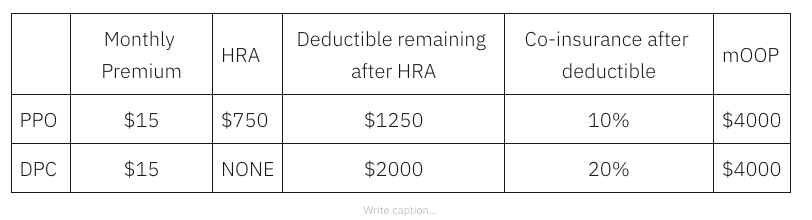
The school district’s 10% coinsurance rate for the PPO predates the arrival of the Nextera option. The school district also has a Kaiser Permanente plan that includes 10% coinsurance. The school district created the unique 20% coinsurance rate for Nextera DPC patients to help fund the added primary care investment involved. Here’s how that benefit structure impacts employees expecting various levels of usage in an coming year.
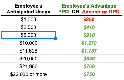
As the image above shows, Nexera reported $5,000 per year is as an average utilization level for an employee member of the district; an employee expecting $5000 in utilization can gain over $900 dollars by rejecting Nextera. Every penny of that advantage for the employee comes out of the employer’s hide — and then it shows up in Nextera’s table as a Nextera win. A employee with moderately heavy utilization – but still only about twice the average and still far short of her mOOP— might even hit the jackpot of shifting $1787 from her pocket to the employer, simply by rejecting Nextera. Heavier utilizers, those who surpass their maximum out of pocket – will all gain at least $750 by rejecting Nextera.
This benefit design pushes a large swath of risky, costly patients away from Nextera.
But that tells only part of the story. As if pushing unhealthy patients away by increasing cost-sharing does not do quite enough to steer low risk patients to Nextera, a difference between employee share of premiums specifically drives children into the Nextera cohort. A Nextera employee pays $1600 less per year to add coverage for her children than she would pay to have the same kids covered in the non-Nextera plan. About 24% Nextera population is under 15 years old, versus about 13% for the other group. On the other hand, those 65 and up are four times more likely to reject Nextera. The overall Nextera population is about 6.5 years younger on average as a result.
And notice that even after Nextera starts with a younger, healthier pool, those who elected Nextera will face vastly more cost-sharing discipline under their benefit plan than their PPO counterparts. They can be expected, in aggregate, to consume less. They will have lower “induced utilization”. Per the Milliman team, this should be considered by those evaluating the impacts of DPC.
If the employer’s claims costs are adjusted for both (a) the youth and health risk difference between Nextera and non-Nextera populations, and (b) the confounding effect of induced utilization, Nextera’s cost savings brag will likely be shredded.
Indeed, we have good reason — from from Nextera’s own previous study of the exact same clinic — to suspect that a population risk-adjustment of more than a third is quite likely. Adjust the Nextera brag by that third and the savings will not simply vanish, they will turn into increased costs.
In this regard, moreover, a 2016 Society of Actuaries commissioned report, explained that all the available risk adjustment models failed to completely compensate for adverse selection. Ironically, their selection of a “highly adverse” population for evaluating the performance of the major risk adjustment methodologies was one with a claims cost history that was 21% higher than the average. In Nextera’s earlier self-study of the same clinic, the prior claims cost history of the non-Nextera cohort was an astronomically adverse 43% higher than the Nextera cohort.
Update: October 22, 2020. So now Nextera has published an extended account of its SVVSD program. It’s here here.
(It was “there” before Nextera sent down the rabbit hole its claim that a Johns Hopkins research team had done the cherry-picking analysis; that claim persists in this slide.)
A video version, here.
I initially replied here , here , here and here.
My extended reply in manuscript form is here.
Medi-Share gives its Christian take on DPC downstream cost savings: $31 — a year.
Christian Care Ministry (“Medi-Share”), whose 400,000 members account for more than a quarter of health cost sharing members nationally, recently acted to allow some of its members to receive credit for their entire direct primary care membership fees up to $1800 per year.
That there is a certain synergy between DPC and health cost sharing plans is testified to in countless instances of mutually interested cross-promotion. But in the end, these are separate economic entities with their own bottom line financial needs.
Precisely because direct primary care entities refuse to work with actual insurers, we do not have much data from insurance companies from which we glean what their actuaries think DPC might be worth.** But a multi-billion dollar, 400k member cost-sharing entity, even if “non-insurance”, needs actuarially skilled professionals to make ends meet. So, when a major cost-sharing ministry rewards direct primary care members with a financial incentive, that may tell us what insurance companies will not.
Tell us what you really think, Medi-Share!
Only one of Christian Care Ministry’s options offers DPC benefits. That plan comes with a $12,000 annual Annual Household Portion (“AHP” is ministry-speak for “deductible”), but it allows its members to apply the full amount of their direct primary care fees toward that AHP. That could be as valuable as lowering an annual deductible from $12,000 to $10,200.
And we can easily estimate the actuarial value of that reduction. Here’s a screen shot from the Colorado ACA plan finder for 2020 for the premiums paid by a 38 year old Coloradan for two Anthem plans that differ only by $2150 in deductible. It costs $2.62 a month to reduce an annual deductible from $8150 to $6000. Necessarily, a reduction of $1800 a year cost less. As well, a reduction of any amount of deductible downward from a higher starting point will have a lesser value than that same amount from a lower starting point, i.e. , Medishare’s $1800 reduction downward from its $12,000 AHB is actuarially worth less than an $1800 reduction down from Anthem’s $8,150.
So there it is. $31 a year.
Wow. In a DPC with a $90 a month fee you’ll be spending twice as much on primary care as the average person using fee for service, but your downstream care savings are estimated by Medishare to be worth a whopping $3 a month on downstream care. It’s like getting one $1500 ED visit for free — every forty years or so.
** On the other hand, we do have the word of the former CEO of the now-defunct Qliance DPC to the effect that, for some presumably nefarious reason, insurance companies were not appropriately responsive to Qliance studies that claimed 20% overall cost savings.
HSA breaks for DPC defeat the purpose of HSA breaks
HSAs are intended to encourage more cost-conscious spending by placing more of the health care financing burden on out-of-pocket spending by the users of services, as opposed to having the costs of those services incorporated in payments shared over a wider group of plan enrollees regardless of service use. H/T Blumberg and Cope. HSAs are a legislative response to a problem in health care economics that occurs when “consumer demand for health care responds to the reduced marginal cost of care to the individual”. As clarified by Mark Pauly in 1968: when the cost of the individual’s excess usage is spread over all payer-members of a group, the individual is not prompted to restrain her usage.
In direct primary care subscription medicine, there is a marginal cost of zero for every medical service the individual consumes. All demanded units of DPC covered medical services are paid by monthly fees collected from each member, regardless of that member’s service use.
That’s precisely opposite to the reason for HSAs.
The HSA tax break exists to get patient-consumers to commit to putting more “skin in the game” through a specified, high level of deductible; the legislative designers forbade participants from “taking skin out of the game”, i.e., from defeating the legislative purpose by taking a second “health plan” that reduces that commitment and the effective burden of that deductible. This is why it is perfectly clear that secondary coverage (e.g., as a dependent on a spouses plan) is HSA-disqualifying.
The undefined words “health plan that is not a high-deductible health plan” in the HSA legislation should be interpreted to include any health payment arrangement, including direct primary care, that lowers the incentive high deductibles provide to restrain utilization. IRS’s interpretive discretion does not extend to undermining the design and intent of HSA legislation.
DPC advocates’ brag about how “there’s never a deductible”, no matter how many covered primary care services a patient actually utilizes. That’s exactly why paying DPC fees is incompatible with the reason for HSAs.
A benefits attorney retained by some DPC clinics has opined that the IRS should allow DPC subscribers to use HSA because DPC “complements” high deductible insurance. But Congress obviously intended a very specific health care payment model for complementing the coverage provided by high deductible insurance coverage — high deductibles!
Helping those patients most dependent on DPC means defeating the DPC/HDHP/HSA “fix”.
Plus, two more reasons to reject the “fix”.
Direct Primary care clinicians and advocates often point out, accurately, that they serve a broad socio-economic range of patients. The range is well illustrated by a pair of oft-appearing themes, “concierge care for the middle class” and “affordable care for those who fall between the cracks”. In turn, the themes are reflected in two almost polar opposite insurance profiles for each of which DPC presents a solution: those in the middle class with sound, high-deductible insurance policies and those with low incomes for whom standard health insurance of any form is beyond their limited means.
The uninsured are not a tiny sliver of DPC subscribers. A recent survey put their numbers at about a quarter of DPC patients, and many DPC docs say 30-40% in their own practice. Indeed, a January NPR piece on the use of DPC by HDHP holders immediately prompted the DPC Alliance to vigorously advise the public that the economically disadvantaged are the “focus” of quite a few direct primary care practices.
The middle class HDHP group predominantly join DPC for mixed reasons of economy and concierge-like convenience, making a relatively good situation even better. Many of them — surely those with the most discretionary spending ability — are able to save. The low income uninsured on the other hand, enter DPC subscriptions to make the best of a bad situation, and they have essentially nothing to bank.
The Primary Care Enhancement Act and similar initiatives seek to provide substantial tax subsidies for direct primary care subscription fees, but these flow only to those who have BOTH high deductible health insurance plans AND enough spare income to facilitate actual savings accounts. But this kind of “fix” does less than nothing to those on the other side of the income/insurance divide; for them, the “fix” actually makes things worse.
Economics 101 teaches that government subsidies increase the price of the subsidized goods or services. The middle-class DPC members with insurance may, or may not, see net benefit from a subsidy; since the supply of family physicians is tight, most of the subsidy will probably flow to the providers as increased subscription fees. In any case, what low income DPC members will get from a “fix” is higher subscription fees.
Already priced out of standard insurance and forced into direct primary care, they will be pressed even harder. And some will find themselves forced out of direct primary care.
Subsidies for middle class savers (and/or their DPC physicians) may or may not be warranted by the purported virtues of direct primary care. But subsidies that are directed toward DPC’s financially soundest subscribers should not come at the cost of pushing DPC’s most financially desperate and loyal patients out of their best chance of quality care. Almost any other way of investing federal resources in DPC would be more fair and better targeted.
Do no harm.
But wait, there’s more.
Bonus # 1: The DPC/HDHP/HSA fix aggravates an income inequity among the insured population that is already baked into the DPC cake.
The signal feature of the DPC world is that direct primary care clinics do not take insurance, so entry is overwhelmingly on a cash only basis. DPC is effectively unavailable to anyone who is insured but does not have the financial resources to buy an additional layer of primary care services that neither draws insurance reimbursment not get credited against a deductible. By the same considerations, DPC becomes increasingly available as the income ladder is ascended.
When that socioeconomic reality is coupled to DPC emphasis on small patient panels and easy access, the resemblance of DPC to concierge medicine undercuts any argument for relaxing HSA rules on DPC. In fact, the HSA break amounts to a regressive subsidy that supplements funds being spent on DPC; this has the effect of growing the rate at which DPC becomes increasingly available as the income ladder is ascended. An HSA break brings DPC closer to concierge care.
Bonus # 2: the DPC/HSA fix aggravates the rural health care provider shortage
DPC advocate claims of being all things to all men sometimes take the form of, “DPC is the best hope for primary care in rural areas.” But the effect of a DPC/HSA fix will be to drive DPC physicians toward areas where middle class HDHP savers are in large proportion and away from rural areas where there are plenty of the poor and disproportionately few in the middle class.
DPC subscriptions transfer financial risk.
Identifying DPC nonsense does not require a law degree.
Watch out. Near you is a direct primary care advocate begging a legislator or regulator to make his medical practice less accountable. He is stomping his feet very, very hard and he’s shouting “This is not insurance”, “There is no risk being transferred”, or “My practice is not a ‘risk-bearing’ entity”.
This is not rocket science.
Question Set #1:
A. The day before I enter into a direct primary care contract, am I at risk of falling while out on a walk, spraining my ankle, and wounding myself by falling on a sharp object?
B. The day after I enter into a direct primary care contract, am I at risk of falling while out on a walk, spraining my ankle, and wounding myself by falling on a sharp object?
Answer Set #1
A. Yes.
B. Yes.
Question Set #2
The day before I enter into a direct primary care contract, am I at financial risk of having to bear the costs of primary care services needed to treat the consequences of my falling while out on a walk, spraining my ankle, and wounding myself by falling on a sharp object?
The day before I enter into a direct primary care contract, is any direct primary care physician at financial risk of having to bear the costs of primary care services needed to treat the consequences of my falling while out on a walk, spraining my ankle, and wounding myself by falling on a sharp object?
Answer Set #2
A. Yes.
B. No.
Question Set #3
A. The day after I enter into a direct primary care contract, am I at financial risk of having to bear the costs of primary care services needed to treat the consequences of my falling while out on a walk, spraining my ankle, and wounding myself by falling on a sharp object?
B. The day after I enter into a direct primary care contract, is my direct primary care physician at financial risk of having to bear the costs of primary care services needed to treat the consequences of my falling while out on a walk, spraining my ankle, and wounding myself by falling on a sharp object?
Answer Set #3
A. No.
B. Yes.
Question Set #4
A. If on the day before I entered into a direct primary care contract, I was the one at financial risk of having to bear the costs of primary care services needed to treat the consequences of my falling while out on a walk, spraining my ankle, and wounding myself by falling on a sharp object and on the day after I entered into a direct primary care contract, my direct primary care physician was the one at financial risk of having to bear the costs of primary care services needed to treat the consequences of my falling while out on a walk, spraining my ankle, and wounding myself by falling on a sharp object, had there been a transfer of the financial risk of having to bear the costs of primary care services needed to treat the consequences of my falling while out on a walk, spraining my ankle, and wounding myself by falling on a sharp object from me to my direct primary care physician?
B. How many heads of direct primary care advocates just exploded?
Answer Set #4
A. Yes.
B. Many.
The State of New York has the financial capital of the world, has the most insurance companies in the country, and was the biggest state for the longest time. For these reasons is generally looked to for leadership in the law on financial subjects primarily governed by state law. Here’s how they define an insurance contract.
(a) In this article: (1) “Insurance contract” means any agreement or other transaction whereby one party, the “insurer”, is obligated to confer benefit of pecuniary value upon another party, the “insured” or “beneficiary”, dependent upon the happening of a fortuitous event in which the insured or beneficiary has, or is expected to have at the time of such happening, a material interest which will be adversely affected by the happening of such event.
(2) “Fortuitous event” means any occurrence or failure to occur which is, or is assumed by the parties to be, to a substantial extent beyond the control of either party.
Every other state has the same core idea of an obligation dependent on a fortuity.
Bonus round (advanced players only).
A. A municipality in the western corner of South Carolina self-insures to cover the costs of its employees’ health care. To meet part of its commitment to its employees it engages a group of primary care physicians who call themselves Western South Carolina Capitated Access MD. The employer pays them a fixed monthly fee for each employee who wishes to be a clinic patient in exchange for as much primary care as each such employee may need during the covered period. Is that capitation?
B. A municipality in the western corner of South Carolina self-insures to cover the costs of its employees’ health care. To meet part of its commitment to its employees it engages a group of primary care physicians who call themselves Western South Carolina Direct Access MD). The employer pays them a fixed monthly fee for each employee who wishes to be a clinic patient in exchange for as much primary care as each such employee may need during the covered period. Is that capitation?
Answers:
A. Yes.
B. Yes.
For pretzel lovers: For DPC advocates’ views on risk, capitation, and direct primary care, see this tweet thread and this one. For more DPC advocate double talk in this genre, extended to address adverse selection, try this masterpiece. See discussion here.
DPC cherry-picking: the defense speaks. Part 2.
Update: In the fall of 2020, KPI Ninja released the first study that relies on it’s new risk information technology. I find it sadly opaque.
Recap of Part 1
The direct primary care community has long tried to support claims that DPC reduces overall health care costs by 20% to 40% with non-risk-adjusted cost-reduction data drawn from employment health plans that allowed employees to elect between DPC and FFS primary care options options. But the first and, so far, only time that independent, neutral, certified professional actuaries looked hard at such a program, careful risk-adjustment showed that the savings claimed were merely an artifact of heavy selection bias. A DPC poster child, the Union County employer program — previously lauded for its claimed 23% cost reduction — was shown by Milliman Actuaries to have had a DPC cohort so young and healthy that it explained away all the observed cost savings.
Any reasonably informed employer or policy maker facing claims about the cost-effectiveness of direct primary care should insist that DPC provider boasts be scrutinized for evidence of selection bias.
In my last post, I noted that the DPC advocacy community has not even bothered to address the simplest of selection bias indicators, the younger average age of DPC cohort members compared to their FFS counterparts. I also noted that Milliman Actuaries have an age/gender risk-adjustment model1 and considered using it for the Union County study.
I further noted that in its Union County study, Milliman relied on a more complex model (“MARA-Rx”) which consider age, gender, and various therapeutic classes of prescription medications used by DPC and FFS group members. Milliman’s Rx risk-adjustment methodology, like its other risk adjustment models, was developed and validated as a health care cost predictor using health care cost data for millions of patients. There is nothing I can see, and nothing in the literature, to suggest that the Rx model has any inherent features that would unfairly penalize a DPC cohort in a studied DPC option employer health plan. As yet, no one in the DPC community has objected to Milliman’s use of the Rx methodology to assess the Union County DPC program, or to its future use in evaluating any other similar program.
There are even more complex and expensive methodologies, like MARA-Cx, that add diagnostic data harvested from payment claims to the factors used in MARA-Rx. In the Part 1 post, I also mentioned an arguably surprising difference in approach to selection among risk-adjustment methodology between Milliman Actuaries, who have no financial interest in the direct primary care movement, and KPI Ninja, a data-analytics group closely connected to the direct primary care movement. Both Milliman and KPI Ninja concurred that risk adjustment methodologies like “Cx” are likely to understate risk score for DPC cohort members because direct primary care physicians do not file claims.
KPI Ninja pointedly laments this “donut hole” in the claims-based data. But there is no anti-DPC donut hole in Rx based risk adjustment methodology.2
Although it possesses a fully-validated claims-based risk adjustment methodology (“MARA-Cx”), Milliman’s common-sense response to the data donut hole problem was to set that Cx methodology aside and determine risk-scores for the Union Count cohorts using only the Rx age/gender/prescription drug methodology. Like Milliman, KPI Ninja has access to risk-adjustment software engines that have equivalents, in a package known as ACG®, to both Rx and Cx. Unlike Milliman, KPI Ninja seemingly rejects Rx methodology and, instead, embraces Cx type methodologies that have the very donut hole KPI Ninja laments.
Why complain about the donut hole in Cx, then reject Rx which has none, and then return to and embrace Cx? Might it be precisely because KPI Ninja knows that Rx based risk adjustment will produce results that are sound, but not happy, for its cherry-picking DPC clients? On the other hand, when convenient, a donut hole can first be performatively disparaged as biased, then filled with custom data products developed by KPI Ninja to tell stories more to DPC’s liking.
Context: DPC docs feel coding makes their patients sick.
Direct primary care practitioners avoid third-party health care payment of claims and the (often digital) paperwork that accompanies it. While the logic of subscription practice renders coding procedures for reimbursement unnecessary and, therefore, a target of scorn, D-PCPs also disdain the type of recording of diagnostic codes that attend claims for third-party reimbursement.
Here’s what Dr Jeff Gold, a co-founder of the Direct Primary Care Alliance, had to say in a post entitled, “ICD-10: It’s Nice Not Knowing You.”
This is nothing more than another layer of bureaucratic red-tape that does nothing to enhance the quality or cost of your care, but rather furthers the disease process. All it does is waste more of your physician’s and office staff’s time – time that should be spent working towards your care. . . .
Luckily for us [Direct Primary Care doctors], we have nothing to do with this nonsense. [Emphasis supplied.]
ICD-10: It’s Nice Not Knowing You
Tell us how you really feel, Dr Gold.
DPC doctors, in other words, not only decline to file claims and code their procedures, they also hold industry standard diagnosis coding in fiery contempt. As a result, the donut hole problem can not be solved by simply collecting DPC patient diagnosis codes from their direct primary care physicians.
Enter KPI Ninja — with balm for DPC’s abstinence
Missing data reduces population risk score. Meaning it will look like you are treating healthier patients in the eyes of those who use these risk scores (employer data vendors, brokers, health plans) … aka they can argue that you are cherry picking.
KPI Ninja Blog Post: Claims vs. EHR data in Direct Primary Care
While the details remain murky, KPI Ninja seemingly plans to meet cherry-picking charges by filling the donut hole with information somehow scoured from such EHR records as direct primary care doctors may have.
But how?
In theory, KPI Ninja could develop a way to reverse engineer a DPC’s EHR entries and other information to generate the diagnostic codes upon which the DPC physician would have arrived had she not thought that participation in diagnostic coding was wasteful. How proceeding “backwards” to arrive at codes would result in any less waste is difficult to image, so that effort strikes me as misguided.
In any event, validation of a reverse engineering model would likely require resources beyond those of KPI Ninja and the DPC advocacy community. It would also likely require the participation of a control group of D-PCPs willing to do extensive coding.
However, for physicians like Dr Gold who have identified ICD-10 coding as “furthering the disease process”, such participation in a coding control group would be an ethical violation; it would “do harm”. Furthermore, if Dr Gold is correct, the members of a patient panel studied in such an experiment would have to give informed consent.
Furthermore, to whatever extent EHR mining for diagnosis codes omitted by a D-PCP produces fully accurate risk codes for members of a DPC cohort, the same mining techniques should be applied to the EHRs of FFS patients to correct any omissions by FFS-PCPs. What’s sauce for a DPC goose is sauce for an FFS gander.
Finally, fair implementation of a model in which diagnosis codes for risk scoring are derived from DPC-EHRs for comparison with diagnosis codes from FFS-claims would require safeguards against the DPCs deliberately larding EHR’s with entries that result in up-coding, just as FFS-claims data is subject to procedures to check up-coding. Again, goose/gander.
Perhaps, KPI Ninja merely has in mind developing a direct method of converting mined EHR data into risk factors that are not directly commensurate with those from diagnosis-based risk models, but that are instead presented to inquiring employers and policy-makers as an alternative model of risk-adjustment.
Precautions would still apply, however. If EHR data on, say, biometrics or family history is brought in demonstrate that the DPC population is less healthy than average, a knowledgeable employer should insist on counterpart data from the EHRs of FFS patients.
A recent addition to KPI Ninja’s website suggests their emphasis may rest on pre-post claims comparisons. It will of course be important to include pre- and post- data on DPC patients and their FFS counterparts. That will be somewhat revealing if the pre-choice claims data for the two populations are similar. But if the results of the Milliman study are representative, that will most likely not be the case.
In the more likely event of a higher level of prior claims in the FFS population, any “difference in difference” analysis of pre-post claims between DPC and FFS populations will still require an attempt to see whether the FFS higher “pre” claims might be accounted for by intractable chronic conditions. Such a finding would impeach any inference that DPC group pre-post gains can simply be projected onto an FFS group. And such a finding seems likely, if the Milliman actuaries were correct to ascribe selection bias to the tendency of the ill to stick with their PCPs; a “sticky” relationship to a PCP seems quite likely to correlate “sticky” chronic health conditions that bind the patient and the PCP.
Further explication from KPI NInja as to how its plans will work was said to be forthcoming. I appreciate the insights they have given in the past, and look forward to learning from them in the future.
There are many risk adjustment software packages available from neutral academics, accountants, and actuaries. They can be expensive; even access to the packages supplied by CMS for use by insurers participating in the Affordable Care Act run a bit over $2 per enrollee per year. Importantly, some of the packages rely on proprietary algorithms, but nonetheless tend to be generally transparent. In most cases, however, these packages come from neutral academic or actuarial sources.
Per se, I fault DPI Ninja neither for its close connection to the DPC industry nor for offering to DPC clinicians the best “risk adjustment” bang that can be generated from the least record keeping buck. To the extent that DPI Ninja delivers DPC data that is generally transparent in its methods and assumptions, that work will speak for itself. Should DPI Ninja lay on data produced by secreted assumptions and methodology, however, it should expect that its business relationship to DPC will affect the credibility of that data.3
Update: In the fall of 2020, KPI Ninja released the first study that relies on it’s new risk information technology. I find it sadly opaque.
For completeness, two parting thoughts.
First, none of foregoing is intended to deny that membership in a direct primary casre practice can significantly reduce usage of emergency departments. Of course it can! The question is what does it cost to avoid such visits. It is very rare for United States Presidents to go to emergency rooms as there’s always a doctor within a few hundred feet. DPC docs are easier to reach at odd hours and are more available for same day visits. They have fewer patients, and that costs a lot more money per patient.
Second, I have discussed in many posts the many sources of selection bias. Use the search item in the menu to find example using words like “selection”, “bias”, or “cherry”. It’s real and the only truly debatable proposition is whether DPC advocates who deny it are unintentionally fooling themselves or deliberately fooling you.
1 A college freshman IT student could probably develop an age/sex risk adjustment engine and apply it age/sex data from paired DPC/FFS cohorts over a weekend. If DPC clinics don’t report age/sex/risk comparisons with their FFS counterparts, it’s because they know full what the results would show.
2 It may even be that Rx metholodogy favors DPCs.
I expect to hear soon that Rx risk adjustment discriminates in favor of “bad”, overprescribing PCPs by making their patients seem sicker than those of “good” doctors who never overprescribe. But this can become an argument that Rx discriminates against DPC if, and only if, it is also assumed that DPC has fewer “bad” overprescribers than does FFS. There is no clear factual basis for assuming, in essence, that DPC doctors are simply better doctors and prescribers than their FFS counterparts.
If anything, DPC self-promotion suggests that Rx data would be skewed, if at all, in the opposite direction. DPC advocates regularly claim that DPC avoids expensive downstream care by better discovering illness early and managing chronic conditions better, by coaching patient compliance and by lowering the cost of medications. Another recurrent theme among DPC advocates is that FFS doctors rely too heavily on specialists; but, if true, FFS cohort patients would be more likely that DPC patients to have over-prescription “wrung out” of their regimes. In these ways, applying a risk adjustment methodology based on prescription medication data, DPC’s own bragging suggests that any donut hole is likely to make the FFS cohort appear healthier.
3 The following fairly new statement on KPI NInja’s website does not bode well, suggesting both secrecy and a predetermination of an answer favorable to DPC.
“We analyze historical claims data from self-insured employers by utilizing our proprietary algorithms to identify cost savings and quality improvement opportunities. Get in touch to learn more about how we can help show your value to employers!”
DPC cherry-picking: the defense speaks. Part 1.
Within days of the Milliman report warning of the “imperative to control for patient selection in DPC studies [lest] differences in cost due to underlying patient differences [] be erroneously assigned as differences caused by DPC”, the first rumbling of resistance from the DPC advocacy community emerged. This was a suggestion, addressed to one of its authors, that the Milliman study may have treated the direct primary care employer unfairly.

KPI Ninja also reached out to me. After some initial misunderstanding on my part, and subsequent examination of KPI Ninja’s online published material on this subject, I reconstruct my understanding of KPI Ninja’s argument in the immediately upcoming section. For reasons discussed in the next following section, I have concluded that KPI Ninja’s argument, although not without insight, simply does not apply to the risk-adjustment methodology used in the Milliman study itself. Thereafter in this post, I begin to respond more broadly to the KIP Ninja critique and to the not-yet fully visible “remedy” it is apparently developing. I will conclude in a subsequent post.
KPI Ninja’s Donut Hole Concept
Some data used in some risk-adjustment methodologies are diagnostic data harvested from claims, including both primary care and downstream care claims. The risk that manifests itself in downstream claims properly counts in evaluating a patient’s risk, whether the patient is a DPC or an FFS patient. But a problem can arise (a”donut hole” in KPI Ninja’s lexicon), in situations where some PCPs have success at averting downstream claims. If the patient is in an FFS practice, the practice is scored as bearing any risk factor appearing in the primary care claims submitted by the FFS PCP. FFS practices, in essence, get fair credit for their good work in avoiding downstream claims. On the other hand, D- PCPs do not file primary care claims; as a result DPC patients risk factors go unrecorded when not reflected in downstream claims; DPC docs therefore do not get proper credit for their good works.
In the upshot, DPC patients look relatively less risky than they really are. On this analysis, risk-adjustment by claims dependent methods of two equally risky panels of DPC and FFS patients will inevitably disfavor DPC.1
The Milliman study of DPC used risk-adjusment that had no donut hole.
There are ways of evaluating population risk that do not depend on harvesting diagnostic data from physician claims, methods for which there is no claims associated donut hole. Milliman itself, based on experience with millions of people, developed and validated at least two methodologies that do not require claims data: one (age/sex) determines risk factors based only on the age and gender characteristics of the populations being compared; a second (Rx) adds, to age and gender, additional patient information about the usage of different therapeutic classes of prescription drugs. Under the Rx methodology, claims are not looked at; DPC and FFS docs get the same “null credit” for every prescription drug avoided through their primary care work.
Of course, Milliman also has a claims based risk-adjustment methodology (Cx). For its study of Union County’s direct primary care option, Milliman carefully considered using the Cx methodology and, precisely because they identified the donut hole, expressly rejected it. Milliman also considered using its age/gender risk adjustment methodology , but decided to use its more granular RX methodology.2
Simple, lost cost risk-adjustments are affordable for modestly sized employers
The beauty of an age/gender risk-adjustment is that it is straightforward. Nor is it doomed to failure by its simplicity. Over three-fourth of persons under the age of 65 lack any diagnosis consider significant for risk adjustment carried out under the Affordable Care Act. Nor is it likely to be expensive; it is definitely not rocket science. A college freshman just learning how to use a spreadsheet could fire it off in an hour, if pointed to a readily available table, and a data set with each employee’s age and gender.3
In its own published “research”, one of the larger DPC groups (Nextera) used raw total claims from an immediate pre-DPC period as a basic risk adjustment methodology for employer DPC and non-DPC groups claims data for the period following the creation of the DPC option. Those choosing Nextera had vastly lower prior claims.4
Dan Malin, a TPA exclusively serving small employers, addressed a 2019 DPC Summit forum on employer DPC with about 100 attendees present. He claimed that his firm could calculate the medical consumption of that group for a coming year to within five or six percent by having each fill out an ordinary health insurance application.
Has an employer-option DPC cohort ever been OLDER than its FFS counterpart?
Or ever entered a DPC option with a HIGHER prior claims experience?
But DPC advocates could go some of the way long way toward reassuring ordinary employers by demonstrating measurable similarities between cohort members being studied. Say, for example, that a DPC group had virtually the same claims as an FFS group in a claims year prior to creation of a DPC option. Unfortunately, for some reason, whenever these type of comparison have been made, the DPC cohort has turned out to to have had a history of smaller pre-DPC claims. This might be because, as Milliman warned, direct primary care is a cherry-picking machine.
As one DPC thought leader has pointed out, “larger direct primary care companies like Qliance, Paladina, and Nextera have repeatedly reported 20% plus savings for employers using the DPC model. Many smaller employers have found similar savings [].” If those selecting DPC were equally likely to be older or younger than their FFS counterparts, the chance that even as few as ten5 such studies would each have had younger DPC populations would be less than 0.1%.
Alas, for some reason, there are no known reports of a DPC cohort being older than its FFS counterpart. Also, perhaps for some related reason, it often appears that employer DPC cohorts are younger than their FFS counterparts.
In some cases, DPC advocates make an effort to show that a presumably large percentage of a DPC cohort have multiple chronic conditions, but reliably matched data from the corresponding FFS counterpart cohort has not, to our knowledge, been reported. Indeed, a DPC advocate promoting the very poster-child clinic studied by Milliman once sarcastically dismissed the idea of cherry-picking by pointing to the chronic conditions of the DPC’s patients — while noting that “control group data is not available”. Really! Since Milliman presented that very control group data in May, we’ve heard no comment by that author.
Does any of these methods have any significant built in distortion against direct primary care? Does direct primary care make younger? Did receiving direct primary care in one year lower claims costs for the preceding year?
Footnotes
1 A masterful extention of that argument came in a tweet from one DPC thought leader, who was asked about the lack of risk-adjustment in a just-published savings claim for his own DPC practice. He invited the inquirer to consult DPI Ninja “or spend $100,000 to prove them right or wrong.” Is this how he plans to answer employers who’ve read Milliman’s advice for employers?
2 Interestingly, Milliman recorded that adjustment using Rx in this particular case was more favorable for DPC than using age-sex adjustment.
3 Virtually every direct primary care clinic in the country has chosen an even simpler path when using age only to establish a variable, usage-anticipation- component for its monthly fee DPC schedule.
4 The employees who chose Nextera’s direct care had, on average, historical prior claims that were 30% less than those who declined direct primary care. Interestingly, Nextera sought to rely on a “difference in difference” analysis, but intertemporal claim comparisons of that sort fail if, for example, the declining groups higher “pre” claims can be accounted for by intractable chronic conditions, something that seems entirely likely.
5 At the moment of commencement of DPC Summit 2020, a least ten such studies of employer option DPC have been publicized. At least one additional study seems likely to appear on July 18, 2020. I wonder if the study results reported will include a comparison of the average age of the two cohorts.
Milliman: A $60 PMPM DPC fee buys an employer a zero ROI.
An actuarial study brings employer direct primary care to a turning point.
Milliman’s actuaries insisted that DPC cost reduction data without risk adjustment is essentially worthless. A second prong of Milliman’s analysis suggested that the direct primary care model is associated with a 12.6% over-all reduction in health services utilization*. Then, working from that number, Milliman went on toward a third suggestion: that an employer who buys into DPC at an average price of $60 PMPM would likely have an ROI of zero.
That is not a very good deal for either an employer or a DPC practice.
For an employer, entering into a break even deal would mean foregoing other investment opportunities, while incurring inconvenience of change and probably a loss of good will from a number of employees who might be, or feel, forced or financially pressured into a narrow primary care network. Why bother?
For a DPC provider, $60 PMPM works out to $432,000 per year for the patient panel of 600 members that DPCs like to brag about. But an average PCP compensation package in, say, Anderson, South Carolina comes to about $276,000. That leaves about 36% of revenue for all overhead. That’s not much.
The American Academy of Family Physicians tells us that overhead for family physician practices runs around 60% of revenue. The most recent peer reviewed study of the subject (2018) indicated billing and insurance (BIL) costs for primary care came out 14.5% of revenue. A somewhat earlier peer reviewed study came near this, finding that physician practices had BIL costs of about 13% of revenue. Even if, say, 15% of revenue can be eliminated in direct pay, D-PCPs could still expect overhead to be 45% of revenue.
In the direct primary care employer clinic, moreover, billing costs do not fall to zero; patient rosters need to be kept up to date, matched to employer records, and processed. In addition, most direct primary care physicians also provide a significant measure of separately paid goods and services for which an employee, employer, employer’s insurer, or a TPA may require documentation and billing. Moreover, much of the data attributed to billing and insurance costs in an FFS setting has a counterpart in direct primary care collection of metrics needed to demonstrate value to an employer.
Accordingly, even for a non-insurance direct primary care clinic, overhead of 36% of revenue is scanty.
At the same time, DPC practitioners have — and regularly express — a very high opinion of themselves and the care they give. As group, they seem distinctly unlikely to settle for merely average levels of compensation.
The most profitable path forward for direct primary care is to persuade employers that paying PMPMs over $60 will do more than break even. Historical brags, based on data that was not adjusted for risk, claimed employer savings from 20% to 40%. A DPC thought leader recently published a book on employer DPC that collected references to such seven studies, including one that claimed to have reduced employer costs by 68%.
Now that real actuaries have weighed in, those days are numbered.
* I believe that Milliman’s 12.6% figure vastly overestimates the reduction in health services utilization association with direct primary care. As explained here, DPC may even result in an increase in health services utilization. Is it really plausible that taking a scarce resource — the time of PCPs — and spreading it thickly over tiny patient panels would NOT result in net economic loss?
Downstream consequences when employers fall for non-risk-adjusted data brags.
Do you remember when Union County’s three year DPC commitment for 2016-2018 was claimed to be saving Union County $1.25 Million per year? So why did Union County’s health benefits expenditure rise twice as fast as can be explained by the combined effect of medical price inflation* and workforce growth?

For the first year or two, a clinic owner in an employer DPC option may get away with presenting the employer with data brags that package selection bias artifact as DPC cost-effectiveness. The wiser employers will figure selection bias out before making the mistake of tossing all their employees into direct primary care based on non-risk-adjusted data.
For those employers who do not figure this out, it will be interesting to watch the DPC clinics adapt to the influx from the sicker, older population. Better, it will be outright fun to hear DPC clinic owners explain why having more employees in their clinic led to an increase in PMPMs for DPC patients. Since it will be hard for them to suddenly come to Jesus on the cherry-picking issue, where will they turn? Probably to blaming a combination of Covid-19, insurance companies, and Obamacare.
*For medical cost inflation I used the Bureau of Labor Standards medical goods and services marketplace statistics. I thank economics student D.S. for pointing out that in the employer insurance sub-market the rate of increase was higher. Kaiser Family Foundation’s annual Employer Heath Benefits Survey data indicate that for the period 2015-2018, costs increased 11%. Substituting 11% from KFF for the 8.5% from BLS, I compute that the 47% increase in Union County was not 200% of that expected, it was a mere 175% of that expected.
Of course, I might have attempted a narrower focus. I fully realize that the average increase might have been different for North Carolina employers, or for county employers, or for county employers in North Carolina. Then, too, there counties named Union in a total of 17 states. I confess that I deliberately refused to determine the employer health coverage cost inflation rate for the other 16 Union Counties. Life is short.
It might also be the case that bringing DPC to Union County created such great opportunities for affordable health care that DPC employees married at a higher rate, and decided to have more children. And, of course, the presence of DPC might have helped Union County recruit a large tranche of new employees with enormous families.
Medicare, dual coverage, and opt-out. The cherry on top of the cherry-picking machine for employer-based direct primary care.
In 2016, the share of people between 65 and 74 who were still working was over 25%. Any of them working at employers with more than twenty employees covered by group health plans are required by law to be included in the employer’s plan. They may also enroll in Medicare Part B. Some employer plans even require their Medicare-eligible employees to enroll in Part B. When optional for the employee, the choice to add Medicare Part B and have dual coverage is typically made by relatively heavy utilizers looking to meet cost-sharing burdens by having Medicare as a secondary payer.
In any event, elder employees with dual coverage will have low, or even zero, out-of-pocket expenses, whether for primary care visit fees; for the types of services, like basic labs, often included in an employer DPC package; or for downstream care. These elders have relatively little incentive to join DPCs, especially in cases where the employee pays more for a DPC option than for a non-DPC option (such as Strada Healthcare’s plan for Burton Plumbing).
Many with dual coverage will have even more incentive to avoid DPC. A large majority of DPCs, including DirectAccessMD, Strada Healthcare, and many Nextera-branded clincs, have opted out of Medicare. Medicare-covered employees who receive ancillary services that the DPC performs for separate charge will be expected to see that the DPC gets paid, but will receive no Medicare payment for those services. A Medicare-covered employee in Nextera’s St Vrain Valley School District plan, for example, would be denied the ability to have Medicare pick up his cost-share for Nextera’s in-office labs and immunizations, Nextera’s on-site pharmacy, or Nextera’s on-site cabinet of durable medical equipment. Were a dual covered employee to choose the Nextera clinic, she would have to make a point of declining to have Nextera draw her blood work or put her in a walking boot.
Most employer workforces have a relatively small percentage of employees over age 64. But provider health coverage for these elders is apt to be very costly. The employees likely to be most costly are the very ones that will find Medicare Part B’s annual premium of less $1750 a good bet for avoiding cost-sharing burdens like those in Nextera’s SVVSD plan – a $2000 deductible and a $4000 mOOP.
Accordingly, those with dual coverage are likely to be high utilizers of services with nothing to gain from DPC. Or, worse: some will pay more in employee contributions; some will have added costs and/or inconvenience owing to Medicare opt-out by the DPC provider.
These high-cost, dually-covered employees will disproportionately end up in the non-DPC cohort under most employer DPC option plans. And every one of them will skew non-risk-adjusted claims data, contributing to a selection bias artifact masquerading as DPC savings.
Much the same reasoning will apply to other employees who have a secondary coverage, such as being a covered spouse. Dual coverage usually comes at a price, such as a premium add-on for spousal coverage. But the price will often be worth it for high utilizers whose primary coverage has high cost sharing burdens that can be brought to negligible levels. For these high utilizers, the incentives to select a DPC option are minimal, even negative if the DPC option comes with a larger employee contribution.
Finally, whatever the source of secondary coverage, the heavy utilizers for whom it is particularly desirable are also the very people most likely to cling to particular PCPs who have served them well in the past, rather than sign on with a DPC clinic offering a narrow choice.
Two new DPC brags failed to show bona fide risk-adjusted savings; together, they make clear that DPC brags rely on cherry-picking.
Two recent DPC brags fit together in a telling way.
Nextera Healthcare reported non-risk-adjusted claims data indicating that employees of a Colorado school district who selected Nextera’s DPC option had total costs that were 30% lower than those who selected a traditional insurance option. But that employer’s benefit package confers huge cash advantages (up to $1787) on risky, older patients if they choose the non-DPC option.
Comes now DirectAccessMD with a report of non-risk-adjusted claims data that employees of a South Carolina county who select a DPC option have percentage cost “savings” that are less than half of those shown for Nextera, a mere 14% lower than those who selected a traditional insurance option. But that employer’s benefit package design has an opposite effect to Nextera’s, conferring a significant cash advantages on risky, older patients if they choose DPC option. (And, good on the County and the DPC for it!)
Nextera’s program works to push risky, older patients away from DPC; DirectAccessMD’s program welcomes them. Pushing the sick and old away helps boost Nextera’s corporate brag to more than double that of DirectAccessMD who, proudly, invite the same people in — even if it makes them appear less successful.
Even without a fancy actuarial analysis, or even a basic one based on patient demographics, it’s apparent that most of Nextera’s brag is merely selection bias artifact masquerading as Nextera DPC cost-effectiveness.
Is DirectAccessMD’s clinic free of selection bias? Not at all. Selection bias can also arise when older and/or riskier patients make enrollment decisions based on differences in access to physicians of their choice. Older, riskier patients tend to cling to a long-standing PCP rather than select from the relative few offered by DirectAccessMD. Think of this as a primary care form of cherry-picking by narrow-networking .
We have learned that Anderson County’s DPC patients are 2.7 years younger than their non-DPC counterparts. Applying CMS risk adjustment coefficients for age and sex reduces DirectAccessMD’s “savings” from 14% to 2% .
If you would like to bet that the age difference between the two Nextera school groups discussed above is less than 2.7 years, please use the contact form. I’ll be right there.
Nothing huge, but a possible small win for DirectAccessMD cost reduction claims.
The DirectAccessMD clinic that serves the employees of Anderson County, SC, is run by a tireless advocate for, and deep believer in DPC, Dr J Shane Purcell. Here the employer, with Dr Purcell’s apparent support, has taken steps that seems to have somewhat mitigated the selection bias that is baked into most other direct primary care option arrangements. Specifically, the competing benefit plans for county employees have both a lower deductible ($250) and a lower co-insurance maximum ($1250) for DPC patients than for non-DPC patients ($500, $2500). Where other benefit plans structures, like the Nextera SVVSD plan reported here, push higher risk patients away, the Anderson County plan is more welcoming to those patients. I applaud the County and Dr. Purcell.
In fact, a high risk Anderson employee can see more than $1500 per year in added costs if she declines DirectAccessMD. A patient expecting the average utilization seen for the FFS cohort (~$4750) in Anderson County would likely incur about $375 in added costs by declining DPC, where a similar patient in Nextera’s SVVSD plan would have saved $925 for doing the same. Again, this important difference is a feather in Dr Purcell’s cap.
UPDATE: 11/28/2020
In November 2020, we applied CMS’s actuarial value calculator to compare the County’s plans. The traditional plan had an actuarial value of 82%, the DPC plan of 87%. More of this update is set out below.
Yet, as the recent Milliman study suggests, high risk patients may be reluctant to disrupt standing relationships with their PCPs, and may choose to resist other incentives if it means having to select a new PCP from a small panel at a given DPC clinic. Consider also that older employees, even those not at high risk, are more likely than younger employees both to have deeper attachments to their long-standing PCP and to have more disposable income to spend on keeping that relationship going. On average, therefore, we would expect employees who eschewed the direct primary care package to be an older and/or riskier group. Let’s go to the tape.
Not surprisingly, raw data — without any risk adjustment — from the employer indicates a noticeably smaller percentage of purported savings, not adjusted for risk, than has been bragged about by other DPCs in the past. Anderson County’s net cost for DPC members came in at 9% less than for non-DPC members, but the employees in DPC had “OOP” only about half of what their non-DPC counterparts did. Combining both employer and employee costs, the average total spend for Anderson County DPC patients came to about 14% less than for non-DPC patients, purported savings of $56 a month.
But note these warning from the Milliman study: “We urge readers to use caution when reviewing analyses of DPC outcomes that do not explicitly account for differences in population demographics and health status and do not make use of appropriate methodologies.” Or this more recent one: “It is imperative to control for patient selection in DPC studies; otherwise, differences in cost due to underlying patient differences may be erroneously assigned as differences caused by DPC.”
A risk analysis of the health status of all the county’s patients, fully detailed as to all chronic coniditions, may not have been financially feasible for a modest operation like Dr Purcell’s. But a sensible population demographic methodology is at hand: comparing the ages of the two populations and using that as a predictor of utilization. This is certainly a “rough approximation”. But, not only is a rough risk adjustment likely to be better than no risk adjustment at all, the reasonableness of using age as a proxy for predicted utilization is affirmed by the fact that nearly all DPC practices use age-cost bands, and no other risk-based factor, in setting their subscription rates. Basic demographics are at the core of risk adjustments used by CMS for the ACA; over 75% of ACA enrollees in insurance plans under 65 have no adjustment-worthy chronic conditions; they are risk-adjusted on demographics alone.
The coefficients for age/sex risk adjustment used by CMS for ACA plans in 2020 can be seen here. Dr. Purcell’s slide pointing out the DPC cohort of Anderson County employees was 2.7 years younger than the traditional cohort is here. Going back to the tape, I estimated the risk adjusted overall medical costs for the DPC membership to be about 7.1 % lower than for traditional primary care group.
UPDATE: 11/28/2020
A second adjustment points the other way. All other things being equal, richer plans are known to produce “induced utilization”. CMS’s risk transfer machinery applies an induced utilization factor to adjust for benefit richness. As shown on the calculation sheet also linked above, this adjustment would increase employer costs by 3.8%.
This brings a tentative measure of savings, pending more definitive risk adjustment, to about 11 % overall, about $40 PMPM.
Maybe it is not what what Dr. Purcell hoped, but his results are more promising than most others.
The great caveat, of course, is that proper risk adjustment could turn this estimate up or down. In the Milliman study, the difference between actuarial value of the benefit packages of the DPC and FFS programs was modest, yet the Milliman team still found massive adverse selection into the FFS. Milliman accounted for this as the result of sicker people clinging to the trusted PCPs who had served them in the past. I think of that as adverse selection by narrow primary care panel. Whatever the explanation, Milliman found that the selection bias required an overall upward adjustment of 8.3 % of DPC costs; and they predicted that most employer DPC option clinics would see similar. On the other hand, a fairly large difference in benefit packages favoring DPC members, as in Anderson County, is something the Milliman team appears not to have contemplated, and it must surely drive some of the risky into the DPC pool.
I am still not betting on DPC saving big money. But, if you call me with your proposed wager, I’ve shortened the odds.
Do bears sh. . .ake cherries out of trees? Selection pressure is built into DPC choices for any population with a normal deductible.
At last, it dawns on me. Selection bias is baked into virtually every DPC cake.*
Direct primary care usually comes with a significant price and a package of financial incentives revolving around primary care (and, sometimes, around some downstream care). For some, the game may be worth the candle. The incentives, typically the absence of primary care visit cost-sharing and free basic labs and generic drugs, have their best value for those who expect total claims to fall near but still short of their deductibles. These people are relatively low risk.
For those expecting to have total claims that will exceed their deductibles even if they receive the incentives, the dollar value of those incentives is sharply reduced — usually to a coinsurance percentage of the claims value of the incentive. These people have risks levels that range run from a bit below average risk to well above average risk.
The least healthy people have the highest claims. At a next level, and all the way up to the stratosphere, are insured patients expecting to hit their mOOP in an upcoming year. For a typical employer contract, however, these people are not necessarily extreme; for an employee with a $2000 deductible and a $4000 mOOP, this represents a $12,000 claims year. That’s not even a single knee replacement at the lowest cash price surgery center. For these, DPC’s financial incentives have essentially zero financial value.
Higher risk patients have significantly less incentives to elect direct primary care. DPC patient panels are enriched for low risk patients while higher risk patients tend to go elsewhere.
Financial considerations apart, the higher risk patients are also likely to be the ones least interested in replacing established relationship with particular PCPs with primary care from a narrow panel DPC practice. A second reason why DPC patient panels are enriched for low risk patients while higher risk patients tend to go elsewhere.
The upshot: Virtually any employer-option DPC clinic can trot out unadjusted claims data that shows employers having lower PMPMs for DPC patients than for FFS patients. After risk adjustment, however, not so much.
*I recently came across an employer health benefit system that included both a DPC option and cost-sharing features that apparently mitigated selection bias somewhat. But note, in that program, employees who chose to retain relationships with PCPs not affiliated with the DPC clinic paid up to $1250 per year for that privilege. Layouts of that order seem likely to correlate with either profound health impairments or advanced age. I have learned that the non-DPC population at that employer is, on average, two years older than the DPC population. On a standard age-cost curve of ~4.6 to 1, every penny of the difference between the groups can be full accounted for.
CHANGED GRADE: The mixed bag of Milliman earns a final grade: C+
Skillful actuarial work on risk adjustment. A clear warning against relying on studies that ignored risk adjustment. Clear repudiation of a decade of unfounded brags.
An admirable idea on “isolating the impact of DPC model” from the specific decisions of a studied employer.
Milliman should have recognized that the health service resources that go into providing direct primary are vastly more than the $8 PMPM that emerged from its modeling and should have done more to subject the data on which the number rested to some kind of validation.
Upshot: there is still no solid evidence that direct primary care results in a reduced overall level of utilization of health care services. Milliman’s reporting needs to clearly reflect that.
Overview: A core truth, and a consequence.
The Milliman report on the direct primary care option in Union County has significant truth, an interesting but unperfected idea, and staggering error. The core truth lay in Milliman determining through standard actuarial risk adjustment that huge selection effects, rather than the wonders of direct primary care, accounted for a 8.3% difference in total health care costs between DPC and FFS populations. Both Union County and the DPC provider known as Paladina Health had publicly and loudly touted cost differences of up to 28% overall as proof that DPC can save employers money. But naysayers, including me, were proven fully correct about Union County — and about a raft of other DPC boasts that lacked risk adjustment, like those regarding Qliance.1
The estimated selection pattern in our case study emphasizes the need for any analysis of cost and utilization outcomes for DPC programs to account for the health status and demographics of the DPC population relative to a control group or benchmark population. Without appropriate consideration for how differences in underlying health status affect observed claim costs and utilization patterns, analyses could attribute certain outcomes to DPC inappropriately. We urge readers to use caution when reviewing analyses of DPC outcomes that do not explicitly account for differences in population demographics and health status and do not make use of appropriate methodologies
Page 46 of Milliman/Union County study
Still, Union County had made some choices in regard to cost sharing that made some results seem less favorable for DPC than they needed to be. That’s where Milliman’s ingenuity came into play in what might be seen as an attempt to turn the County’s lemon into lemonade for the direct primary care industry. And that is where Milliman failed in two a major ways more than important enough to make the lemonade deeply unpalatable.
The Union County DPC program was even more of a lemon than Milliman reported.
To the Milliman team’s credit, they did manage to reach and announce the inescapable conclusion that Union County had increased its overall health care expenditure by implementing the direct primary care option. Even then, however, Milliman vastly understated the actual loss. That’s because its employer ROI calculation rested on an estimate of $61 as the average monthly direct primary care fee paid by Union County to Paladina Health; the actual average month fee paid was $106. There had been no need for a monthly fee estimate as the actual fees were a matter of public record.
Though $1.25 million in annual savings had been claimed, the total annual loss by Union County was over $400,000. Though 28% savings had once been bragged, the County’s actual ROI was about negative 10%. Milliman’s reliance on an estimate of the fees received from the County, rather than the actual fees collected, made a fiscal disaster appear to be close to a break even proposition.
Milliman’s choice likely spared the county’s executive from some embarrassment.
For more detail on Union County’s negative ROI and Milliman’s understatements of it, click here and/or here.
The Milliman team came up with an interesting idea, but their thinking was incomplete and they flubbed the execution.
To prevent the County’s specific choices about cost-sharing from biasing impressions of the DPC model, Milliman developed a second approach that entailed looking only at a claim cost comparison between the two groups. According to Milliman, “this cost comparison attempts to isolate the impact of the DPC delivery model on the overall level of demand for health care services“. [Italics in original].
The Milliman calculation of 12.6% overall savings turns on a a massive underestimate of the cost of the direct primary clinic studied.
Milliman needed to determine utilization for the DPC clinic.
Milliman’s model for relative utilization is simple:
Milliman used claim costs for both downstream components of the computation, and for the FFS primary care utilization. But because DPC is paid for by a subscription fee, primary care utilization for the DPC patients cannot be determined from actual claims costs.
One reasonable way of estimating the health services used by DPC patients might be to use the market price of DPC subscriptions, about $61 PMPM. With this market value, the computation would have yielded a net utilization increase (i.e., increased costs) for DPC. Milliman eschewed that method.
Another reasonable way of estimating the health services used by DPC might be to estimate the costs of staffing and running a DPC clinic. Using readily available data about PCP salaries and primary care office overhead, estimated conservatively this would come to at least $40 PMPM. Had it sued that figure, Milliman would have been obliged to cut its estimate of savings by more than half.
The lower the value used for utilization of direct primary care services, the more favorable DPC appears. Ignoring models that would have pointed to $61 and $40 values, Milliman used a methodology that produced an $ 8 PMPM as the value of the resources required to provide direct primary care. This resulted in a computed 12.6% reduction in overall usage.
But $8 PMPM is an absurdly low value. Just try asking a few DPC providers what they would give you for eight dollars a month. Most will – rightly – regard it as an insult. Their usual charge for adult care is usually about 8 to 10 fold higher than that.
Milliman’s “ghost claims” method was ill-suited for DPC and vulnerable.
Milliman’s “solution”, however, turned on the stunning assumption that utilization of subscription-based holistic, integrative direct primary care could be accurately modeled using the same billing and coding technology used in fee for service medicine.
As a group, the DPC community loudly disparages such coding for failing to compensate most of the things they do to improve overall care, such as slack scheduling to permit long, same day visits. For another example, in the time frame studied by Milliman, there was no code for billing non-facing patient care coordination.
Examination of billing codes for downstream services is fully capable of harvesting the contributions the DPC plan may have made to reducing the health care resources used for downstream care. But owing to the lack of billing codes for the access and service level enhancements that characterize DPC, a billing code based model was largely incapable of capturing a significant share of the increased health care resources expended in delivering direct primary care.
Consider also that, D-PCPs consider coding for billing a waste of time and do not ordinarily use use billing friendly EHRs.
Yet Milliman chose to rely on the clinic’s unwilling DPC physicians to have accurately coded all services delivered to patients, then used those codes to prepare “ghost claims” resembling those used for FFS payment adjudication, and then to have submitted the ghost claims to the employer’s TPA, not to prompt payment, but solely for reporting purposes. The collected ghost claims were turned into the direct primary care services utilization by application of the Union County FFS fee schedule. The result was $8 PMPM.
The $8 PMPM level of clinic utilization determined by the ghost claims was absurd.
Valuing the health services utilization for patients at the direct primary care clinic at a mere $8 PMPM is at war with a host of things that Milliman knew or should have known about the particular clinic it studied, knew or should have known about the costs of primary care, and knew or should have known about the nature of direct primary care. Clinic patients were reportedly receiving three visits a year; this requires more than $8PMPM ($96 PMPY). The length of clinic visits was stressed. County and clinic brag 24/7 access and same day appointments for 1000 clinic patients. The clinic was staffed at one PCP to 500 members; at $96 a year, clinic revenue would have been $48,000 per PCP. This does not pass the sniff test.
The most visible path to Milliman’s $8 PMPM figure for health services demand for the delivery of direct primary care is that the direct primary care physicians ghost claims were consistently underreported. About what one might expect from “ghost claims” prepared by code-hating D-PCPs with no motivation to accurately code or claim (or, perhaps, even with an opposite motivation). Milliman even knew that the coding habits of the DPC practitioners were inconsistent, in that the ghost claims sometimes contained diagnosis codes and sometimes did not. Report at page 56.
Yet, Milliman did nothing to validate the “ghost claims”.
Because the $8 PMPM is far too low, the 12.6% overall reduction figure is far too high. As noted above, substituting even a conservative estimate of the costs of putting a PCP into the field slashes 12.6% to something like 4%. If in place of the $8 PMPM , the $61 market price determined in the survey portion of the Milliman study is used, Milliman’s model would show that direct primary care increases the overall utilization of health services.
For more detail on the “ghost claims” and erroneous primary care data fed to Milliman’s isolation model, click here.
Union County paid $95 a month to have Paladina meet an average member’s demand for primary health care services. That Milliman computed the health care services demanded in providing DPC to be $8 per month is absurd.
Milliman should amend this study by adapting a credible method for estimating the level of health services utilized in delivering primary care at the DPC clinic.
Milliman’s good work on risk adjustment still warrants applause. Indeed, precisely because the risk adjustment piece was so important, the faulty work on utilization should be corrected, lest bad work tar good, and good work lend credibilty to bad work.
1 The reaction to Milliman’s making clear the necessity of risk adjustment by those who had long promoted the Qliance boasts was swift and predictable: DPC advocates never ignore what can be lied about and spun. DPC Coalition is a lobbying organization co-founded by Qliance; a co-founder of Qliance is currently president of DPC Coalition. DPC Coalition promptly held a legislative strategy briefing on the Milliman study at which the Executive Director ended the meeting by declaring that the Milliman study had validated the Qliance data.
Milliman’s valuation of DPC health care services at $8 PMPM rests on faulty data.
This post has been replaced. Please click
<<HERE>>.
ATTN: Milliman. Even if Union County had not waived the $750 deductible, the County still would have lost money on DPC.
The lead actuary on Milliman’s study of direct primary care has suggested that the employer (Union County, NC, thinly disguised) would have had a positive ROI on its DPC plan if it had not waived the deductible for DPC members. It ain’t so.
Here’s the Milliman figure presumed to support that point.
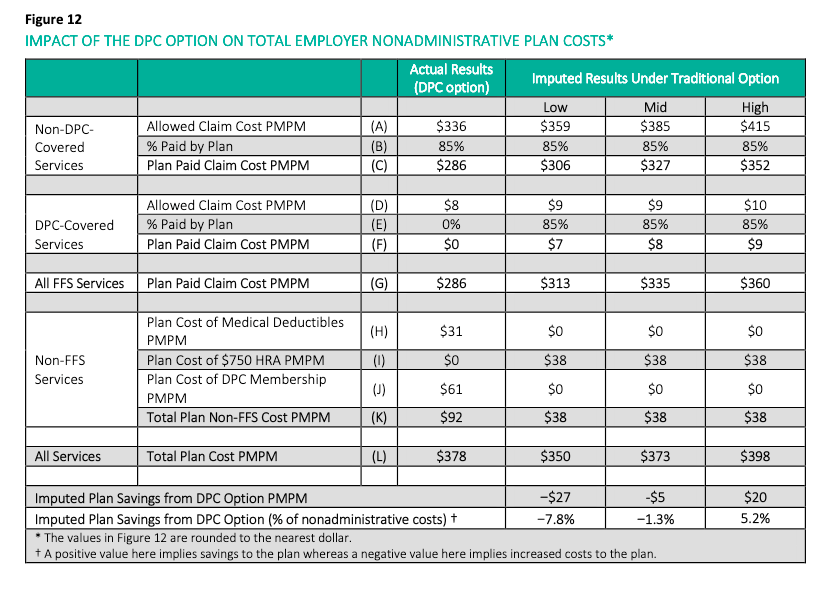
It is true that removing the $31 figure of Line H, would lead to a tabulated result of total plan cost of $347, which would suggest net savings.
The problem is that the $61 figure of Line J of the Milliman report has been too low all along — and by more than $31.
Milliman got the $61 by estimating the plan cost of DPC membership, rather than learning what the actual plan cost was. $61 was the result of Milliman applying a 60:40 adult child split to fee levels drawn from Milliman’s survey of $75 adult and $40 child. But the publicly recorded contract between the DPC provider, Paladina, and Union County set the fees at $125 adult and $50 child, and $95 is the correct composite that should have been in Line J, representing $34 PMPM missed by Milliman.
Accordingly, even if the $31 cost that fell on the County for waiving the deductible is expunged from the calculation, the total plan costs for DPC would work out to $381 and would still exceed the total plan costs for FFS. The County’s ROI was indeed negative.
I can not tell you why Milliman used estimated fees of $61 rather than actual fees of $95. But doing so certainly made direct primary care look like a better deal than it is.
Risk adjustment, and more, badly needed for KPI Ninja’s Strada-brag
Amended 6/26/20 3:15AM
The Milliman report’s insistence on the importance of risk adjustment will no doubt see the DPC movement pouring a lot of their old wine into new bottles, and perhaps even the creation of new wine. In the meantime, the old gang has been demanding attention to some of the old wine still in the old bottle, specifically, the alleged 68% cost care reductions attributed to Strada Healthcare in its work with a plumbing company of just over 100 persons in Nebraska.
Challenge accepted.
KPI Ninja’s study of Strada’s direct primary care option with Burton Plumbing illustrates why so much of the old DPC wine turns to vinegar in the sunlight.

At an extreme, there will be those who anticipate hitting the plan’s mOOP in the coming year — perhaps because of a planned surgery or a long-standing record of having “mOOPed” year-in and year-out due to an expensive chronic condition; these employees will be indifferent to whether they reach the mOOP by deductible or other cost-sharing; for them, moreover, the $32 PMPM in fixed costs needed for DPC option is pure disincentive. Furthermore, any sicker cohort is more likely to have ongoing relationships with non-Strada PCPs with whom they wish to stay.
An average non-Strada patient is apparently having claims costs of $8000. With a $2000 deductible and say 20% coinsurance applied to the rest that’s an employee OOP of $3200 and a total employee cost of about $6100; with a $3000 deductible that’s an OOP of $4000 and a total cost of $7250 . Those who expect claims experience of $8000 are unlikely to have picked the DPC/$3K plan. Why $1100 pay more and have fewer PCPs from which to choose?
But what about an employee who anticipated claims only a quarter that size, $2000. With the $2000 deductible that would come to an OOP of $2000 and a total cost of $4860. With the $3000 deductible that would come to an OOP of $2000 and a total cost of $5250. For these healthier employees, the difference between plans is now less than a $400 difference. Why not pay $400 more if, for some reason, you hit it off with the D-PCP when Strada made its enrollment pitch?
The sicker a Burton employee was, the harder this paired-plan structure worked to push her away. It’s a fine cherry-picking machine.
Strada’s analyst, KPI Ninja, recently acknowledged Milliman’s May 2020 report as a breakthrough in the application of risk adjustment to DPC. In doing that, KPI Ninja tacitly confessed their own failure to work out how to reflect risk in assessing DPC for its string of older reports.
To date, as far as I can tell, not one of KPI Ninja’s published case studies has used risk-adjusted data. If risk adjustment was something that Milliman invented barely yesterday, it might be understandable how KPI Ninja’s “data-analytics” team had never used it. But risk adjustment has been around for decades. It’s significantly older than Direct Primary Care.
KPI Ninja should take this opportunity to revisit its Strada-Burton study, and apply risk adjustment to the results. Same for its Palmetto study and for its recently publicized, but risk-adjustment-free study, for DirectAccessMD. Or this one about Nextera.
Notice that, precisely because they have a higher deductible plan than their FFS counterparts, the Strada-Burton DPC patients faced greater cost-sharing discipline when seeking downstream care. How much of the savings claim in the Strada report owes to the direct primary care model, and how much to the a plan design that forced greater shopping incentives of DPC members?
It’s devilishly clever to start by picking the low-risk cherries and then use the leveraged benefit structure to make the picked cherries generate downstream cost savings.
The conjoined delivery of Strada DPC and enhanced HDHP makes the enhanced HDHP a “confounder” which, unless resolved, makes it virtually certain that even a risk adjusted estimate of DPC effectiveness will still be overly favorable to Strada DPC itself on utilization.
I have no doubt that risk adjustment and resolution of the confounding variable will shred Strada’s cost reduction claims. But, of course, if Strada is confident that it saved Burton money, they can bring KPI Ninja back for re-examination. It should be fun watching KPI Ninja learn on the job.
I’m not sure it would be fair for KPI Ninja to ask Strada to pay for this work, however. KPI Ninja’s website makes plain that its basic offering is data analytics that make DPC clinics look good. Strada may not like the result of a data analytic approach that replaces its current, attractive “data-patina” with mere accuracy.
I’ll skip explaining why the tiny sample size of the Strada-Burton study makes it of doubtful validity. Strada will see to that itself, with vigor, the moment it hears an employer request an actuarially sound version of its Burton study.
Special bonus segment. Burton had a bit over 100 employees in the study year, and a large fraction were not even in the DPC. I’m stumped that Burton had a one-year hospital admission rate of 2.09 per thousand. If Strada/Burton had a single hospital admission in the study year, Strada/Burton would had to have had 478 covered lives to reach a rate as low 2.09. See this spreadsheet. If even one of 200 covered lives had been admitted to the hospital, the inpatient hospitalization rate would have been 5.00.
The use of the 2.09 figure suggests that the hospital admission rate appearing in the whitepaper was simply reported by Strada to the KPI Ninja analyst. A good guess is that it was a hospitilization rate Strada determined for all of its patients. Often, DPC practices have a large number of uninsured patients. And uninsured patients have low hospitilization rates for a fairly obvious reason.
DPC is uniquely able to telemed: a meme that suffered an early death.
An update to this post.
Larry A Green Center / Primary Care Collaborative’s Covid-19 primary care survey, May 8-11, 2020:
In less than two months, clinicians have transformed primary care, the largest health care platform in the nation, with 85% now making significant use of virtual health through video-based and telephone-based care.
Larry A Green Center and Primary Car Collaborative.
These words spelled the end of the meme that direct primary care was uniquely able to telmed. “DPC-Telly”, as the meme was known to her close friends, was briefly survived by her near constant companion, “Covid-19 means FFS is failing financially, but DPC is fine”. Further details here.
The Nextera/DigitalGlobe study design made any conclusion on the downstream effect of subscription primary care impossible.
The study indiscriminately mixed subscription patients with pay-per-visit patients. Selection bias was self-evident; the study period was brief; and the study cohort tiny. Still, the study suggests that choosing Nextera and its doctors was associated with lower costs; but the study’s core defect prevents the drawing of any conclusions about subscription primary care.
ADDENDUM of January 2021: In effect, for the seven month duration of the study, the average enrollee in the Nextera option faced a deductible more than $600 higher than those who declined Nextera, further skewing results in Nextera’s favor. See new material near bottom of post.
The Nextera/DigitalGlobe “whitepaper” on Nextera Healthcare’s “direct primary care” arrangement for 205 members of a Colorado employer’s health plan is such a landmark that, in his most recent book, an acknowledged thought leader of the DPC community footnotes it twice on the same page, in two consecutive sentences, once as the work of a large DPC provider and a second time, for contrast, as the work of a small DPC provider.
The defining characteristic of direct primary care is that it entails a fixed periodic fee for primary care services, as opposed to fee for service or per visit charges. DPC practitioners, their leadership organizations, and their lobbyists have made a broad, aggressive effort to have that definition inscribed into law at the federal level and in every state .
So why then does the Nextera whitepaper rely on the downstream claims costs of a group of 205 Nextera members, many of whom Nextera allowed to pay a flat per visit rather than having compensation only through than a fixed monthly subscription fee?
This “concession” by Nextera preserved HSA tax advantages for those members. This worked tax-wise because creating a significant marginal cost for each visit in this way actually creates a form of non-subscription practice within the intended medical economic goals for which HDHP/HSA plans were created— in precisely the way that a subscription plan, which puts a zero marginal cost on each visit, cannot.
The core idea is that having more immediate “skin the game” prompts patients to become better shoppers for health care services, and lowers patient costs. Those who pay subscription fees and those who pay per visit fees obviously face very different incentive structures at the primary care level. It would certainly have been interesting to see whether Nextera members who paid under the two different models differed in their primary care utilization.
More importantly, however, precisely because the fee per visit cohort all had HDHP/HSAs, they had enhanced incentives to control their consumption of downstream costs compared to those placed in the subscription plan, who did not have HDHP/HSA accounts. The per-visit cohort can, therefore, reasonably be assumed to have expereinced greater downstream cost reduction per member than their subscription counterparts.
Had the whitepaper broken the plan participants into three groups — non-Nextera, Nextera-subscriber, Nextera per-visit — there is good reason to believe that the subscription model would have come out one of the two losers.
Instead, Nextera analyzed only two groups, with all Nextera members bunched together. And, precisely because the group mixed significant numbers of both fixed fee members and fee for service members, it is logically impossible to say from the given data whether the subscription-based Nextera members experienced downstream cost reduction that were greater than, the same as, or less than the per-visit-based Nextera members. So, while the study does suggest that Nextera clinics are associated with downstream care savings, it could not demonstrate that even a penny of the observed benefit was associated with the subscription direct primary care model.
Here are the core data from the Nextera report.
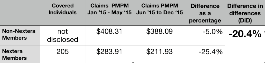
205 members joined Nextera; they had prior claim costs PMPM of $283.11; the others had prior claim costs PMPM of $408.31. This a huge selection effect. The group that selected Nextera had pre-Nextera claims that were over 30% lower than those declining Nextera.
Rather than award itself credit for that evident selection bias, Nextera more reasoanbly relied on a form of “difference in differences” ( DiD) analysis. They credited themselves, instead, for Nextera patients having claims costs decline during seven months of Nextera enrollment by a larger percentage basis (25.4%) than claim cost for their non-Nextera peers (5.0%), which works out to a difference in differences (DiD) of 20.4%.
Again, the data from mixed subscription and per-visit member can only show the beneficial effect of choosing Nextera, rather than declining Nextera. The observed difference appears to be a nice feather in Nextera’s cap; but the data presented is necessarily silent on whether that feather can be associated with a subscription model of care.
It cannot be presumed that Nextera’s success could have been replicated on the DigitalGlobe employees who declined Nextera.
In the time since the report, Nextera has actively claimed that its DigitalGlobe experience demonstrates that it can reduce claim costs by 25%. Nextera should certainly amend that number to the reflect the smaller difference in differences that its report actually shows (20%). But even that substituted claim of 20% cost reduction would require significant qualification before extension to other populations.
Even before they were Nextera members, those who eventually enrolled seem to have had remarkably low claims costs. The Nextera population may be so much different from those who declined Nextera that the trend observed for the Nextera cohort population can not be assumed even for the non-Nextera cohort from DigitalGlobe, let alone for a large, unselected population like the entire insured population of Georgia.
Consider, for example, an important pair of clues from the Nextera report itself: first, Nextera noted that signups were lower than expected, in part because of many employees showed “hesitancy to move away from an existing physicians they were actively engaged with”; second, “[a] surprising number of participants did not have a primary care doctor at the time the DPC program was introduced”.
As further noted in the report, the latter group “began to receive the health-related care and attention they had avoided up until then.”
A glance at Medicare, reminds us that routine screening at the primary care level is uniquely cost-effective for beneficiaries who may previously avoided costly health care. Medicare’s failure to cover regular routine physical examinations is notorious. But there is one reasonably complete physical examination that Medicare does cover: the “Welcome to Medicare” exam.
First attention to a population of “primary care naives” is likely a way to pick the lowest hanging fruit available to primary care. Far more can be harvested from a population enriched with people receiving attention for a first time than from a group enriched with those previously engaged with a PCP.
Accordingly, the 20% difference in differences savings in the Nextera group cannot be automatically extended to the non-Nextera group.
Relatedly, the comparative pre-Nextera claim cost figure may reflect that the Nextera population had a disproportionately high percentage of children, of whom a large number will be “primary care naive” and similarly present a one-time only opportunity for significant returns to initial preventative measures. But a disproportionately high number of children in the Nextera group means a diminished number of children in the remainder — and two groups that could not be presumed to respond identically to Nextera’s particular brand of medicine.
A similar factor might have arisen from the unusual way in which Nextera recruited its enrollees. A group of DigitalGlobe employees with a prior relationship with some Nextera physicians first brought Nextera to DigitalGlobe’s attention and then apparently became part of the enrollee recruiting team. Because of their personalized relationship with particular co-workers and their families, the co-employee recruiters would have been able to identify good matches between the needs of specific potential enrollees and the capabilities of specific Nextera physicians. But this patient panel engineering would result in a population of non-Nextera enrollees that was inherently less amenable to “Nexterity”. Again, it simply cannot can be assumed that the improvement seen with the one group can simply be assumed for any other.
Perhaps most importantly, let us revisit the Nextera report’s own suggestion the difference in populations may have reflected “hesitancy to move away from an existing physician they were actively engaged with”. High claims seem somewhat likely to match active engagement rooted in friendship resulting from frequent proximity. But consider, then, that the frequent promixity itself is likely to be the result of “sticky” chronic diseases that have bound doctor and patient through years of careful management. It seems likely that the same people who stick with their doctors are more likely to have a significantly different and less tractible set of medical conditions than those who have jumped to DPC.
Absent probing data on whether types of different health conditions prevail in the Nextera and non-Nextera populations, it is difficult to draw any firm conclusion about what Nextera might have been able to accomplish with the non-Nextera population.
These kinds of possibilities should be accounted for in any attempt to use the Nextera results to predict downstream cost reductions outcomes for a general population.
Perhaps, the low pre-Nextera claims costs of the group that later elected Nextera reflects nothing more than the Nextera group having a high proportion of price-savvy HDHP/HSA members. If that is the case, Nextera can fairly take credit for making the savvy even savvier. But it cannot be presumed that Nextera could do as well working with a less savvy group or with those who do not have HDHPs.
Whether or not Nextera inadvertently recruited a study population that made Nextera look good, that study population was tiny.
Another basis for caution before taking Nextera’s 20% claim into any broader context is the limited amount of total experience reflected in the Nextera data — seven months experience for 205 Nextera patients. In fact, Nextera’s own report explains that before turning to Nextera, DigitalGlobe approached several larger direct primary care companies (almost certainly including Qliance and Paladina Health); these larger companies declined to participate in the proposed study, perhaps because it was too short and too small. The recent Milliman report was based ten fold greater claims experience – and even then it had too few hospitalizations for statistical significance.
Total claims for the short period of the Nextera experiment were barely over $300,000, the 20% difference in difference for claimed savings comes to about $60,000. That’s a pittance.
Consider that two or three members may have elected to eschew Nextera in May 2015 because, no matter how many primary care visits they might have been anticipating in the coming months, they knew they would hit their yearly out-of-pocket maximum and, therefore, not be any further out of pocket. Maybe one was planning a June maternity stay; another, a June scheduled knee replacement. A third, perhaps, was in hospital because of an automobile accident at the time for election. Did Nextera-abstention of these kinds of cases contribute importantly to pre-Nextera claims cost differentials?
The matter is raised here primarily to suggest the fragility of a purported post-Nextera savings of a mere $60,000 over seven months. An eighth month auto accident, hip replacement, or Cesarean birth could evaporate a huge share of such savings in a single day. The Nextera experience is too small to be reliable.
Nextera has yet to augment the study numbers or duration.
Nextera has not chosen to publish any comparably detailed study of downstream claims reduction experience more recent than 2015 data — whether for DigitalGlobe or or any other group of Nextera patients. That’s a long time.
Nextera now has over one-hundred doctors, a presence in eight different states, and patient numbers in the tens of thousands. Shouldn’t there be newer, more complete, and more revealing data? (Note added in 2021 – In October 2020, Nextera provided new admittedly incomplete data, involving many more members and of longer duration. It was very, very revealing. See this analysis.)
Summation
Because of its short duration and limited number of participants, because it has not been carried forward in time, because of the sharp and unexplained pre-Nextera claims rate differences between the Nextera group and the non-Nextera group, and because its reported cost reduction do not distinguish between subscription members and per-visit members, the Nextera study cannot be relied on as giving a reasonable account of the overall effectiveness of subscription direct primary care in reducing overall care costs.
January 2021 Addendum: An additional study design defect skews results in Nextera’s favor.
June 1 is an odd time to start a health expenditure study, coming as it does near the mid-point of an annual deductible cycle. In the five months prior to the opportunity to enroll in Nextera, those who declined Nextera had combined claims that averaged $2041, while those who opted for Nextera had combined claims of only $1420. The average employer plan in the US in 2015 had a deductible of $1318 for single employee. Whatever the level at Digital Globe, it is quite certain that the group that eschewed Nextera had significantly more members who had already met their 2015 deductible than those in the Nextera group, and more who were near to doing so.
Note that an employee who had already met her annual deductible at the time Nextera became available would have had deductible-free primary care for the rest of the year, whether she joined Nextera or not. She would have gained nothing by choosing Nextera, but may well have had to change her PCP to one of the few on Nextera’s ultra-narrow panel.
More importantly, however, it is well known that, in the aggregate, once patients have cleared their deductible for an annual insurance cycle, they increase their utilization for the rest of the cycle. On the other hand, patients who do not envision meeting their deductible tend to defer utilization. Ask any experienced claims manager what happens in November and December.
Higher relative claims going forward for the non-Nextera group would be entirely predictable even if the Nextera and non-Nextera populations had had precisely equal risk profiles and had received, in the seven-month study period, precisely the same package of primary care services.
Nextera’s case study also had errors of arithmetic, like this one:
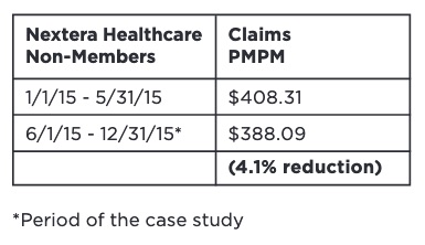
The reduction rounds off to 5.0%, the number I used in the larger table above.
Why is subscription DPC the precise hill on which self-styled “patient-centered” providers have chosen to make a stand?
A subscription model is not the most patient-centered way.
Consider this primary health care arrangement:
- Provider operates a cash practice
- no insurance taken
- no third party billed
- Provider may secure payment with a retainer
- balance is carried
- refreshed when balance falls below a set threshold
- Provider may bill patient for services rendered on any basis other than subscription
- specific fees for specific services; or
- flat per visit fee for all patients; or
- patient-specific flat visit fee, based on patient’s risk score; or
- patient-specific flat visit fee, based on affinity discounts for Bulldog fans; or
- fee tiers based on time/day of service peak/off-peak; or
- fee tiers based on communication device: face-to-face/ phone/ video/ drum/ smoke signal; or
- any transparent fee system based on transparent factors; but
- Provider elects not to bill a subscription fee, e.g., she does not require regular periodic fees paid in consideration for an undetermined quantum of professional services.
The plan above is price transparent to both parties. It is more transparent than a subscription plan because it is easier for each party to determine a precise value of what is being exchanged.
The plan above gives a patient “skin in the game” whenever she makes a decision about utilization.
Patient and doctor have complete freedom to pair and unpair as they wish. There will no inertial force from the presence of a subscription plan to interfere with the doctor-patient relationship.
The patient gets to use HSA funds, today. The plan above is fullly consistent with existing law and its policy rationale; a subscription plan is not.
Precisely because this plan beats subscription plans on freedom, transparency, and “skin in the game”, this plan is likely to lower your patient’s total costs better than a subscription plan — even if your patient does not have an HSA.
The specific fees and fee-setting methods will be disciplined by market forces. Some providers, for example, might find that the increased administrative costs of a risk-adjusted fee are warranted, while other stick with simpler models. Importantly, forgoing subscription fees should reduce the market distortions that arise when contracts that allocate medical cost risk between parties.
Health care economics has lessons about cherry picking, underwriting and death spirals, dangers associated with increased costs. These dangers have palpably afflicted health insurance contracts. Subscription service vendors are not immune. A subscription-based PCP unwilling to pick cherries will be left with a panel of lemons.
HDHP/HSA plans were created as a countermeasure to the phenomenon described by Pauley in 1968 , that when “the cost of the individual’s excess usage is spread over all other purchasers of that insurance, the individual is not prompted to restrain his usage of care“. A state legislature declaring that subscription medicine “is not insurance” does nothing to check the rational economic behavior of a DPC subscriber with no skin to lose when seeking her next office visit.
Some who generally do subscription medicine have, for years, also used per visit fees like those suggested above to address concerns about HSA accounts. In fact, one of the more widely touted self-studies by a direct provider, Nextera’s whitepaper on Digitial Globe, supported its claim of downstream claims cost reduction by comparing traditional FFS patients and a “DPC” population that included a significant proportion of per visit flat rate patients. Although Nextera claims that its study validates “DPC”, it presented no data that would allow determination of which DPC model – subscription or flat rate – was more effective.
In fact, before the end of March 2020, several DPC practices responded to the pandemic by offering one-time flat-rate Covid-19 assessment to non-members, such as non-subscribed children or spouses of subscribed members. Those flat-rated family members would have been able to use HSA funds for that care in situations in which the actual members might well have been unable.
I urge the rest of the no-insurance primary care community to reconsider its insistence on a subscription system that simultaneously reduces the ambit of “skin in the game” and cuts off the access of 23 million potential patients to tax-advantaged HSAs. There’s a better way — less entangled with regulation, less expensive, more free, more transparent, and even more “patient-centered”.
UPDATE: IRS showed in recent rulemaking process that it fully believes DPC subscription fees are, by law, a deal breaker for HSAs, despite the president* signalling his favor for DPCs. In my opinion, IRS would prevail in court if it cared to enforce its view. Philip Eskew of DPC Frontier is 100% correct that the odds of the IRS winning on this are closer to 10% than they are to 1%, just not in the way he apparently meant it.
Union County Direct Primary Care in a nutshell.
Union County is estimated by Milliman to have lost money. The odds that Union County saved more than 5.2% are less than one in twenty. The odds that Union County saved 28% or anything near that are miniscule.

Do you remember when DPC was claimed to be saving Union County $1.25 Million per year? So why did Union County’s health benefits expenditure rise twice as fast as can be explained by the combined effect of medical price inflation and workforce growth?
DPC Alliance manifesto steps on its own foot attempting to prove that DPC saves money.
On May 13th, the Direct Primary Alliance published a manifesto: Building the Path to Direct Primary Care. It was signed by every officer and board member of the largest membership organization of direct primary care physicians.
In so many words, it said:
- FFS primary care practice is being destroyed, financially, by the Covid-19 pandemic.
- DPC is thriving, financially.
- DPC has always been great, and has always been superior to FFS.
- Because of the pandemic, DPC is now even greater and even more superior to FFS.
- DPC will be even greater than it is now and even more superior to FFS than it is now, if we get help from government, insurers, employers, patients and everyone else.
- DPC achieves lower overall healthcare spending.
- DPC Alliance will help FFS practicitioners transfer to DPC.
In a recent post, I addressed the DPC-PATH’s claims regarding how well, relative to FFS practices, DPC practices were weathering covid-induced financial stress.
Here I turn to DPC-PATH as representing DPC Aliance’s clearest statement yet of the perennial claim by DPC advocates that “Direct pay primary care models provide health care purchasers with a means to achieve lower overall healthcare spending.5 6“.
Ah, yes, the footnotes.
Here’s Footnote 5:
Basu, Sanjay, et al. “Utilization and Cost of an Employer-Sponsored Comprehensive Primary Care Delivery Model.” JAMA Network Open, vol. 3, no. 4, 2020, doi:10.1001/jamanetworkopen.2020.3803.
This was a lengthy, exhaustive study of a large number of employees of a single employer, and it featured serious efforts at adjusting for demographic factors. The employees were offered the option of receiving primary care through traditional community PCPs or through either one on-site or fifteen near-site employer-sponsored clinics. It may well be the soundest study ever to show success in a primary care cost savings initiative. The study found savings of $167 PMPM, 45%, for those using primarily the on-site, near-site clinics delivery model.
But that delivery model was absolutely not direct primary care. Every employee visit in both the “treatment” group and the “control” group was reimbursed to the providers on a fee for service basis by the employer and/or employee cost sharing (a mix of deductibles, co-pays, and coinsurance).
In other words, what DPC Alliance’s manifesto presented as its first piece of evidence that direct primary care can save money was an article that seemingly demonstrated that certain FFS-based primary care delivery clinics saved money.
Interestingly, the Basu article on FFS on-site, near-site clinics in DPC-PATH’s footnote 5 more or less steps on the second bit of evidence purported, by DPC Alliance in Footnote 6, to show that DPCs reduce cost. That footnote links to the claimed savings of 28% for a DPC option in the employee health plan of Union County, NC.
Surprise! DPC is offered in Union County through a proudly touted near-site clinic. So, the article presented by DPC-PATH Footnote 5 suggests that the results shown in the article presented by DPC-PATH Footnote 6 can be explained by the location of the Union County clinic rather than the payment model under which the Union County clinic operates.
More importantly, however, the Union County DPC plan is the best studied plan in the entire direct primary care universe. DPC advocates have bragged about it again and again (1k hits for “Union County” and “direct primary care”).
It is also the only DPC plan to date (May 2020) that has received extended, comprehensive, risk-adjusted analysis from an independent team of actuaries. They found that:
… [T]he introduction of a DPC option increased total nonadministrative plan costs for the employer by 1.3% after consideration of the DPC membership fee and other plan design changes for members enrolled in the DPC option.
Pleaase click here for further detail..
Apparently, not even using a near-site clinic could make DPC a money saving proposition for Union County. In fact, I show in a separate post that the DPC option likely increased Union County’s costs for covered employees, not by a mere 1.3%, but by nearly 8%.
That “DPC is working while FFS is failing financially because of COVID” meme takes a big hit; proof furnished by DPC Alliance.
Reality: while it is may not be a pretty picture, no one has a clear view what the pandemic’s ultimate effects on primary care practices, FFS or DPC, will be.
On May 13th, the Direct Primary Alliance published a manifesto: Building the Path to Direct Primary Care. It was signed by every officer and board member of the largest membership organization of direct primary care physicians.
In so many words, it said:
- FFS primary care practice is being destroyed, financially, by the Covid-19 pandemic.
- DPC is thriving, financially.
- DPC has always been great, and has always been superior to FFS.
- Because of the pandemic, DPC is now even greater and even more superior to FFS.
- DPC will be even greater than it is now and even more superior to FFS than it is now, if we get help from government, insurers, employers, patients and everyone else.
- DPC achieves lower overall healthcare spending.
- DPC Alliance will help FFS practicitioners transfer to DPC.
In this blog, I’ve dealt previously with several of these issues, but today’s special attention goes to the new information about financial viability in mid-May 2020 that came to my attention through the DPC-PATH manifesto itself.
For its key financial arguments, the manifesto relies on an end of April survey of primary care practices , including some DPC practices, by the Larry A Green Center. That center highlighted that an astonishing 32% of PCP respondents said they were likely to apply, in May, for SBA/PPP Covid-emergency money. That means a lot of PCPs expected to certify either they have suffered a significant economic harm because of the current emergency (SBA-EIDL) or that a loan is “necessary to support on-going operations”.
The Alliance also linked a breakout focused on DPC practices. 52% of PCP in direct primary care practice responding to the same survey expected to seek such loans.
I don’t think DPC Alliance should be bragging about how much better DPC is weathering a pandemic than FFS with a survey that indicates that DPC docs were 60% more likely to seek emergency assistance this month than their FFS counterparts.
When this survey result was brought to the attention of some DPC Alliance board members, some offered the small size of most DPC practices as an explanation. I was told they feared “doom” and that they applied for government help because of the economic uncertainty coupled to their fear that they would not get government help. Interesting rationale!
But I was also told that it was reckless of me to think that DPC practices who certified to a good faith belief that uncertain economic conditions make their PPP loans necessary actually believed what they certified. Yet, strange as it is for DPC advocates to suggest that some DPC practitioners had committed felonies, one advocate earned “likes” from DPC advocates when he hammered the point home by cheerfully noting that the SBA had announced that PPP loans under $2 million would not be audited.
In fact, the SBA did not announce this non-audit policy until more than two weeks after the Green Center survey. Even then, the policy was carefully explained as intended to relieve smaller businesses from the financial burden of audit (not from the consequences of crime — fines up to $1 million and 30 years imprisonment). When DPC docs say they needed PPP loans to maintain current operations, I believe the docs and not those who accuse them of committing felonies.
On the other hand, there are clear advantages that DPC practices have had over PPS in weathering, financially, the first few months of the pandemic.
Relative to FFS practices, DPCs are concentrated in states with lower infection rates; there is less shutdown, less lost wages, less social distancing, less risk to office visits, less public panic.
Also, DPC practices do not accept Medicare, and have relatively tiny numbers of elderly patients relative to FFS practices. In average FFS- PCP practice during normal times, about one-quarter of patient visitors are over 65. But it is elders who, presently, have the strongest incentives to cancel office visits, to postpone routine care, and even to forgo minor sick visits or urgent care. Even in Georgia, the first state to “reopen”, the elderly remained subject to a gubernatorial stay at home order. FFS is taking a current revenue hit on patients who are barely visible in DPC practices.
That DPC providers tend to be located in less infected states and that their patient panels are nearly devoid of seniors means that DPC practices have likely caught a financial break relative to FFS. In terms of long-term policy goals and health care costs, however, DPC has found nothing in its response to the Covid crisis to brag about.
How will DPC practices compare to FFS practices six months or a year from now?
If Covid-19 survivors have a surge of primary care needs, DPC practices could be obliged to deliver more care for previously fixed revenue, but FFS practices are likely to be more able to match rising patient needs to rising revenues.
If social distancing continues to keep the number of in-office visits depressed, the perceived value of what was sold to patients as high-touch medicine will fall and subscribers may insist on lower subscription fees.
If the economy stays in the tank, patients may pay more attention to whether DPC gives good value. DPC would do well if those 85% cost reduction claims were anywhere near valid. But there is extremely little evidence to support the cost-effectiveness brags of DPC providers. Instead, there is solid actuarial evidence that can DPC increases cost.
Reality: while it may not be a pretty picture, no one has a clear view what the pandemic’s ultimate effects on primary care practices, FFS or DPC, will be.
A single-post critique of AEG/WP’s recommendation on direct primary care.
In “Healthcare Innovations in Georgia:Two Recommendations”, the report prepared by the Anderson Economic Group and Wilson Partners (AEG/WP) for the Georgia Public Policy Foundation, the authors clearly explained their computations and made clear the assumptions underlying their report. The report’s authors put a great deal or energy into demonstrating that billion dollar savings could be derived from direct primary care under certain assumptions. After what I believe was careful examination, I concluded that those assumptions were unsupportable.
Here, I summarize my opinions, linking to about twenty individual posts. The posts themselves contain numerous supporting citations and data, as well as access to spreadsheets that can be used as templates for the reader’s own calculations.
AEG/WP made two questionable assumptions about direct primary care fees. One assumption was that appropriate direct primary care would have a fixed monthly fee of $70. My analysis shows that $70 lowballs the fee considerably. A second assumption was that monthly direct primary care fee would remain flat for a decade.; I noted that these fees were likely to track medical cost inflation. I recomputed the possible savings based on using a more accurate monthy fee and the same medical cost inflation number AEG/WP used. And I left in place AEG/WP’s assumption, discussed below, that direct primary cuts 15% off downstream care costs. Correcting only AEG/WPs two assumptions about $70 fees caused the billion dollar purported savings to fall by 85%.
The most central assumption in the AEG/WP analysis is that direct primary care reduces the cost of downstream health insurance by 15%. Direct primary care needs to show significant reduction in downstream care costs to justify the fact that even $70 direct primary care monthly fees would exceed expected fee-for-service primary care payments — by about $350 per year in the individual market. While the AEG/WP’s 15% assumption corresponds to a downstream care cost savings in the vicinity of $660 per year, there is no clear evidence to show that direct primary care can even cover its own $350 annual upcharge,
I noted that AEG/WP supported its 15% assumption only by referring to undisclosed research internal to its own team. I noted that the marketplace had already demonstrated skepticism about similar claims. I noted that a DPC practice founded by one of the authors of the AEG/WP reports authors had made similar claims, without producing supporting data. I further noted that selection bias had infected the best documented argument that direct primary care reduced downstream costs.
I contacted AEG/WP and learned the 15% assumption was based on three reports, available on the internet, about different DPC clinics. I was able, therefore, to carefully examine the information available to AEG/WP. In a single post, I addressed the experience of two clinics, which together were both the two largest and the two most current examples used by AEG/WP; I concluded that these both examples failed to address selection bias adequately.
The third example, the Nextera clinic, deserved its own posts. Their report noted obvious selection bias, while revealing modest evidence that Nextera cuts cost for some of its patients. But the data set was skimpy and contaminated by results for fee for service patients. The patient data that showed downstream cost reductions for patients served by Nextera included both significant numbers who paid only Nextera’s fixed monthly fee and significant numbers who paid Nextera only on a per visit basis. This may be an adequate method for measuring the positive value of Nextera. It is hardly sufficient as a yardstick for the positive downstream value of fixed-fee direct primary care. In a separate post, I noted that Nextera’s experience showed only a $72 PMPM overall claims cost reduction, an amount that would barely exceed the $70 monthly fee.
I pointed out that even if the foregoing criticisms of the source data on which the AEG/WP relied were in error, their further assertion that the 15% assumption is a conservative one is incorrect.
I also pointed out that AEG/WP’s source material for the 15% assumption consisted only of marketing information, and I suggested that a few brags from a few DPC companies is not a sound basis for public policy decisions.
I spoke with the actuary who was on the AEG/WP team; he made clear that his role did not include validating the 15% assumption.
I noted that the AEG/WP sourced low monthly fees to a set of direct primary care providers who had sharply lower fees than the providers to whom AEG/WP sourced its claim of downstream cost reduction. I suggested that an analyst seeking to establish cost-effectiveness would be well-advised to draw both cost data and effectiveness data from the same sources.
Not a penny of the savings in the AEG/WP report can be achieved unless direct primary care will significantly reduce downstream care costs. There is no sound evidence in the sources on which the AEG/WP authors relied that direct primary care can even manage to cover its own added cost, even if direct primary care were priced at $70 and would stay at the level for a decade.
May 2020: An important study by actuaries at Milliman now suggest that 15% downstream care cost reductions are credible, affect our previous take on the AEG/WP report.
Brain Forrest, MD
Despite his longtime DPC advocacy, Dr Forrest’s work has yet to receive the kind of respect it truly deserves. For example, even though he publicized its astonishing findings, many do not even recall that Forrest directed a team of NCSU graduate business students in canvassing the entire Raleigh area to observe directly the amount of time FFS-PCPs were actually spending with their patients. Even the very students on that NCSU team have no recollection that this actually happened.
As important as overhead expenses are in the economics of PCP practice, expressing measured overhead costs as a percentage of revenue may be misleading.
After attaining a certain measure of success and a spreading reputation, an illustrator can vastly increase his prices and still sell his entire output, and do so without incurring added costs for pencils, paint, paper, other studio supplies or studio space. Revenue up; no change in overhead costs; overhead costs as a percentage of revenue down.
In other words, increasing prices can result in driving down overhead as a percentage of revenue.
Another route to a similar place might be for an entrepreneur to shift to specific activities that generate greater revenue but that need lower cost inputs. In an AMA journal practice note, I’ve seen a PCP report that his overhead as a percentage of revenue was lower when he devoted a larger portion of his practice to hospital visits rather than office visits. He specifically noted that his hospital calls entailed only a 5% overhead.
Reports of low overhead as a percentage of revenue from direct primary care clinics might result from a situation similar to that report. D-PCPs typically stress the virtue of simply spending more time talking to their patients. Financially able patients are apparently willing to pay for the extra time, enhancing revenue; but talking twice as long does not require a proportional increase in, say, staff payroll or medical supplies.
A physical exam followed by a ten minute talk uses the same number of examination gloves as the same physical exam followed by a thirty-minute talk. Similarly, the DPC selling point of same-day appointments (slack scheduling) can warrant provider revenue enhancements without requiring a proportional increase in floor space. Or, a provider offering concierge-availablity at premium price can increase revenue per patient, reduce panel size, and so face smaller malpractice risk as a share of revenue.
A cardinal point of its advocates is that DPC eliminates a significant measure of insurance related administrative tasks. It would be useful to know — in absolute terms, i.e., in dollars rather than as percentages of revenue — the costs that are actually subject to elimination (see., e.g., Jiwani et al., “Billing and insurance-related administrative costs in United States health care.“) But, in so far as the service mix in typical DPC offices differs from that in typical insurance based offices, comparing overhead only as an overall percentage of revenue in direct versus insurance practices will not yield a clean measurement of the savings that can be directly attributed to eschewing insurance.
It might be useful to compare the administrative overhead costs of direct primary care practices with those of “concierge” practices with similar panel sizes. DPC advocates typically cast “concierge” practice as only modestly different from DPC practice in nearly all respects except insofar as that, in addition to collecting a monthly retainer fee common to both DPC and “concierge”, the latter will “double-dip” by also billing insurers for any covered services provided. Assuming broadly comparable panel sizes and service mixes, administrative costs of the two kinds of practices should differ by more or less the actual administrative costs of participation in third party payment.
Quick guide/recap for Brekke’s “Paying for Primary HealthCare” and my responses
In an e-book and blog about paying for primary care, Gayle Brekke presents an argument laced with actuarial theory and jargon, calculations, notes, and citations. An appearance of scholarly pursuit and mathematical precision is thereby created; in both blog and e-book Brekke makes clear that she is an experienced actuary who is also deep into a Ph.D. candidacy. But, mostly, it’s all nonsense.
Per Brekke
Brekke’s core claim is that paying for primary care within the traditional health insurance system costs at least 50% more than paying for primary care with direct patient to practictioner transfers. Brekke reaches that conclusion in four key steps, each of which gets its own chapter.
- Provider-side administrative costs associated with insurance comprise half or more of primary care provider overhead, this adds about 28% to insurer payments to providers.
- Insurer-side administrative costs, including profits, require insurer premiums to exceed insurer payments to providers by over 17%.
- The presence of insurance results in at least 5% induced utilization of primary care services.
- Fee for for service insurance coverage incentivizes primary care providers to perform unnecessary primary care services far more than any direct payment system.
Per DPCreferee
Point by point, here are the principal failings of Brekke’s analysis, and a fifth point on which her analysis fails in a more global way. The superscripts link to detailed analyses.
- The data sources Brekke cites here simply do not support the huge difference in overhead costs she attributes to them.[A] Still, meaningful data related to Brekke’s point is available and it suggest a far smaller difference.[B]
- Brekke offers no supporting data; she simply but incorrectly assumes that each and every insurer will in all cases set premiums that capture the maximum administrative costs and profits allowable under MLR rules. There are many reasons this cannot be assumed, e.g., where insurance markets are competitive or where public insurers have low administrative costs and earn no profits. There is plenty of data available. [C]
- Even Brekke admits there is no data to support the 5% minimum amount she assigns to this factor. Given that insurers have available counterstrategies (e.g., cost-sharing) to curb moral hazard, the matter is wide open. Further, Ms Brekke preferred alternative to insurance is subscription based direct primary care, in which cost-sharing is akin to heresy. Actual data comparing induced utilization for direct and insured primary care might very well show an advantage for insured care.[D]
- Brekke offers no data to support the proposition that insurance based FFS physicians initiating medically unnecessary services is a serious problem. More importantly, Brekke fails to grasp that DPC’s extended visit times and same day scheduling might also be a form of well-paid, medically unnecessary feather-bedding. The corrupt will find a way in any system. Brekke has no cause to assume that traditional PCPs are any more corrupt than D-PCPs.[E]
More generally, at no point does Brekke even seem aware that insurers sometimes contribute to containing primary care costs. The most consequential of these contributions is almost certainly that, even in the face of a PCP shortage, an insurer representing the market power of tens of thousands of consumers can somewhat restrain PCP compensation. If that seems no big deal, ask any D-PCP if low payment rates were an important consideration behind her migration from insured care.[F]
In rural areas, decreased primary care panel size is a problem, not a solution.
Montana’s last governor twice vetoed DPC legislation. He was not wrong.
Over the last month or so, DPC advocates from think-tanks of the right have trotted out the proposition that direct primary care could be “the key to addressing disparities in health care access in underserved areas of Montana facing severe shortages of primary care”. They are very excited that eight DPC clinics have “opened” in Montana in just a few years. Yet, when the very same advocates testified before the Montana legislation, they brought along some real MT DPC docs whose own testimony made it clear that what really happened is that eight existing clinics or practitioners in Montana decided to switch to subscription model care.
And, no doubt, each such D-PCP significantly reduced the size of their patient panel. Typical DPC clinicians brag about reducing patient panel sizes to one-third the size of those in traditional practices. Indeed, some members of the same pack of DPC advocates in the same hearing stressed the glories of tripled visit times.
But reducing patient panels sizes by two-thirds obviously aggravates the problem of primary care physicians shortages.
The most common response of the DPC community has been that DPC lowers burnout, lengthening primary care careers, presumably mitigating that aggravation – to some unknown degree and at some unknown point in the future.
I did some math.
Each PCP who chooses DPC and reduces patient panel sizes by two-thirds would need to triple the length of his remaining career to cover the gap he created by going DPC. And it would take decades to do so.
Assume an average career length of 20 years for a burning out PCP, with retirement at the age of 50. Let’s suppose that DPC makes PCP life so sweet that he works until he is 80 years old.
By the end of those 30 additional years, the equivalent of one-quarter of the patients he left behind by going DPC will still be left in the cold Montana snow.
To fully close the gap his switch to DPC created, he would have to work until he was a 90 year old PCP. The good news is that he would be very experienced; the bad news is that some 90 year-olds might struggle with “24/7 direct cellphone access to your direct primary care physician”.
To supplement the patent insufficiency of this bleak scenario, DPC advocates further argue that DPC will lead to increases in the percentage of young professionals choosing primary care practice instead of specialties. One of the think-tank “experts” from the Montana expedition has said that “we know” this to be the case, but provided no evidence other than the naked claim “we know”. Is this knowledge, or just speculation? Feel free to put a link to any significant evidence in the comments section below.
Even if there was hard evidence that DPC had shifted or might shift career choices toward primary care, it would still be wise to “be careful what you wish for”. Physician shortages in rural areas are not limited to primary care. To the contrary, there is ample evidence, such as this study from a Montana neighbor state, that rural communities face shortages of specialists that are even more consequential than the shortages of PCPs.
If a potentially gifted surgeon is willing to return to her roots in Whitefish, why turn her into a PCP?
Montana officials, beware.
